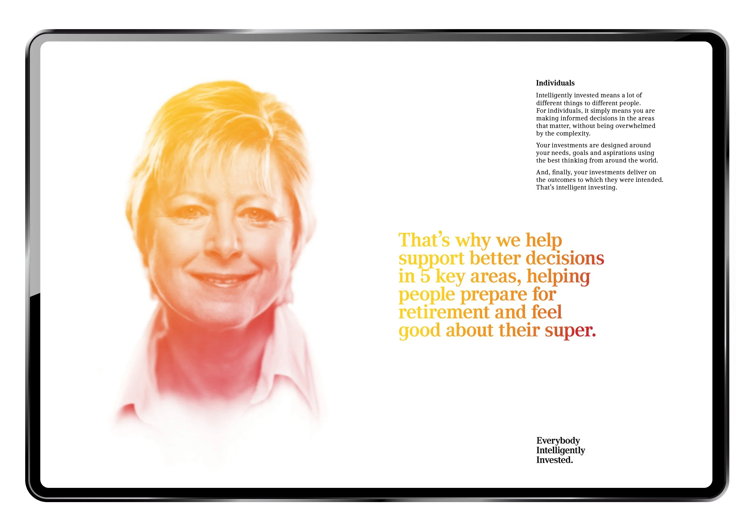
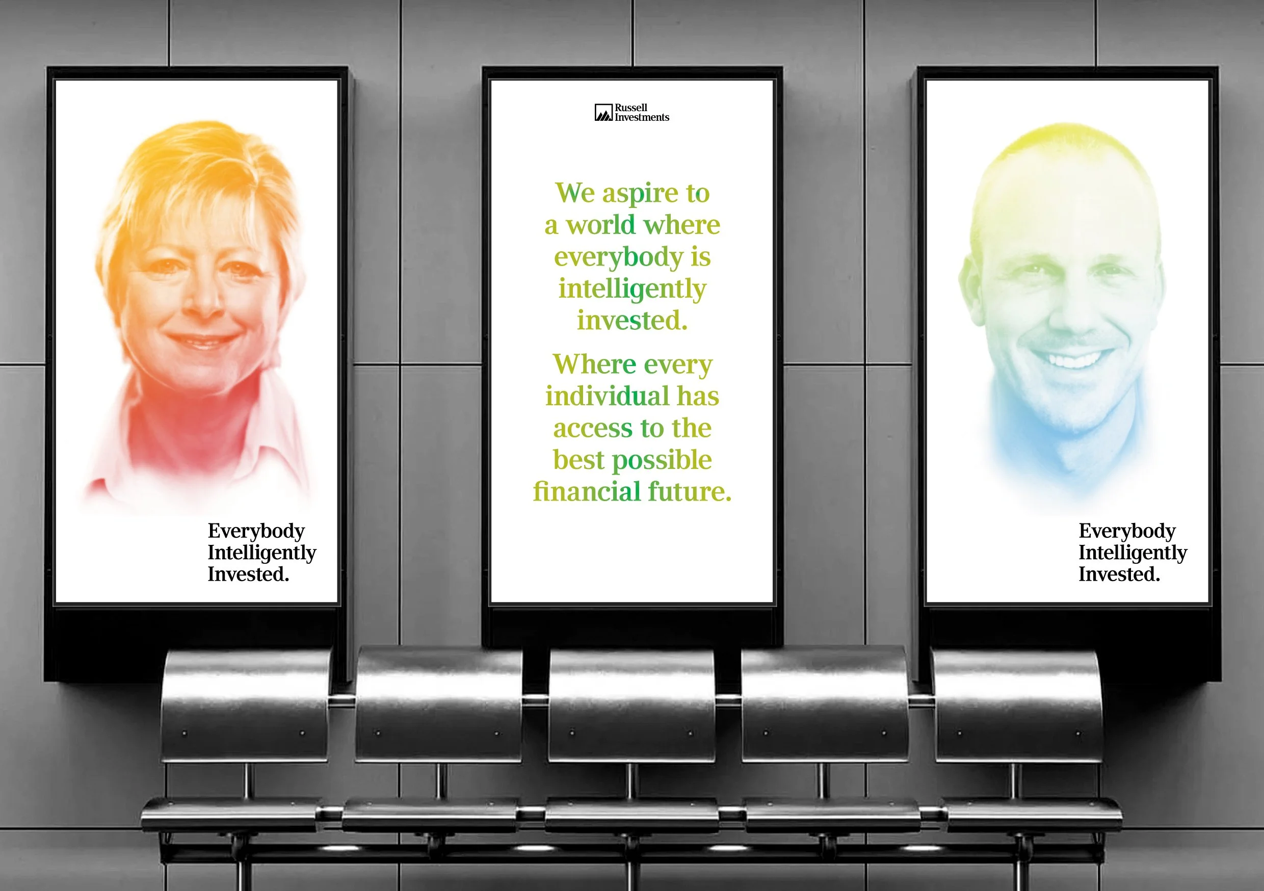
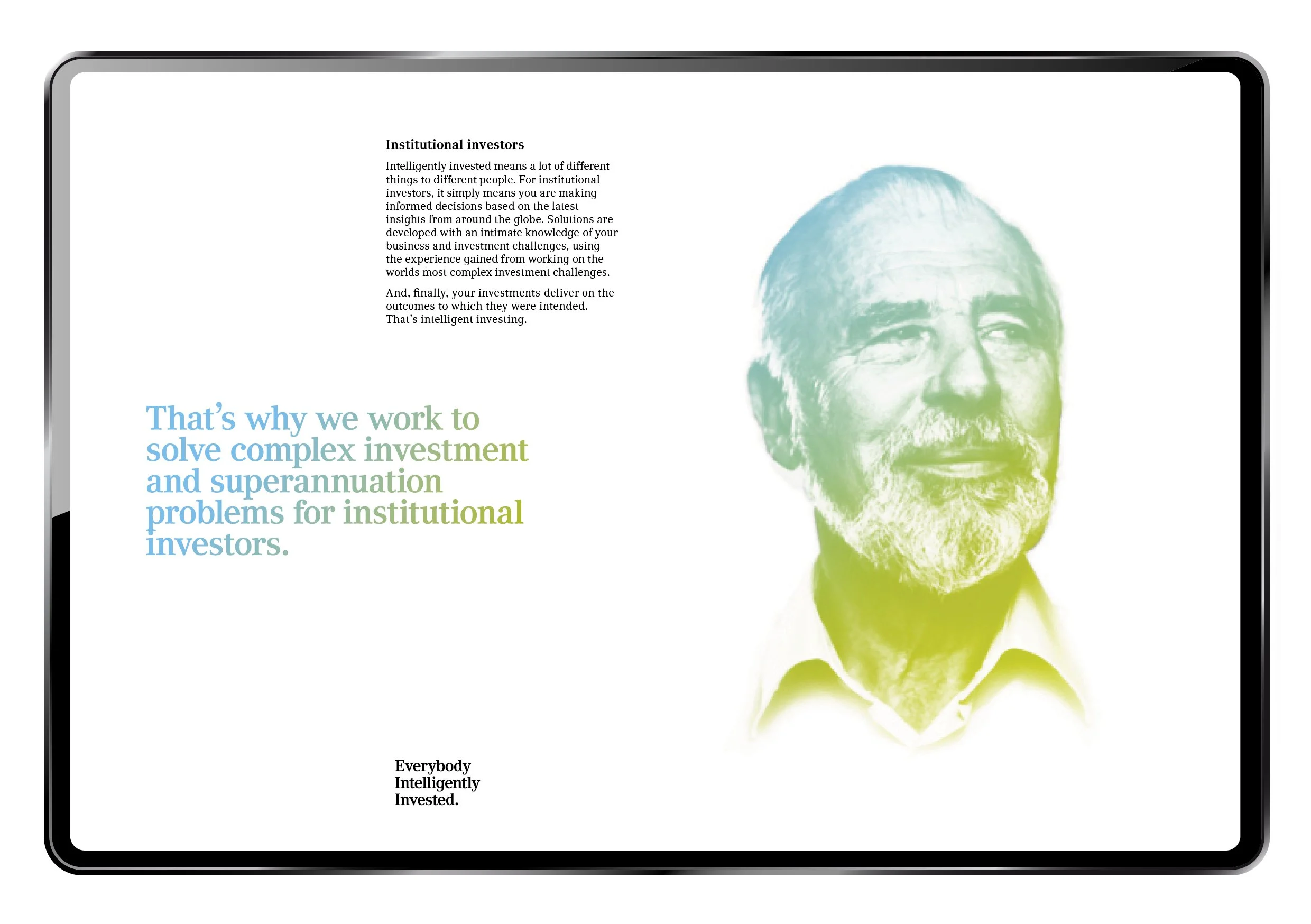
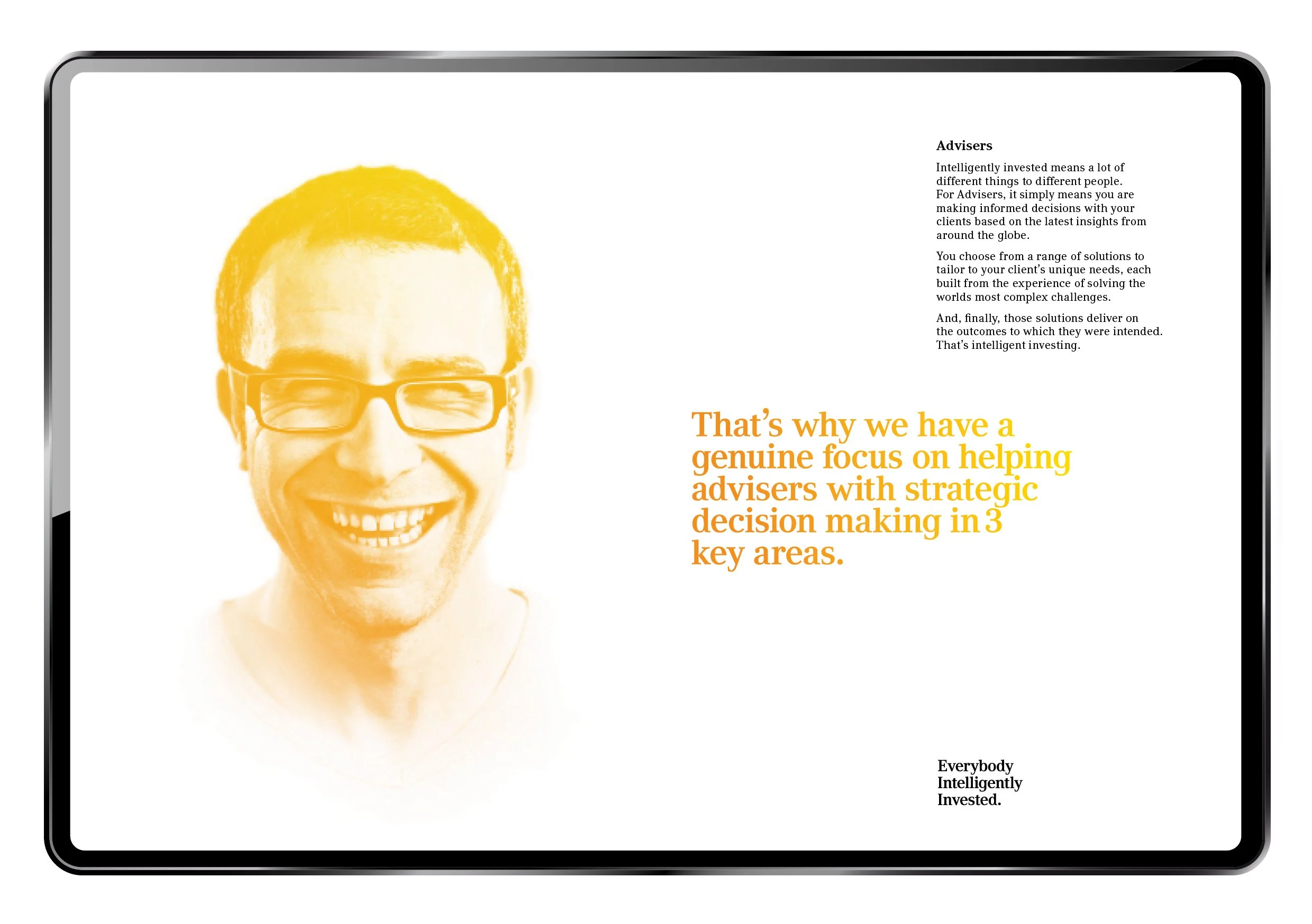
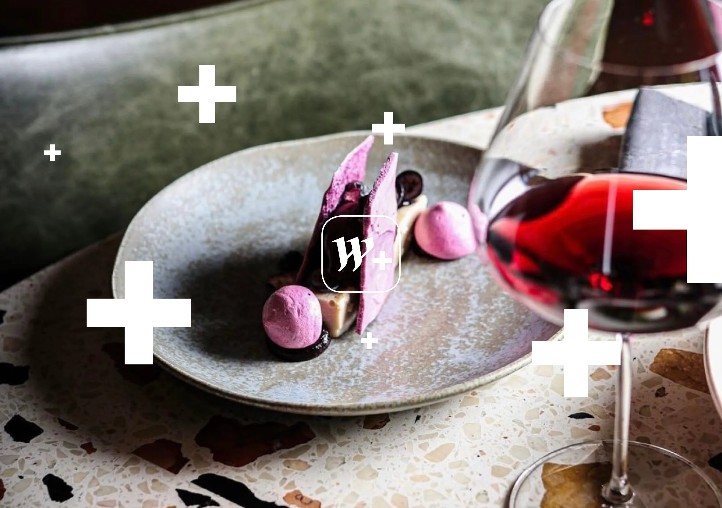
Russell InvestmentsExpanding our collaborations with the brilliant Russell Investments, we were engaged by their internal marketing team to amplify their corporate profile. The positioning, and therefore a strategic and creative direction, was built around Russell believing in a world where everybody is intelligently invested - seeing a clear path through complex issues - one that brings investing out of the dark, and shines a light on the financial needs of their clients - being able to guide them towards the best possible financial future through education, understanding and intelligent thinking.
People are always at the heart of everything Russell do, so we gave their clients an illuminated treatment - a glow up surrounded by lots of white space that cuts out the clutter and confusion that often permeates the financial word.
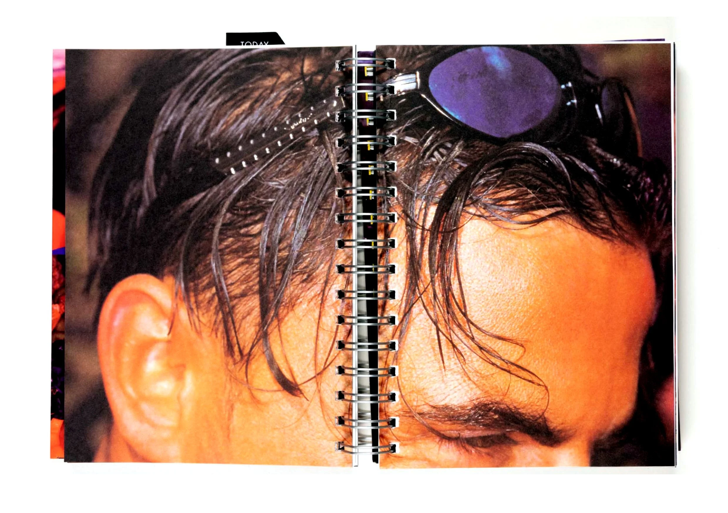
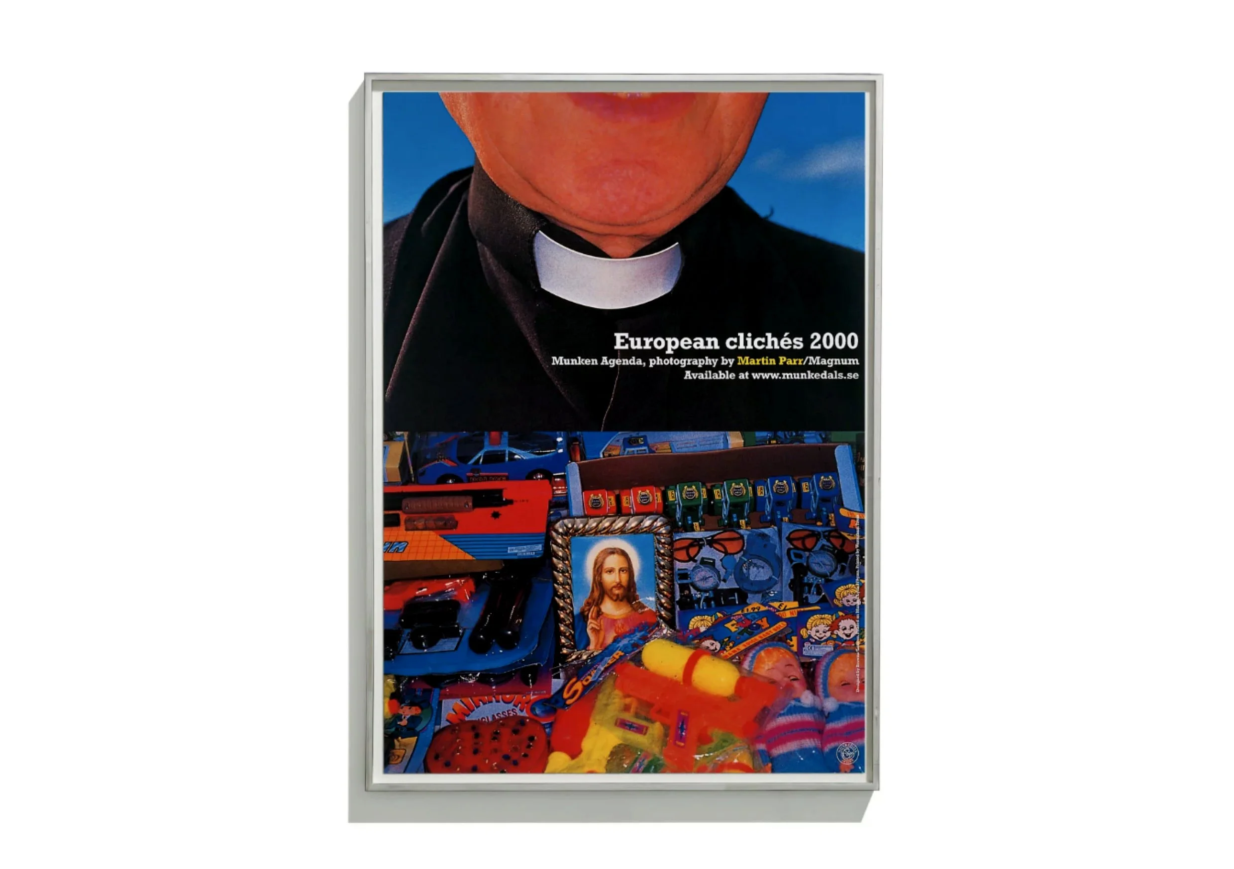
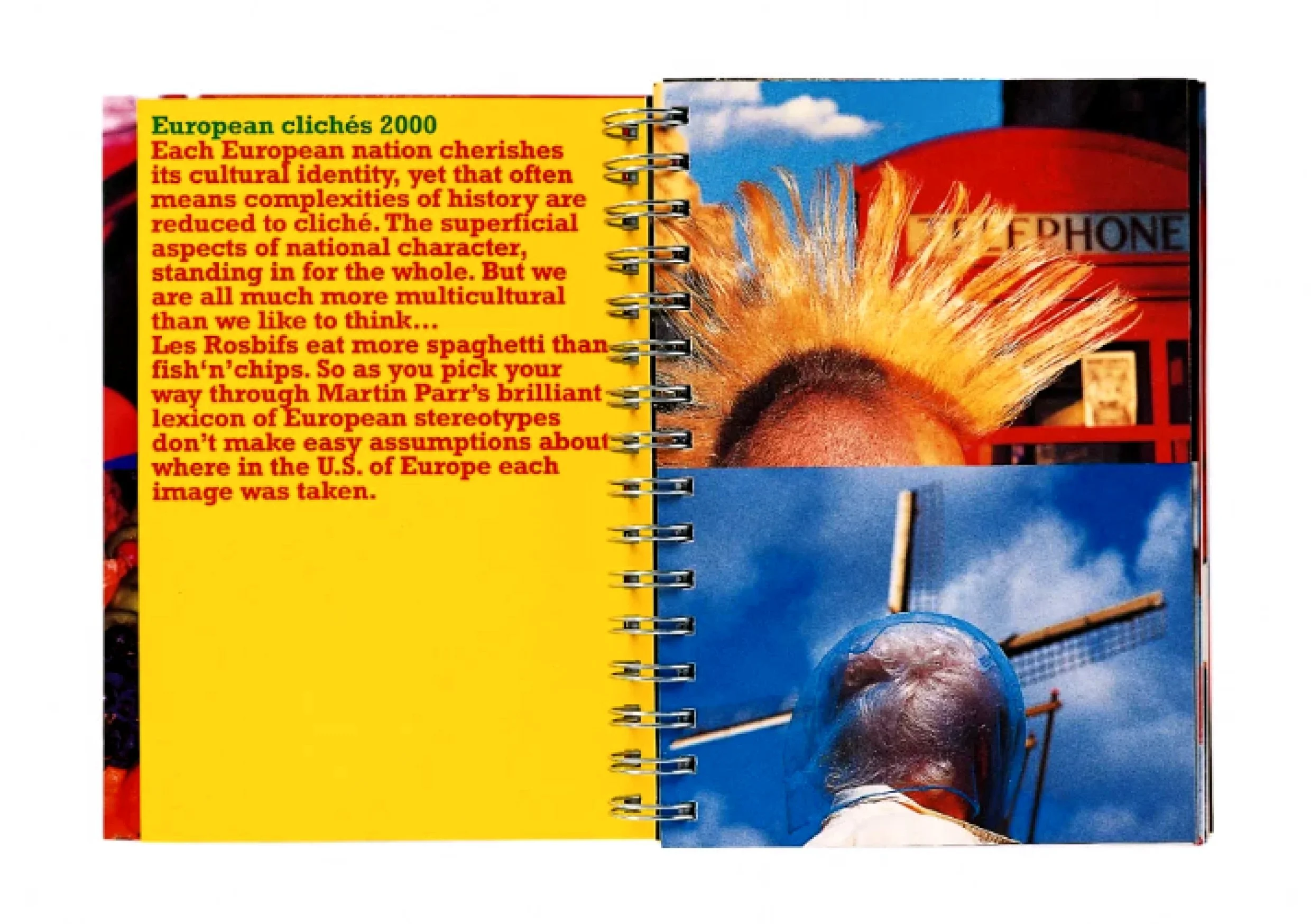
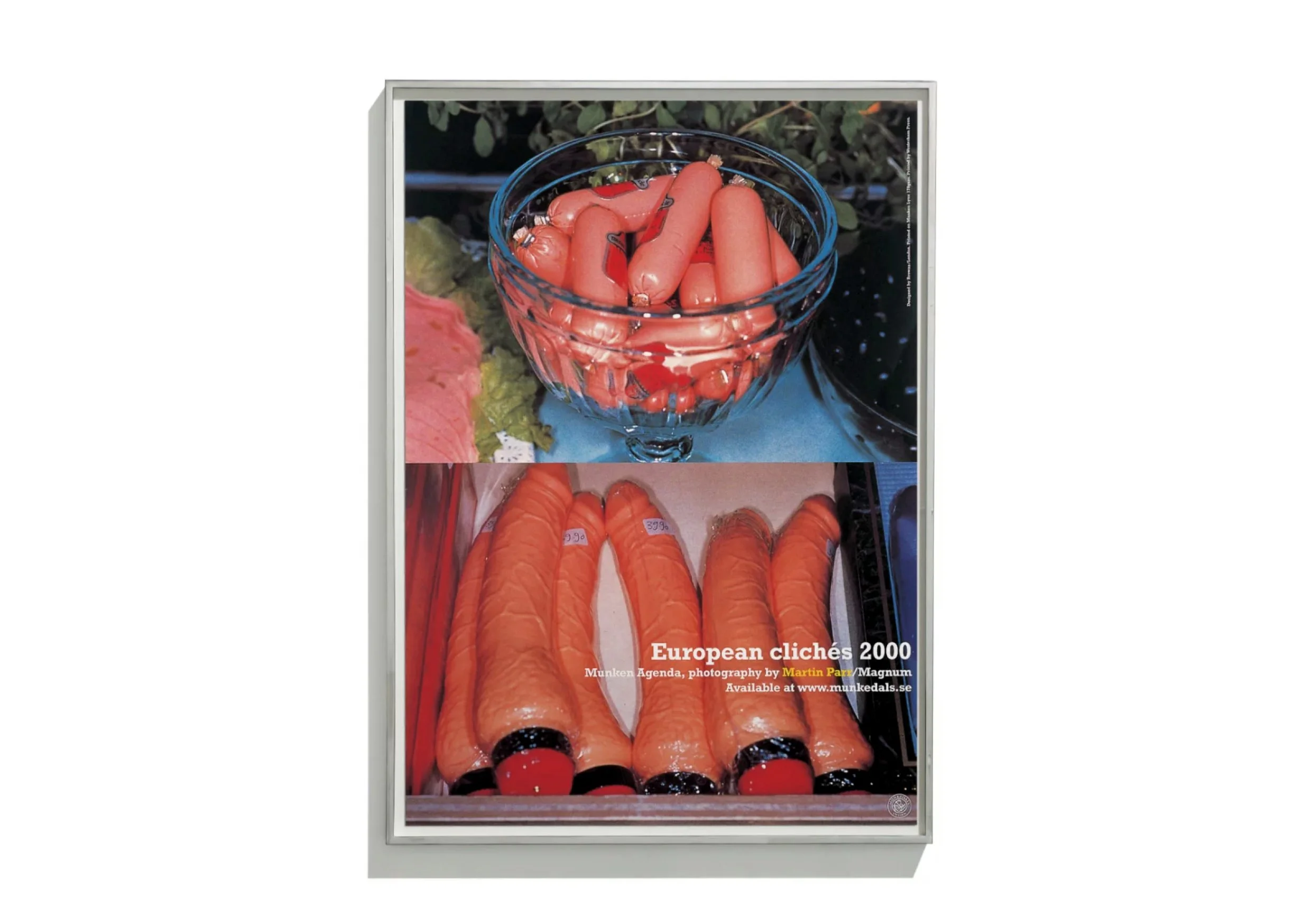
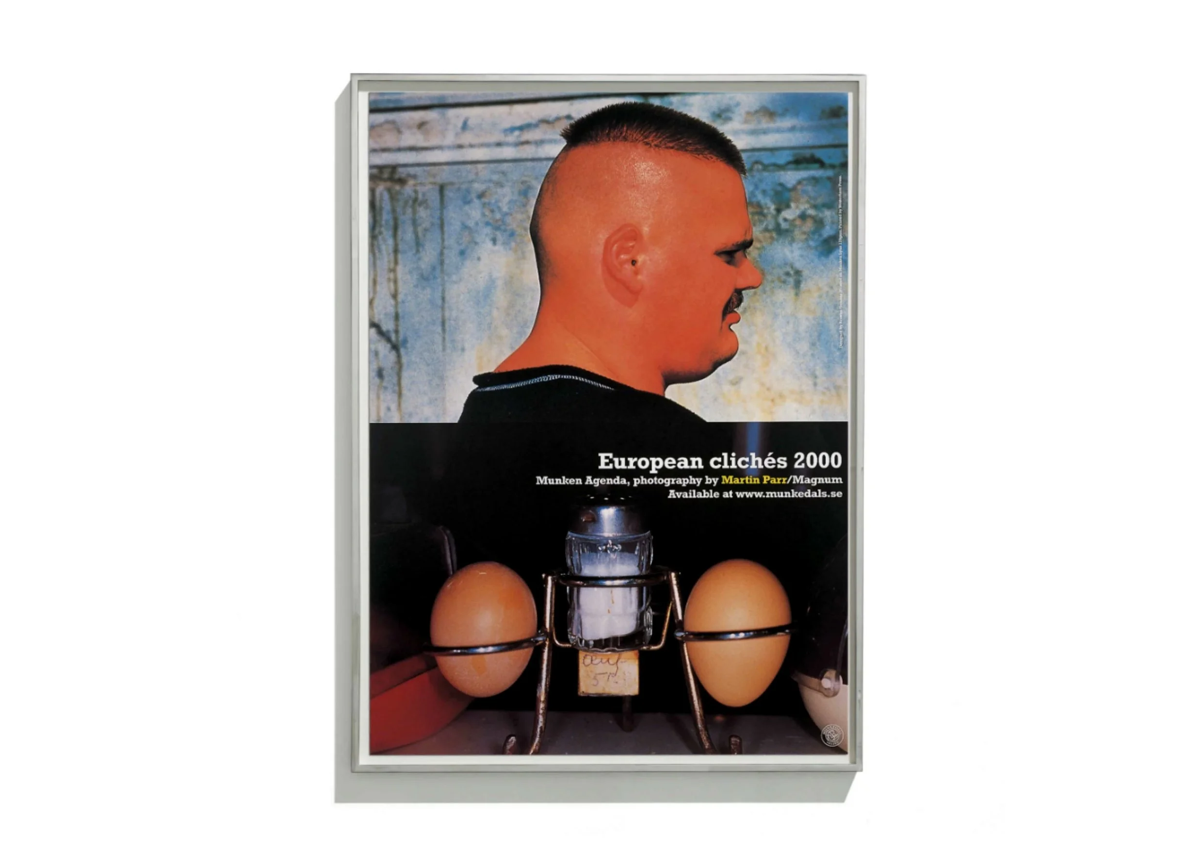
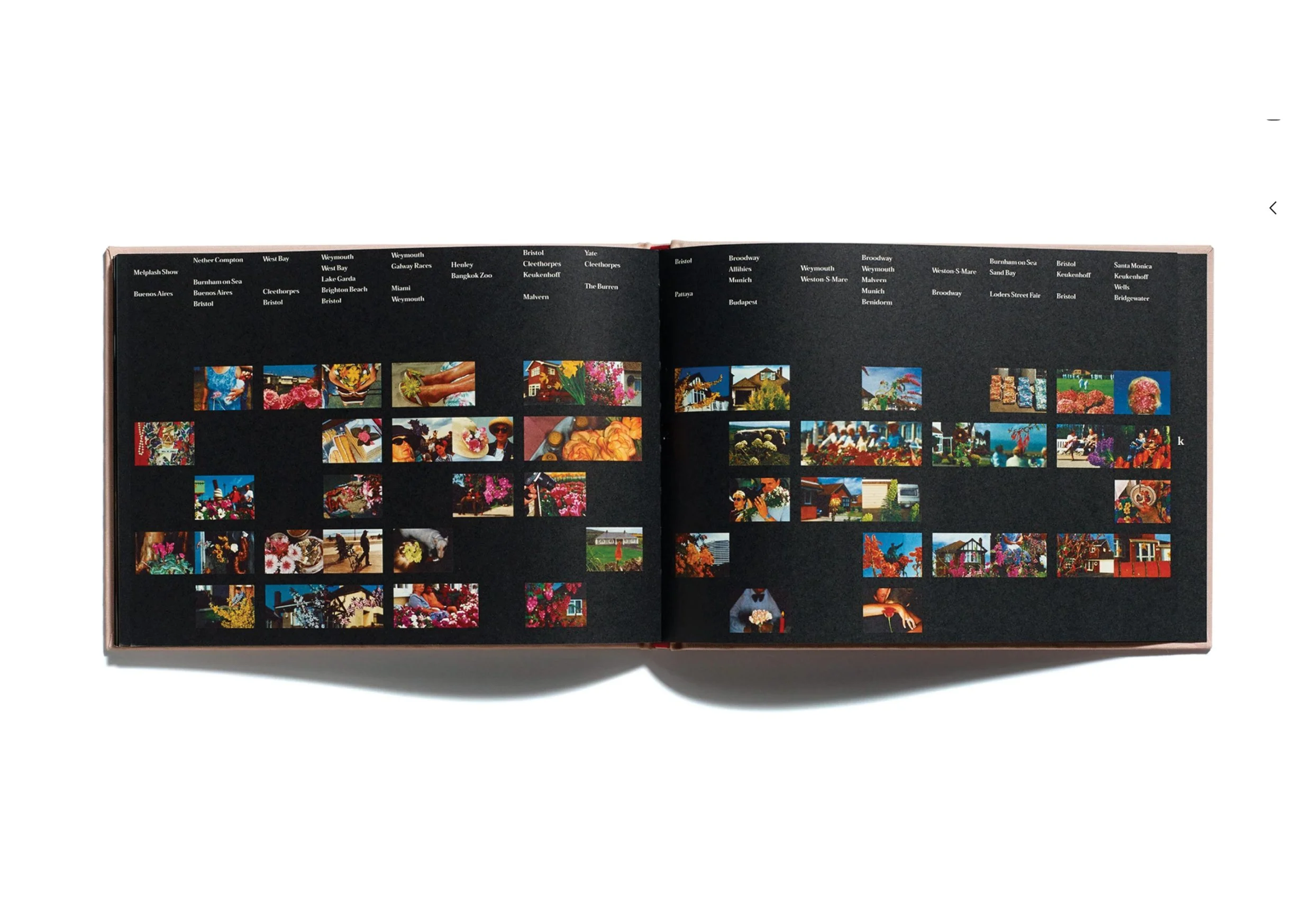
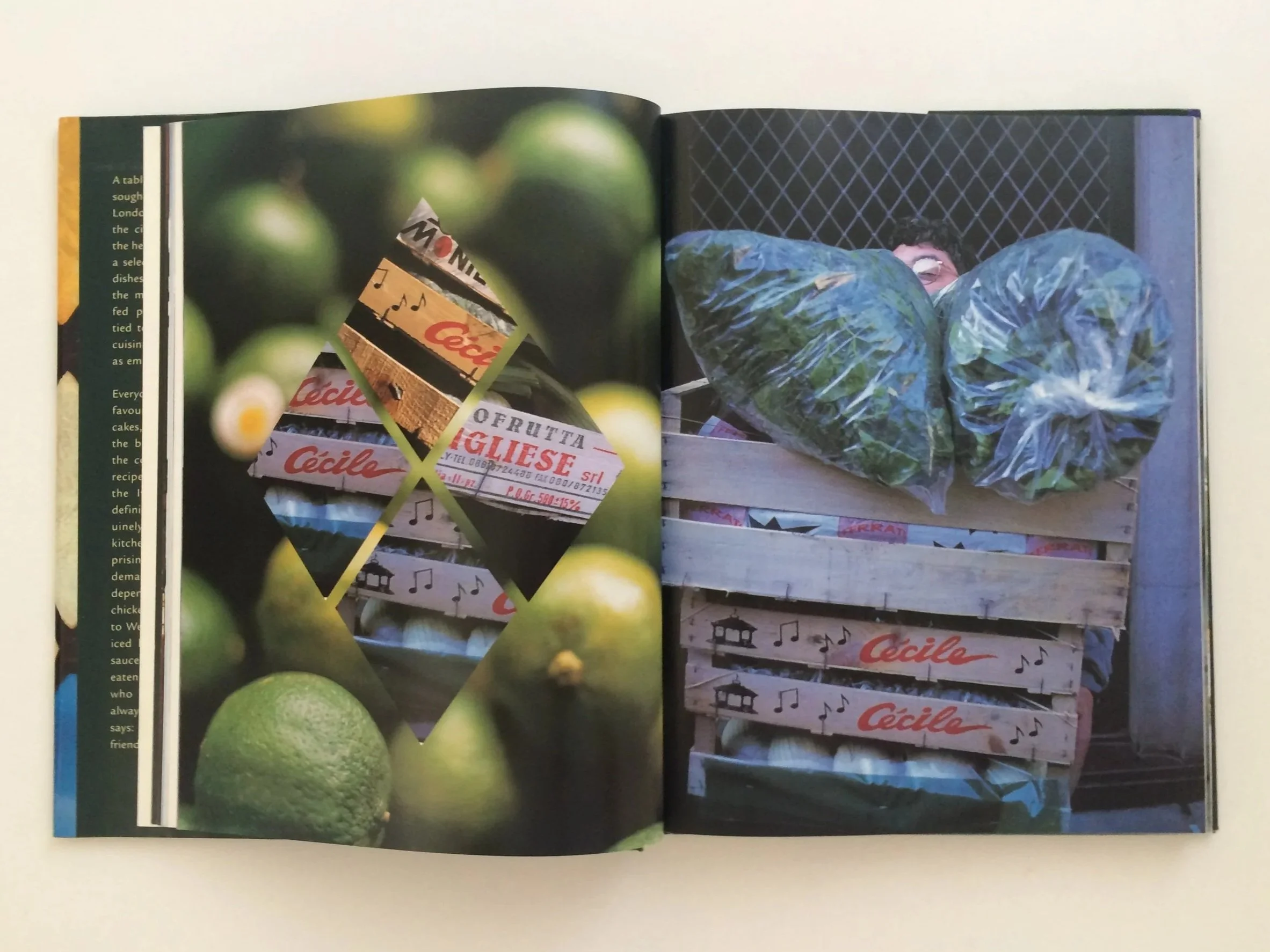
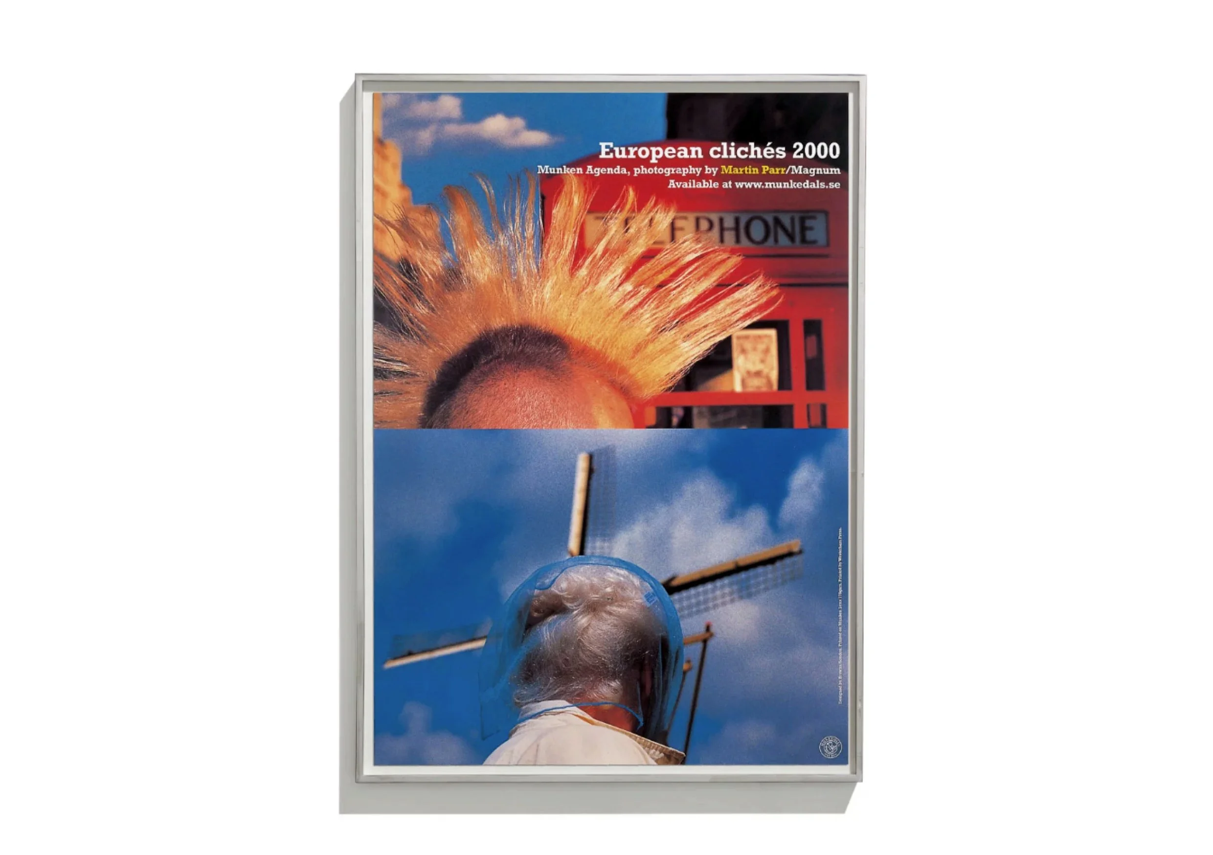
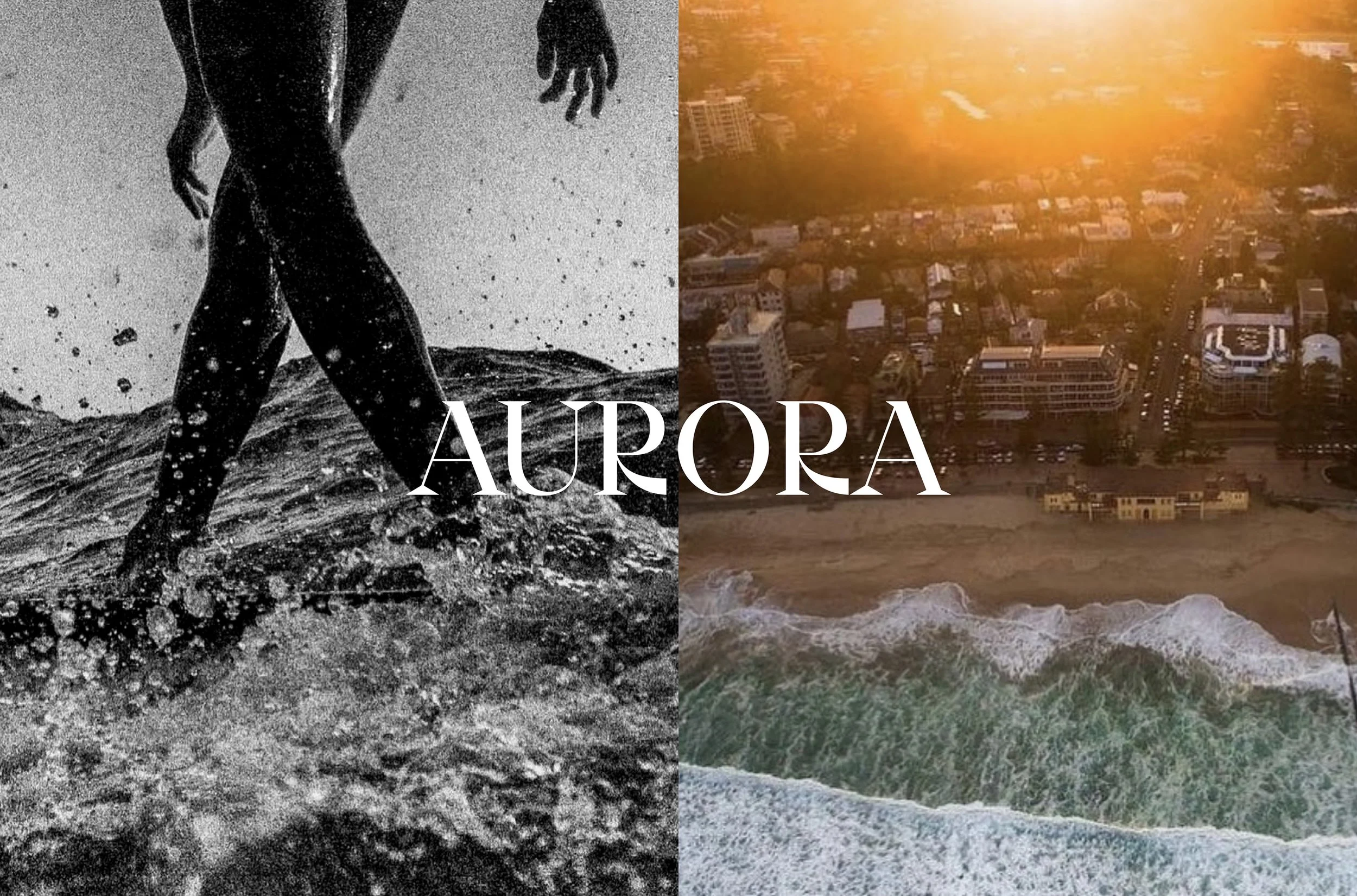
European ClichesFollowing our collaboration with Martin Parr on his Flowers book, Jonathan and I created the European Clichés agenda - a desk diary for the millennium, designed for Swedish paper company Munken.
The agenda, at 254 pages including 6 removable postcards, was used to increase paper sales throughout Europe, targeting design and advertising agencies. It was built around the concept of clichés - one that would be pan-European in its appeal and understanding.
We also created a set of limited edition, A1 posters to support the agenda. The posters won awards at both Design Week, and D&AD in 2001.
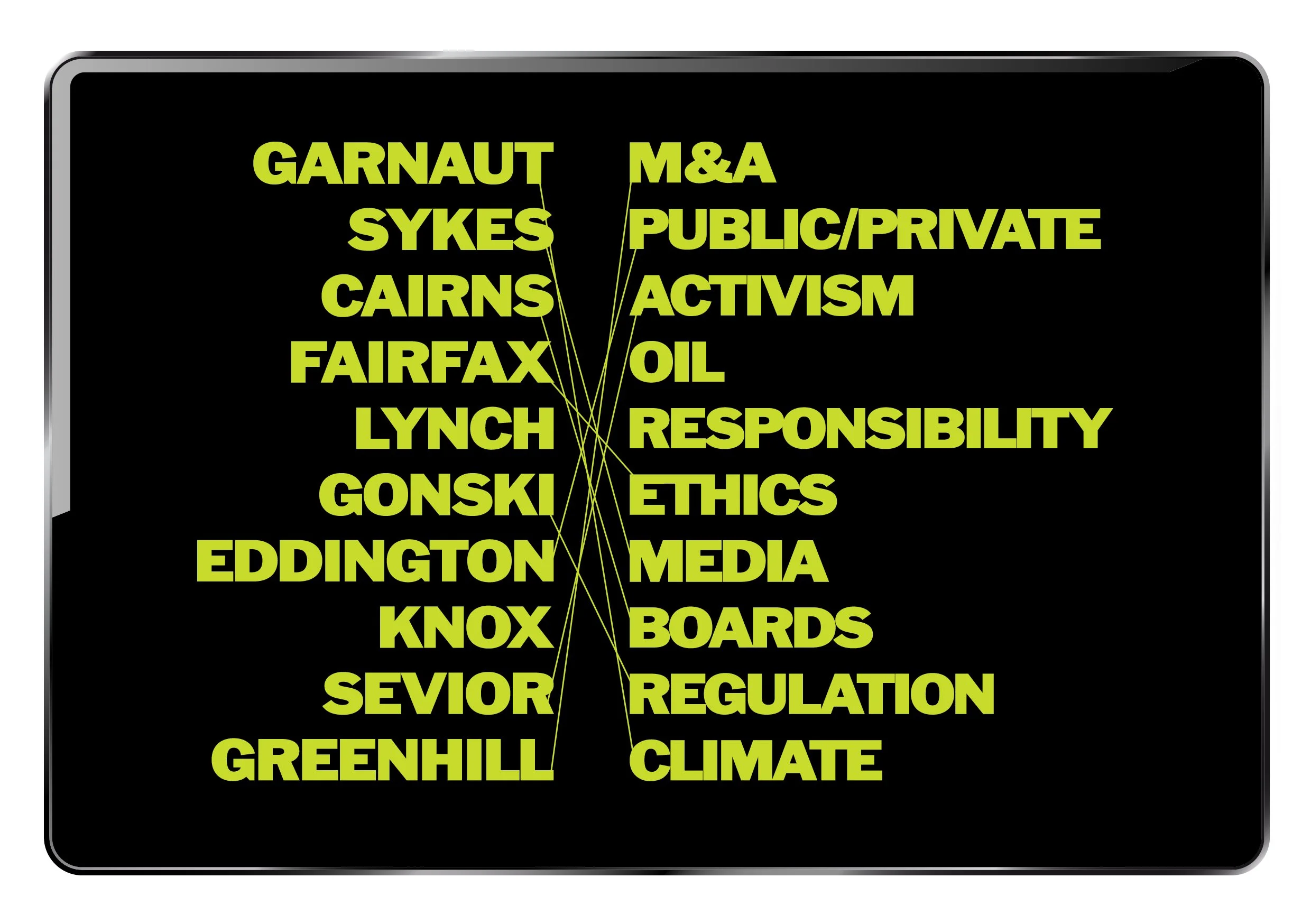
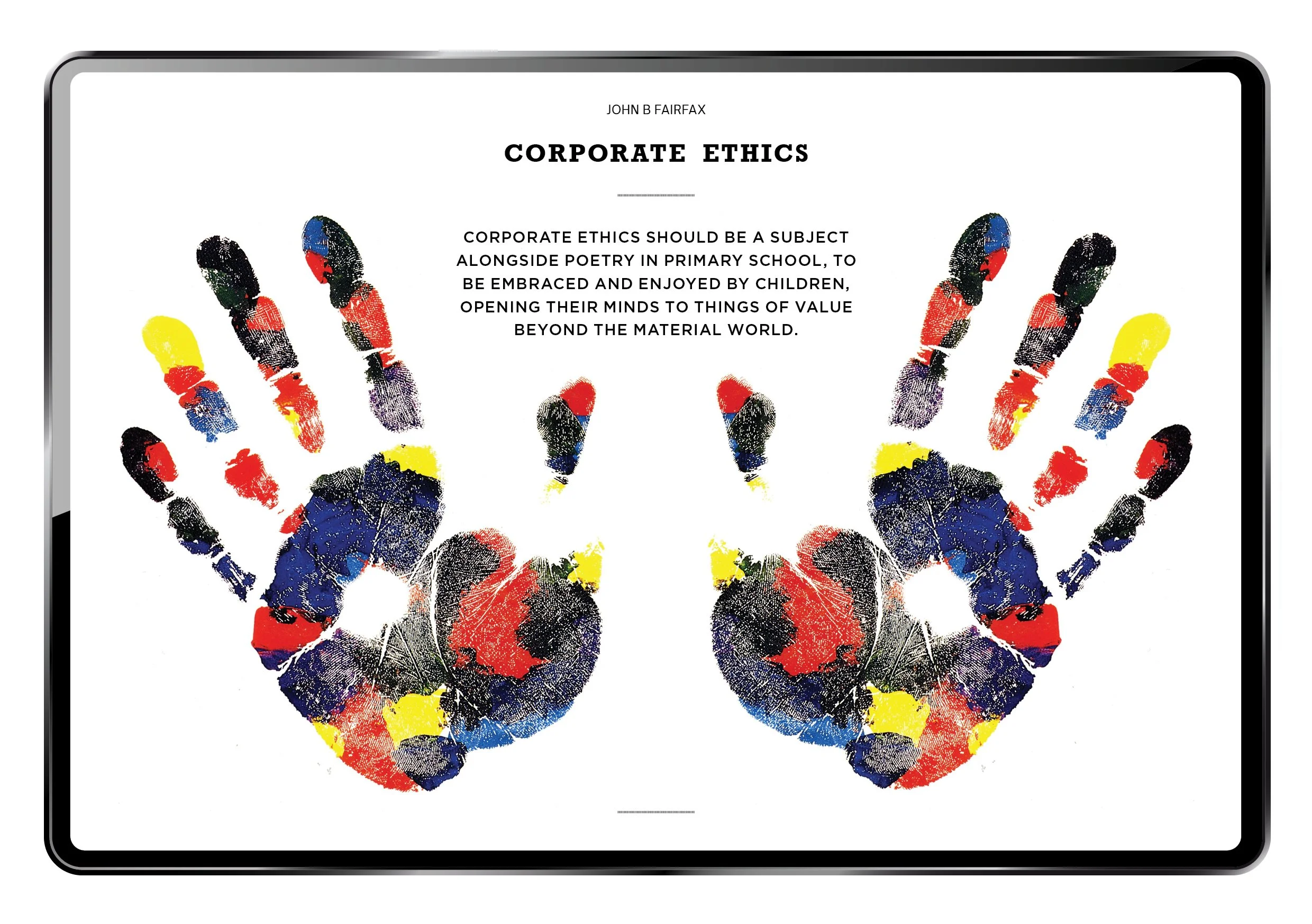
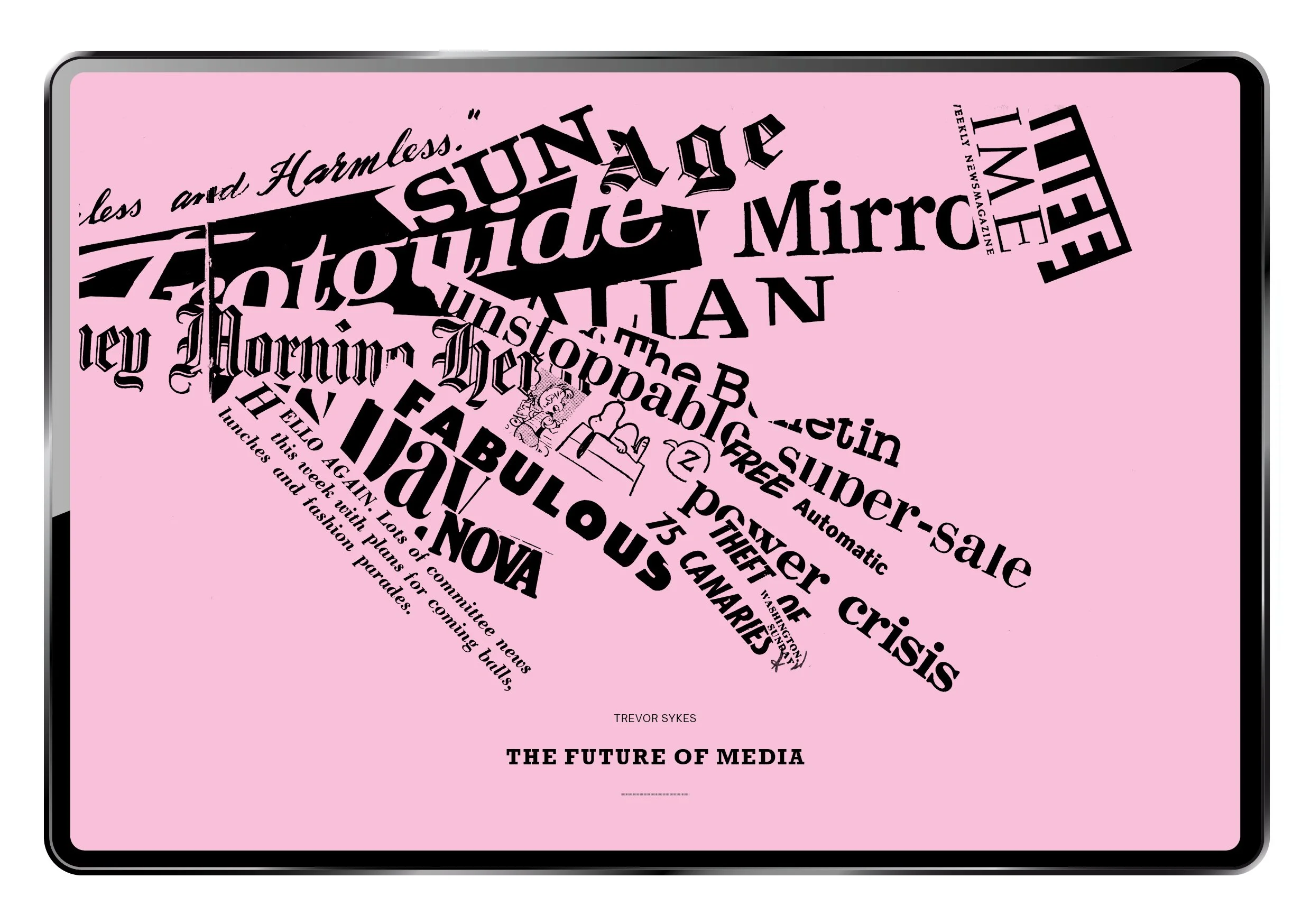
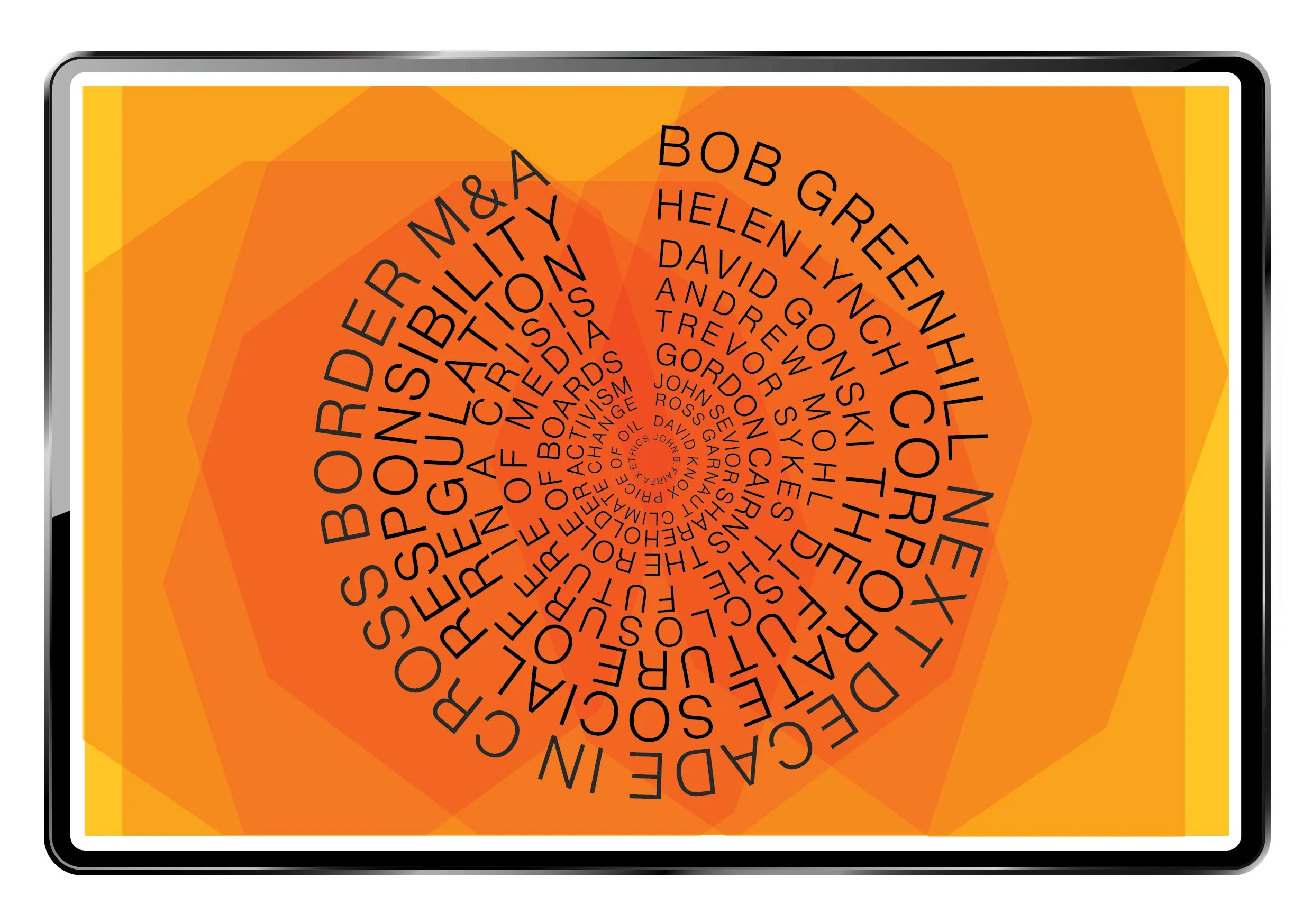
Caliburn PartnershipAlmost 20 years ago, as co-founder and creative director of Nice.Idea. I designed the annual review for Caliburn Partnership. To celebrate 10 years of business, we asked 10 prominent industry figures to submit articles about hot topics of the day - many of which are still relevant in 2026. John B Fairfax wrote about Ethics, Ross Garnaut - Climate Change, David Knox - Price of Oil, Helen Lynch - Corporate Social Responsibility, and David Gonski - The Future of Regulation.
We commissioned Andrew Quilty to take the board shots, and I remember them to be a fun group, and I particularly enjoyed my ‘art chats’ with Simon Mordant. Collage illustrations by Bruce Petty.

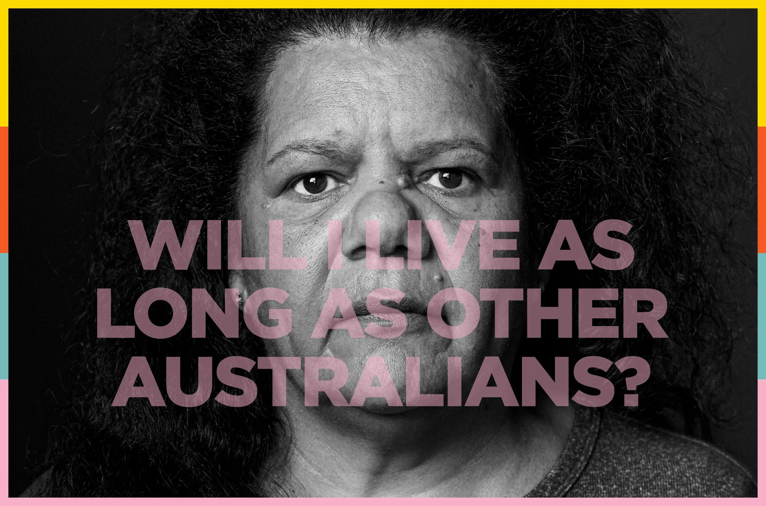
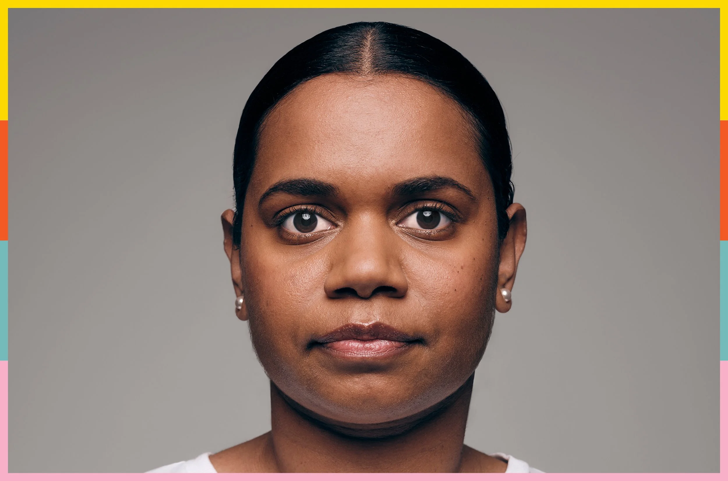
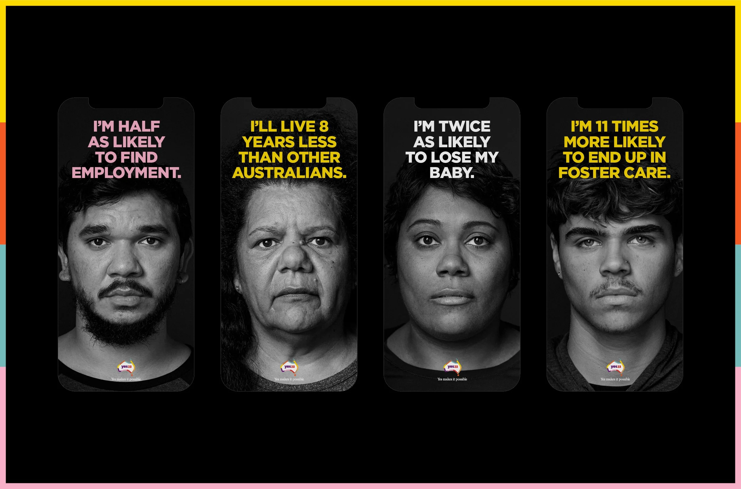
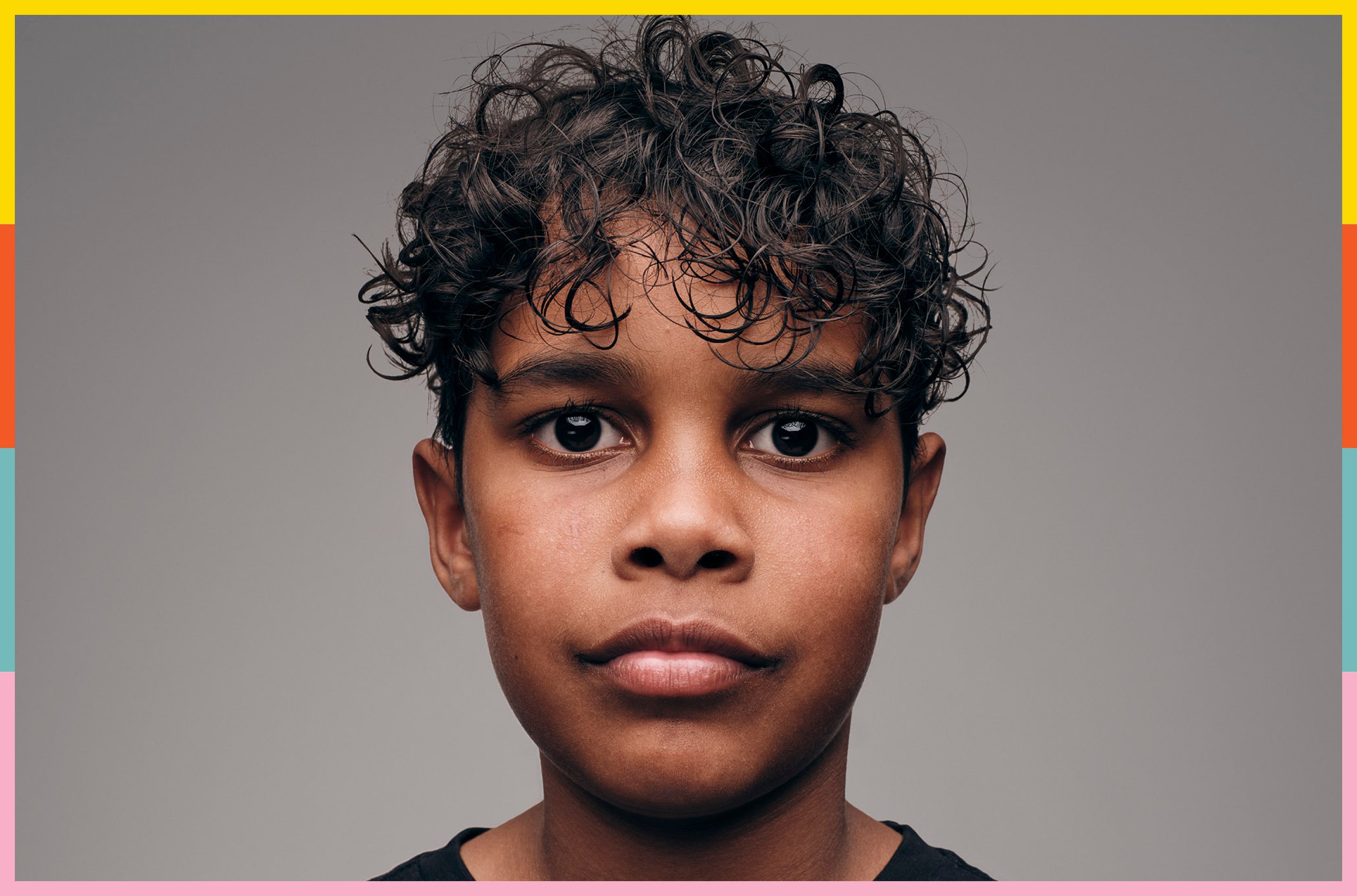
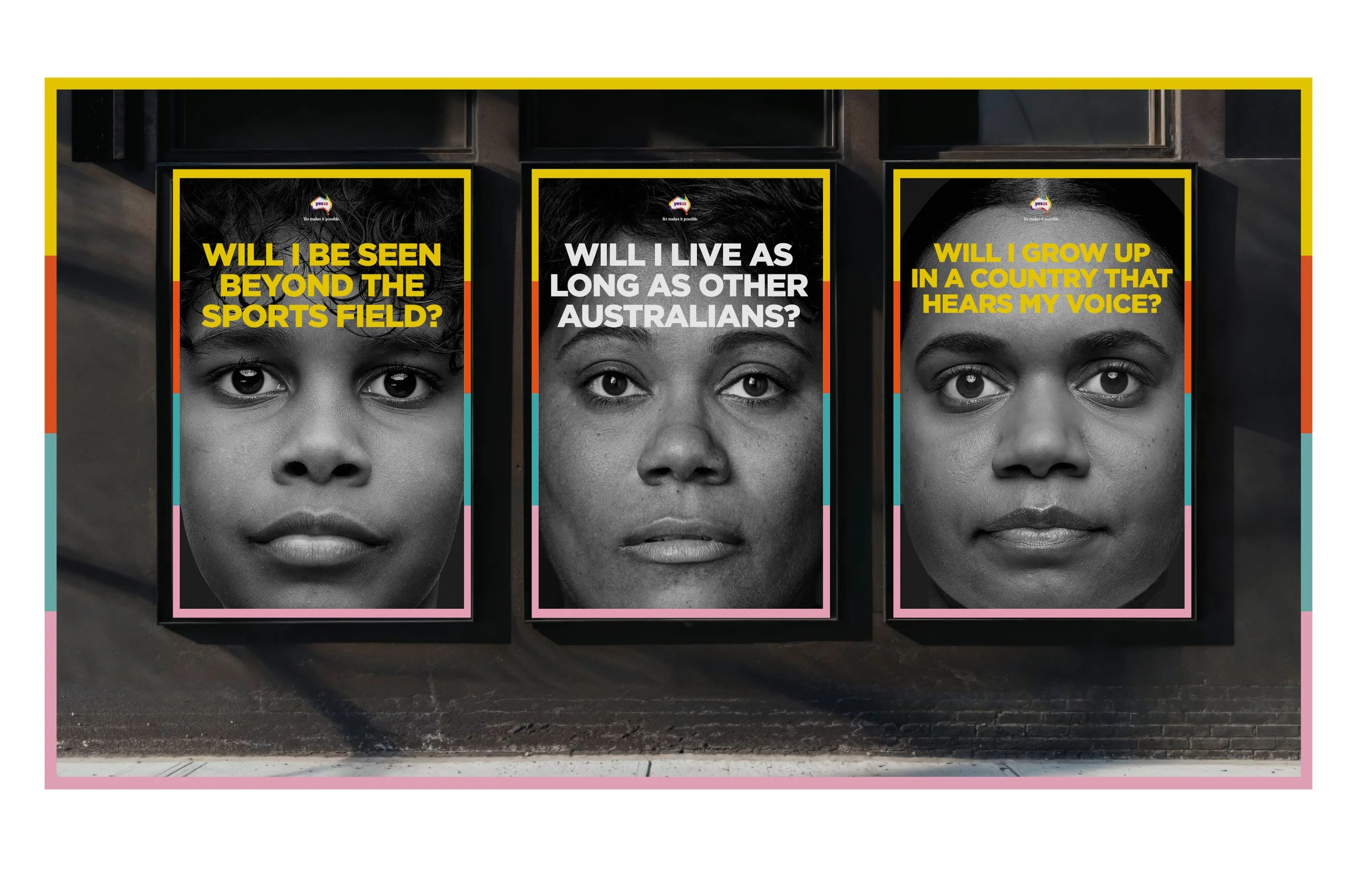
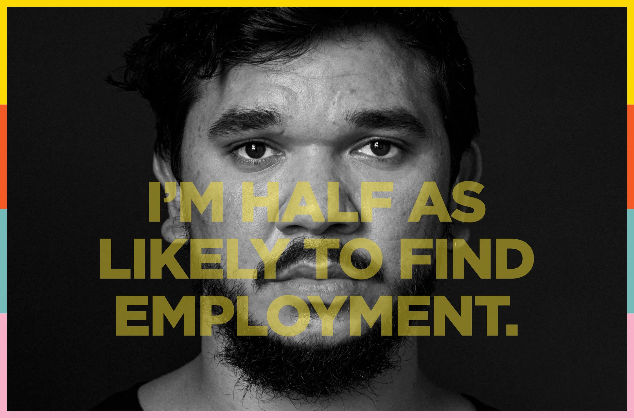
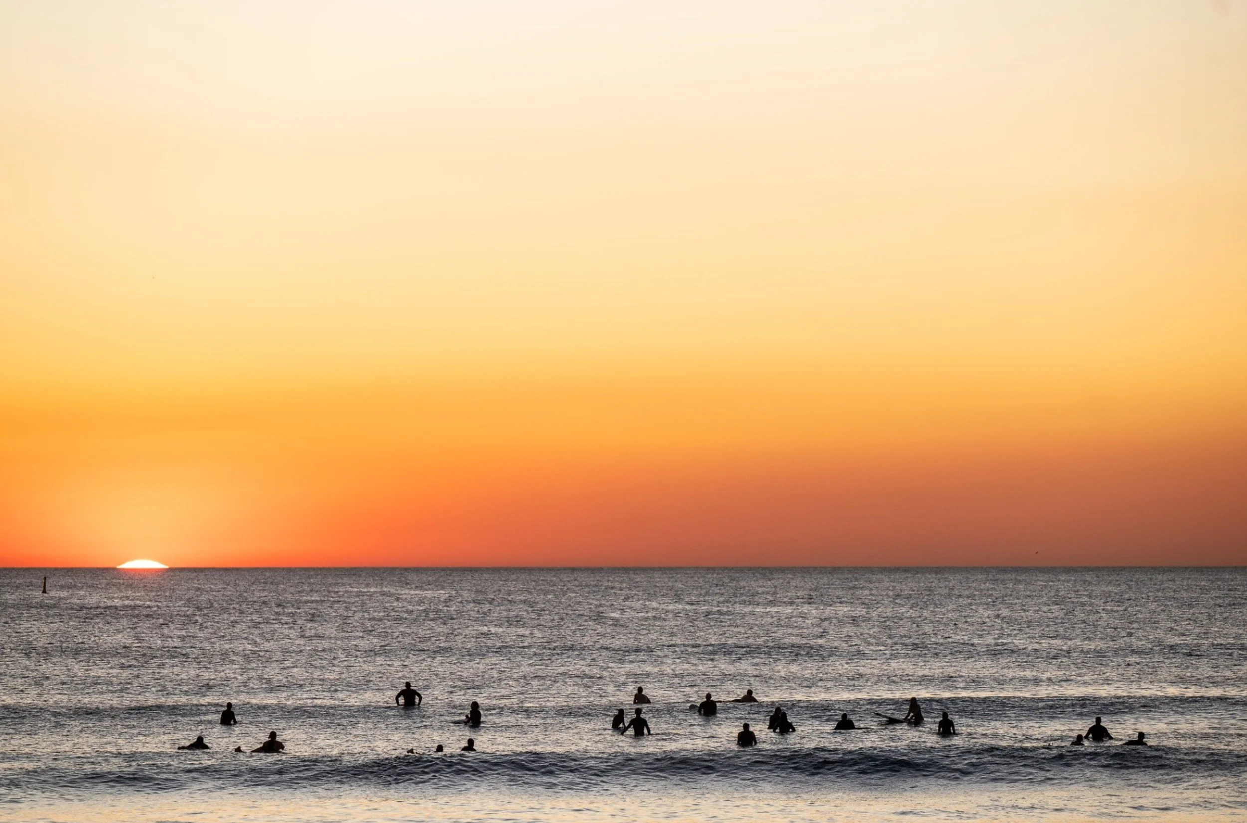
YES23 CampaignI was engaged by Clemenger BBDO as the design lead for the YES23 campaign. I created a simple but robust design system that was quick to update, adapt and publish across an ever shifting and emotionally driven political campaign. We shot beautiful portraits with TOVO in Melbourne and Adam Ferguson / Photoplay in Sydney, eventually outputting over 1000 assets across digital, social, print and OOH platforms.
Our ambition was to give ALL of its people a voice…but Australia still said NO…
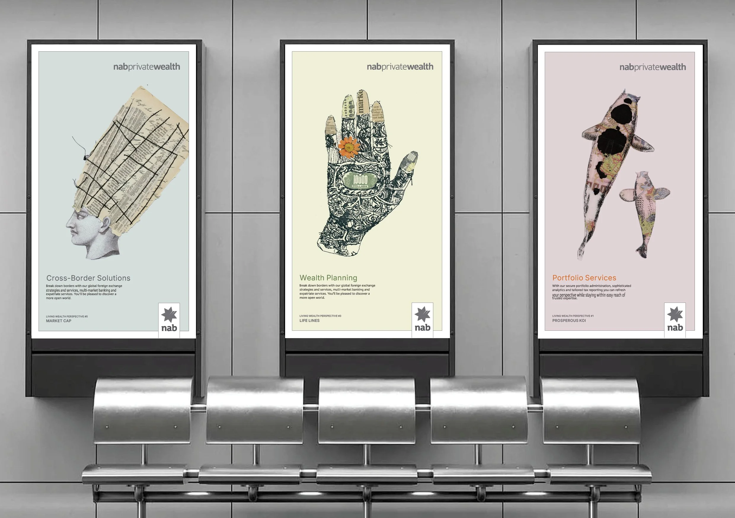
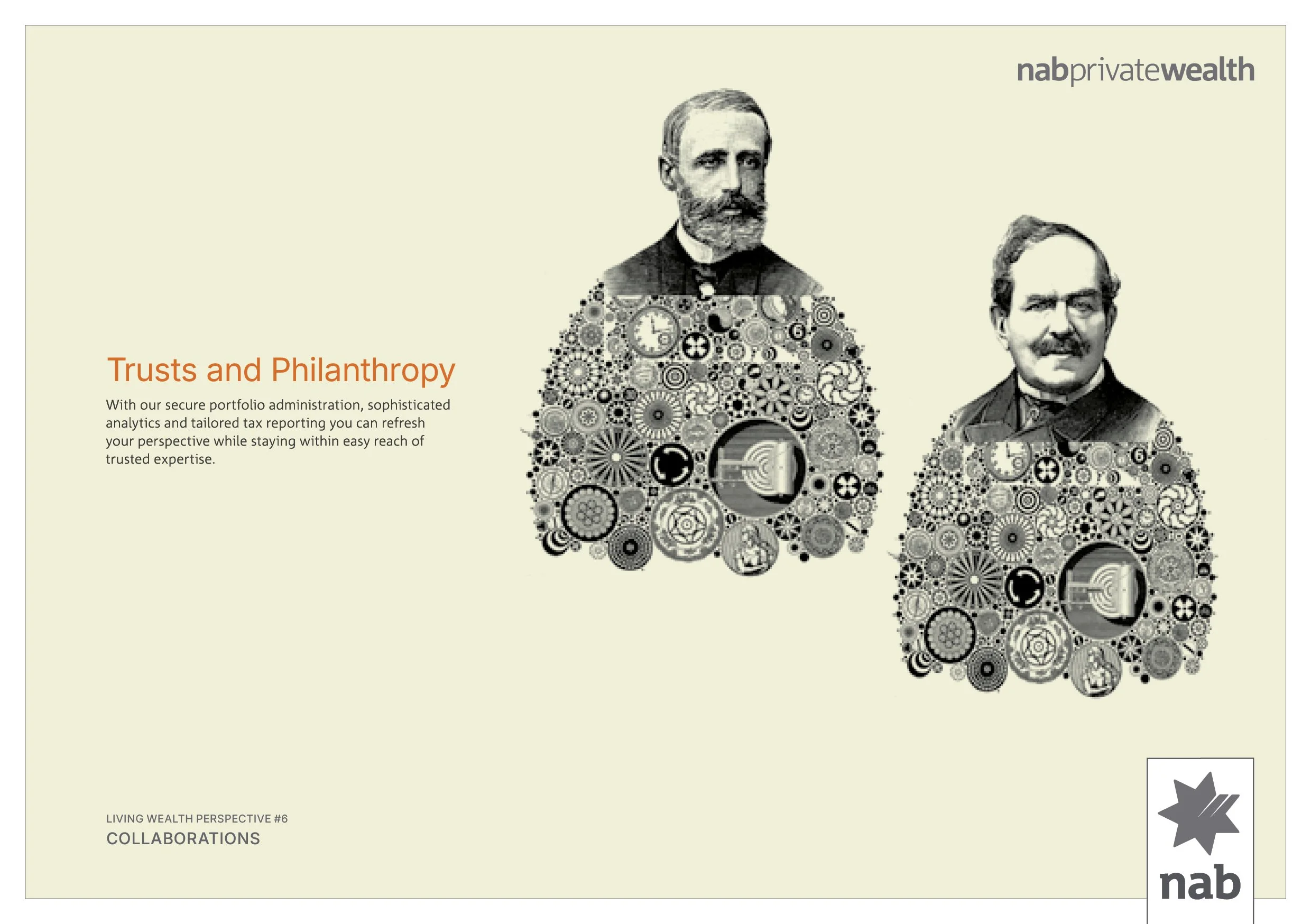
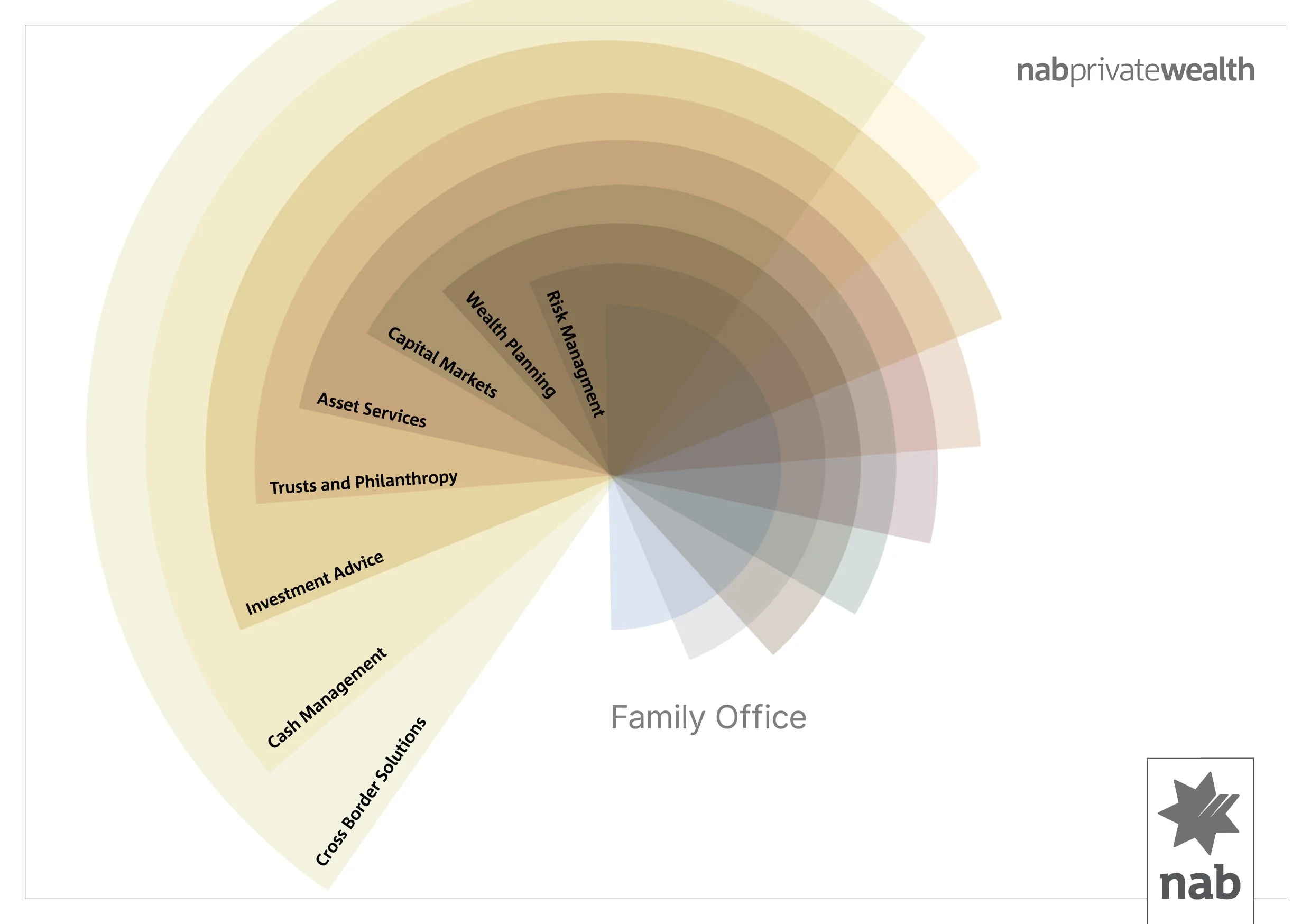
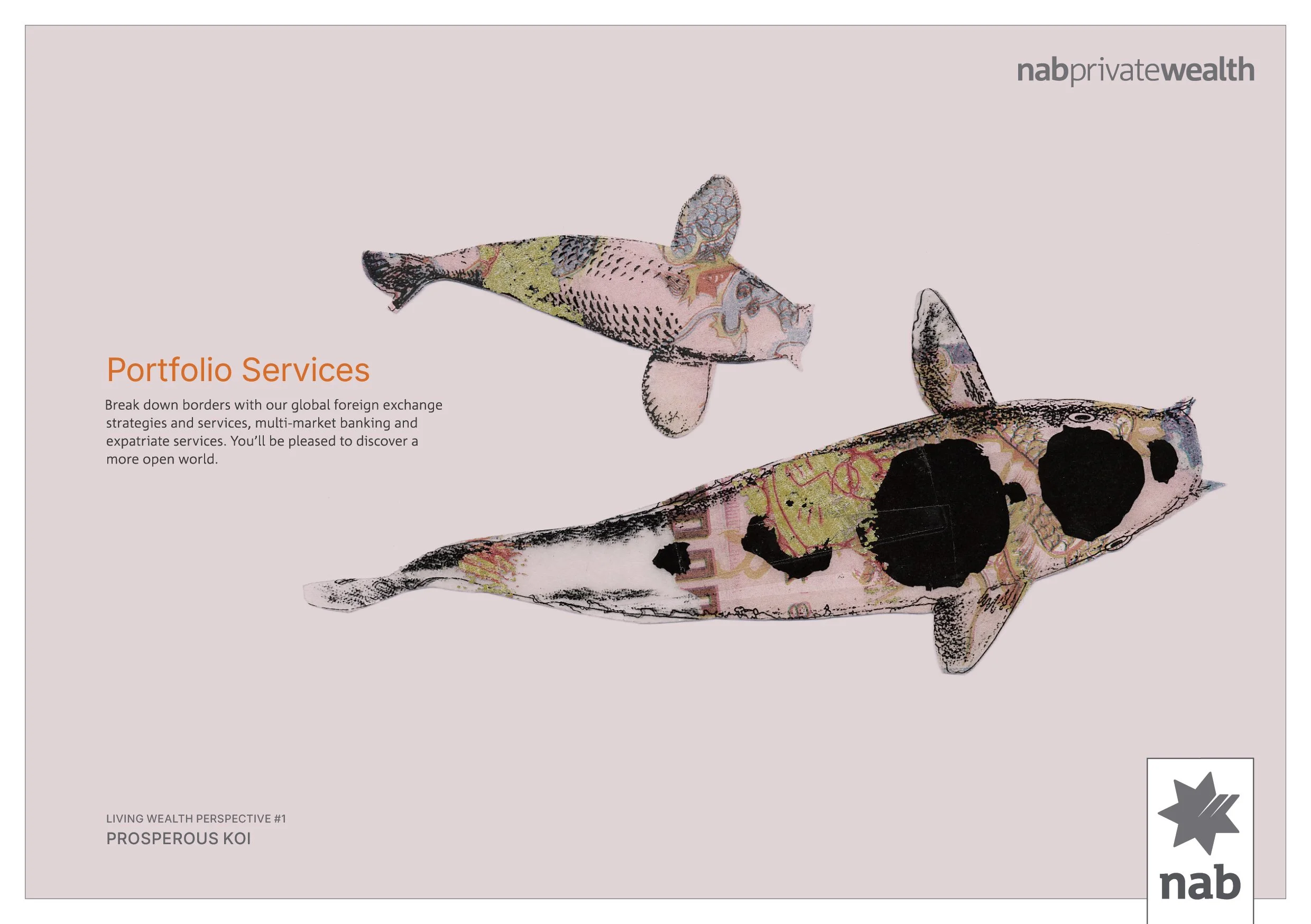
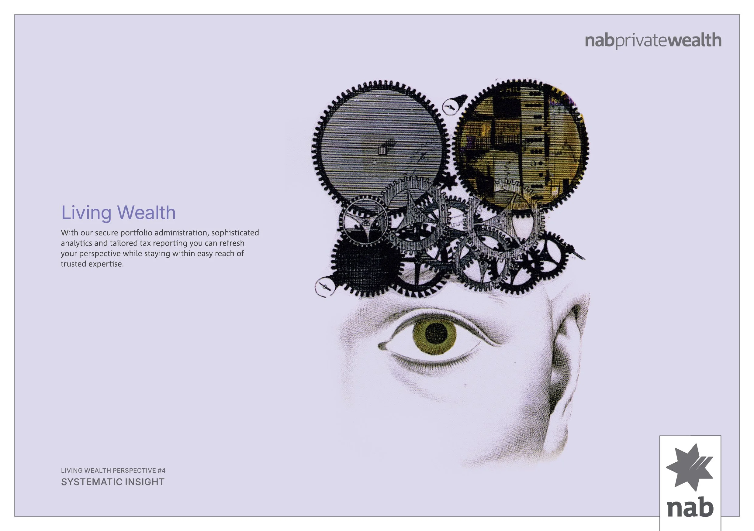
nab private wealthHaving completed the rebrand and repositioning of Goldman Sachs JB Were for the Australian market while at Landor Sydney, I took the plunge and became the co-founder and Creative Director of design and brand studio Nice Idea. We hit the ground running with three foundation clients, one of which was National Australia Bank (nab), and worked across numerous projects for nab Homeside, nab Broker, and nab Invest.
The biggest and most challenging brief though, came in the form of the brand creation for nab Private Wealth - the banks Private Banking division for its high net worth individuals and families. This isn’t high street banking, this is stealth wealth - quiet luxury with one on one wealth management conducted out of premium lounges and suites.
Given the bank had recently launched a whole of business rebrand, we were required to use the corporate font in any proposed identity, and the inclusion of the nab star was a non-negotiable. We could however move away from the existing colour palette of black, red and white, and explore a fresh visual language.
We stripped everything away and built a minimalist design system around a simple wordmark, a muted colour palette, and engaged artist Sibylle Schwarz to create a range of bespoke illustrations that were used across multiple capabilities and platforms. For printed collateral we used the finest papers, printed with multiple special inks, and the nab star was amplified with a metallic silver foil.
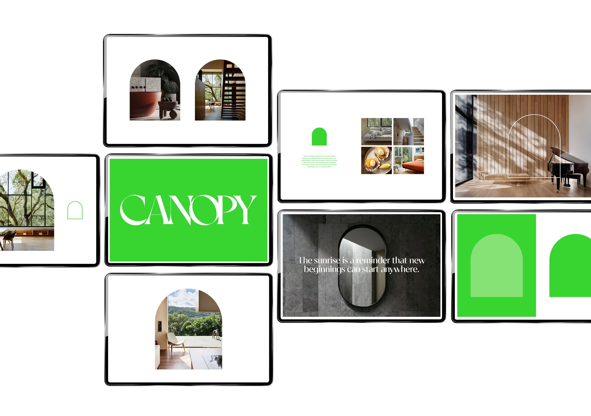
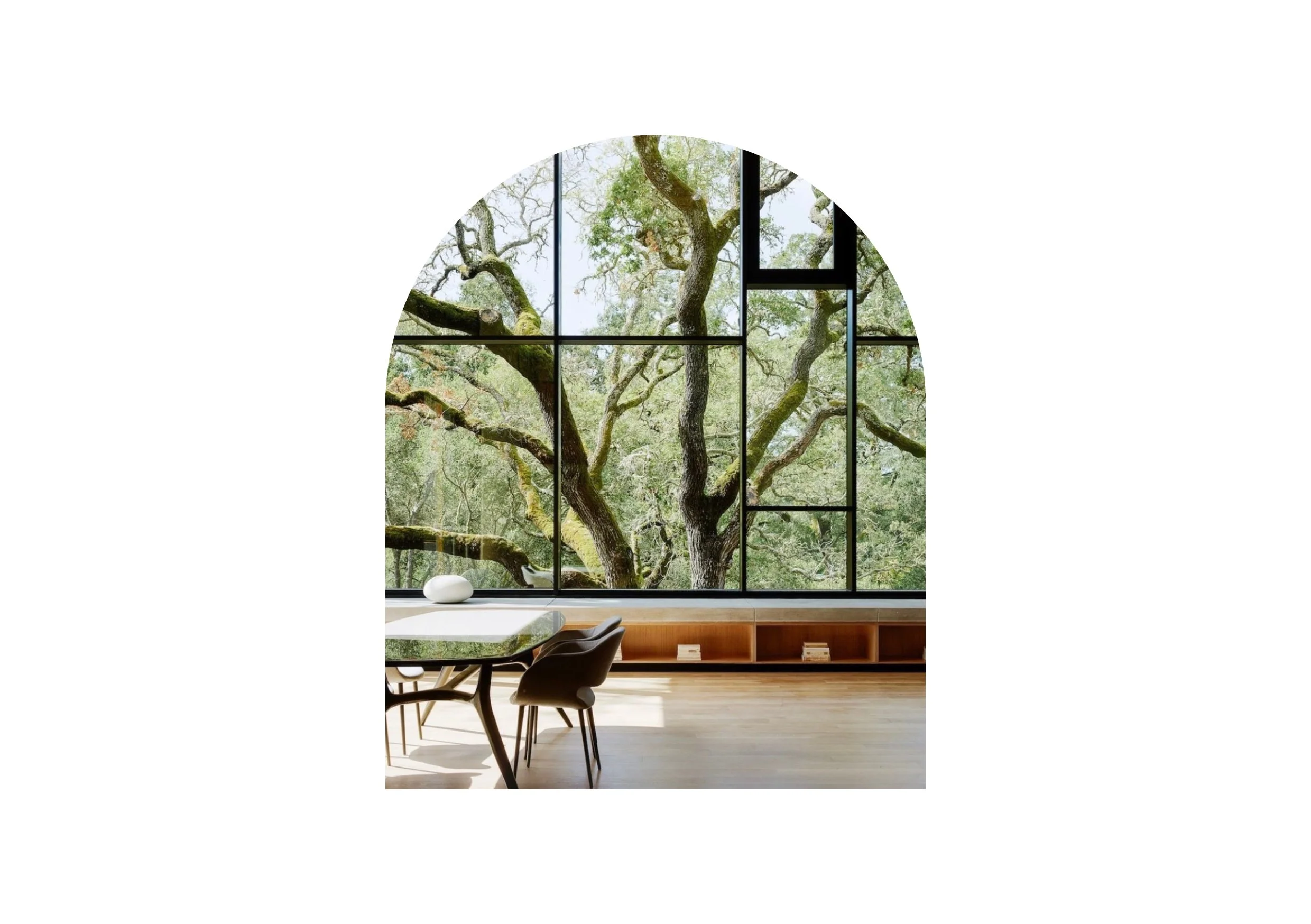
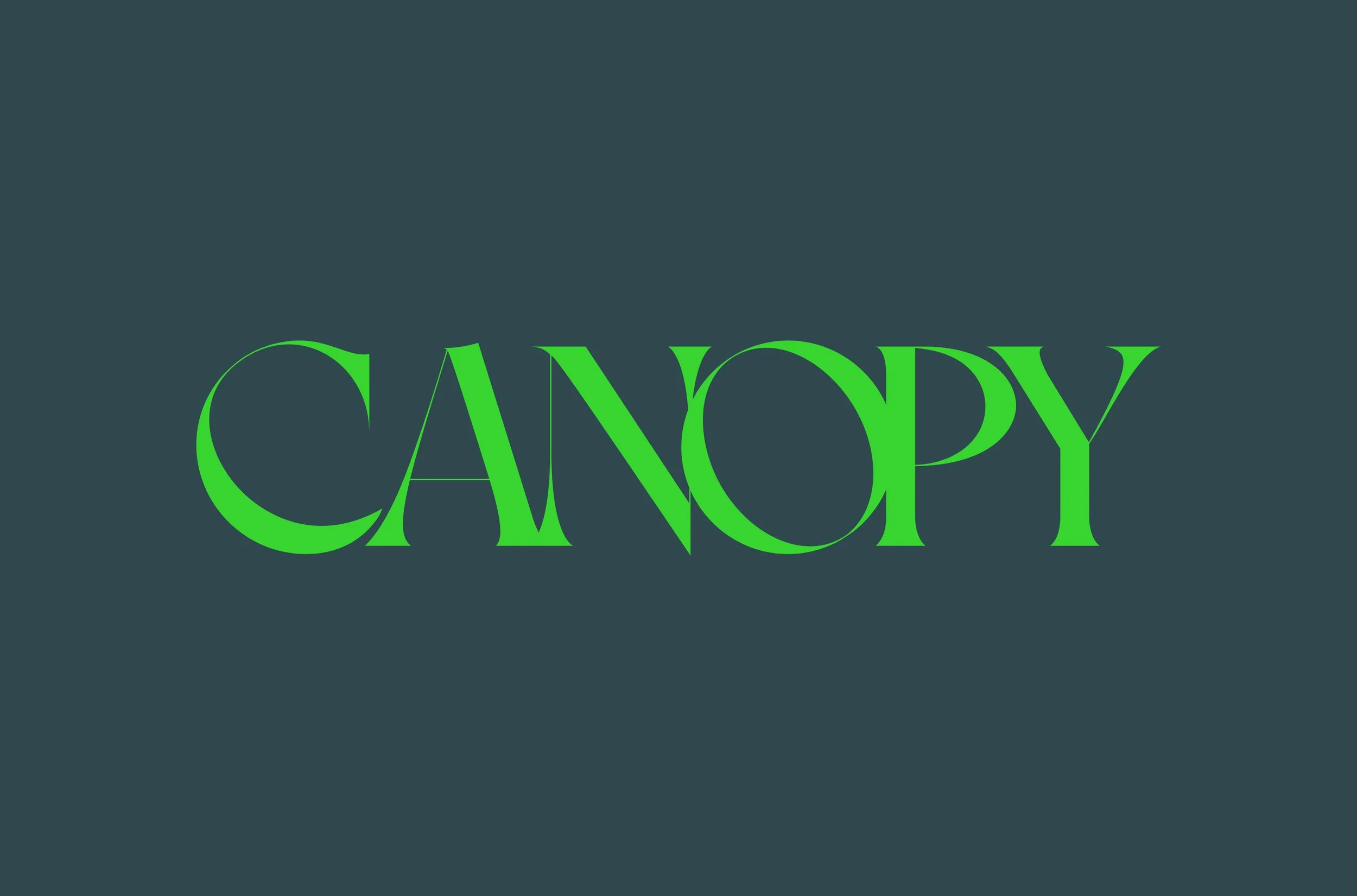
CanopyI created the name, and developed the identity and design system for a group of 4 residences that sit nestled into the landscape, high above the dense tree canopy below - a vantage point that delivers uninterrupted views both horizontally... and vertically.
The wordmark references the symmetrical overlapping of the flora on the surrounding rainforest floor, and the curve of the tree canopy as it disappears into the distance, is reflected in a simple graphic device.


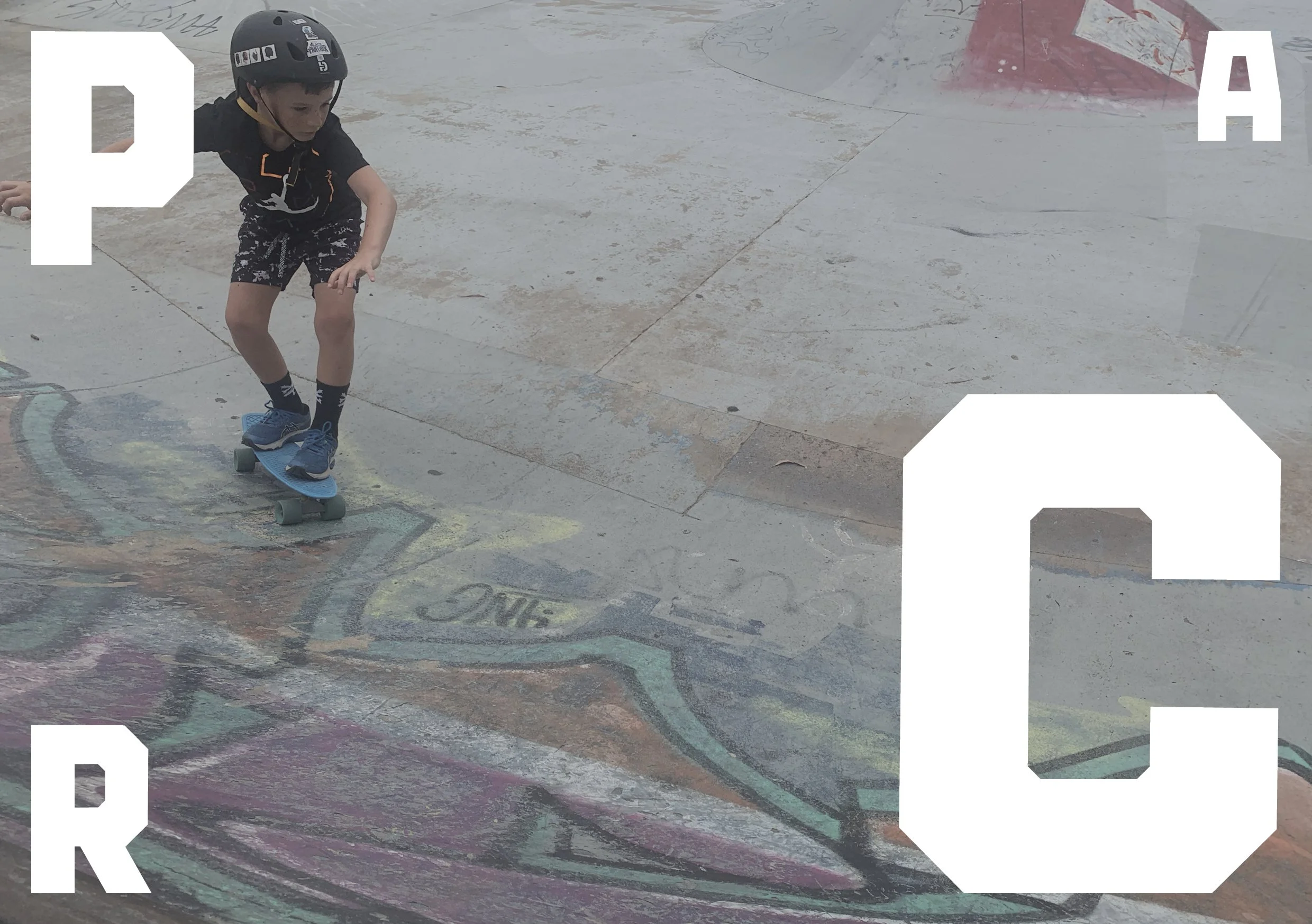
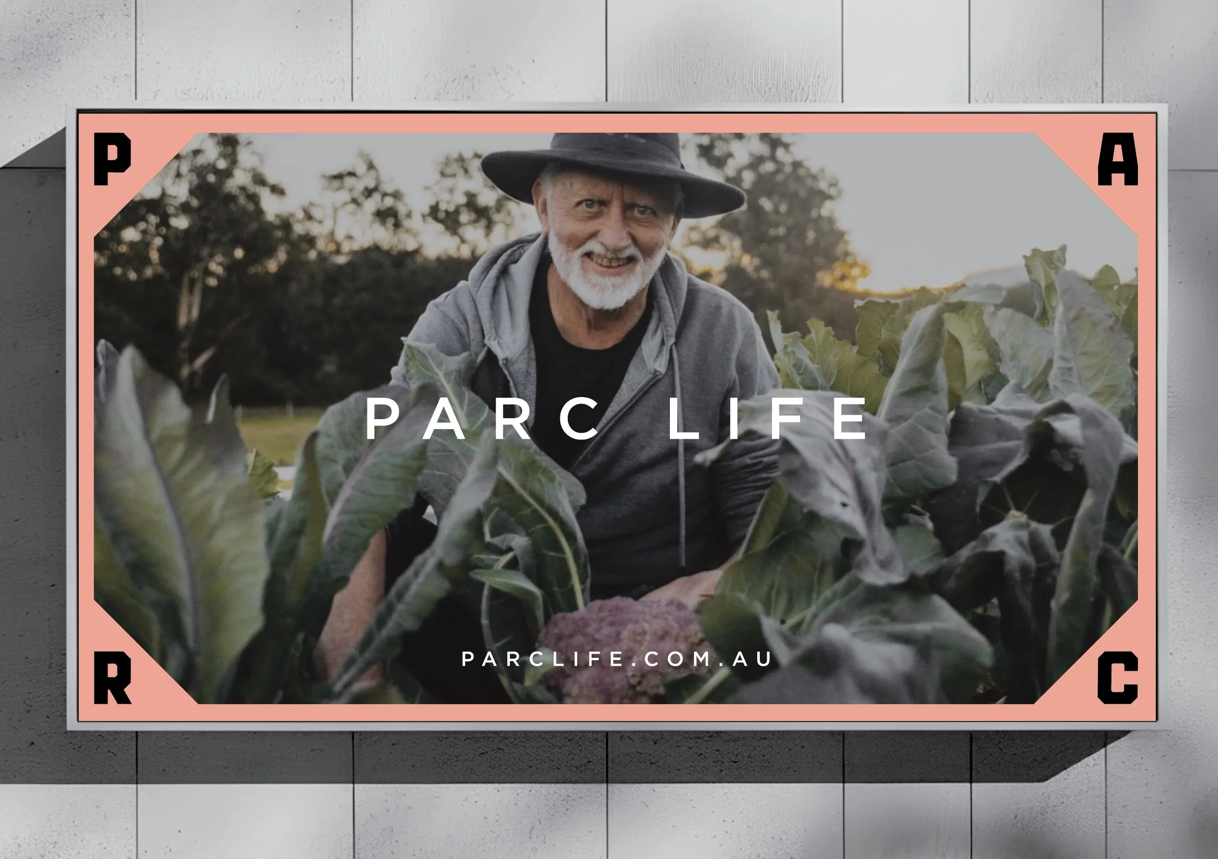
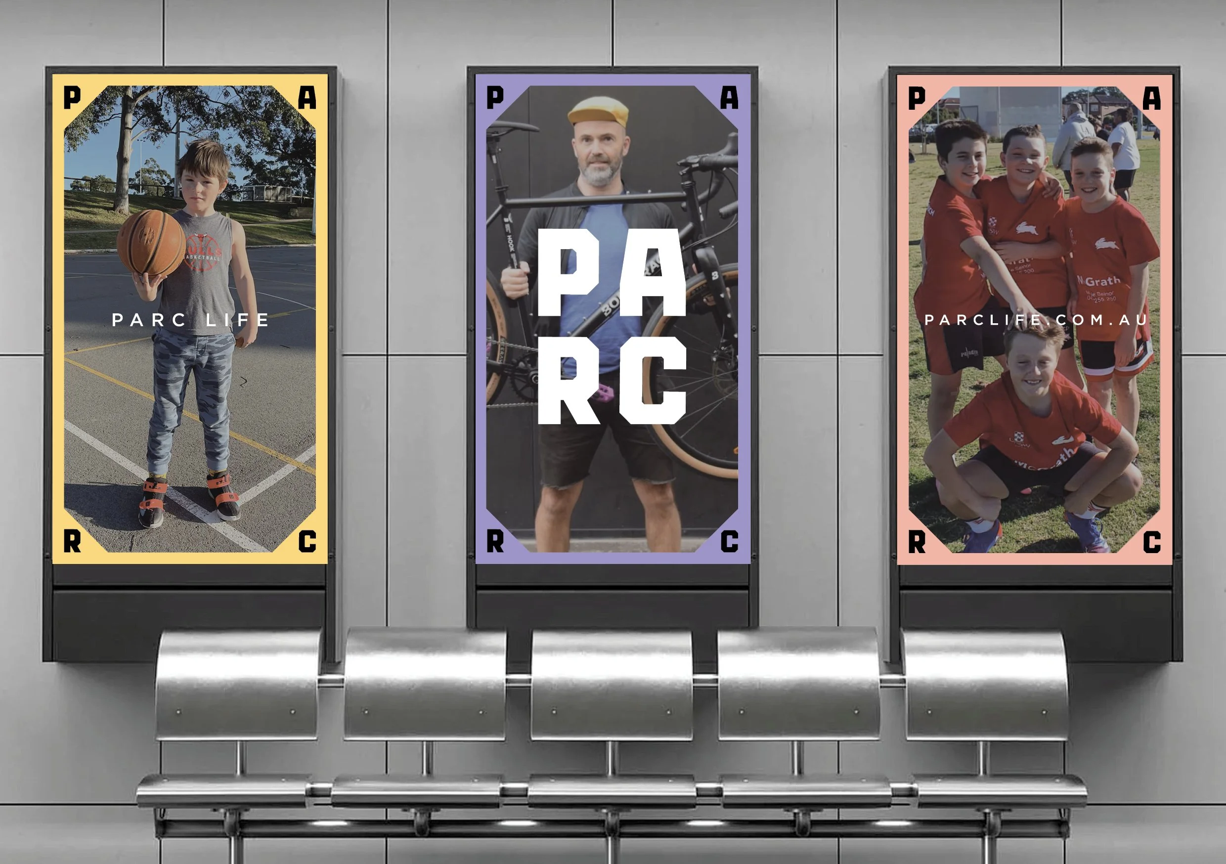
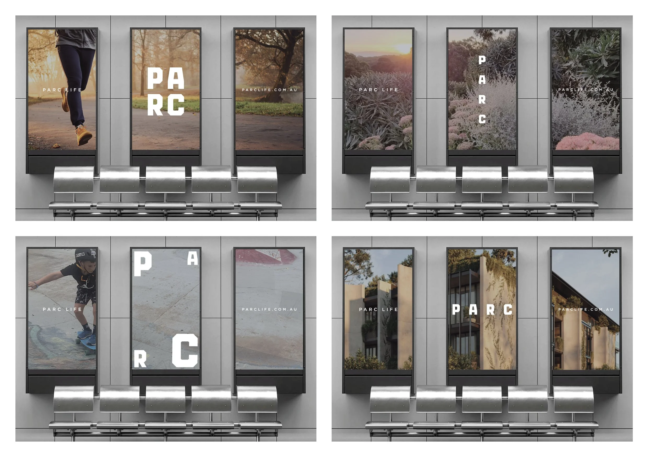
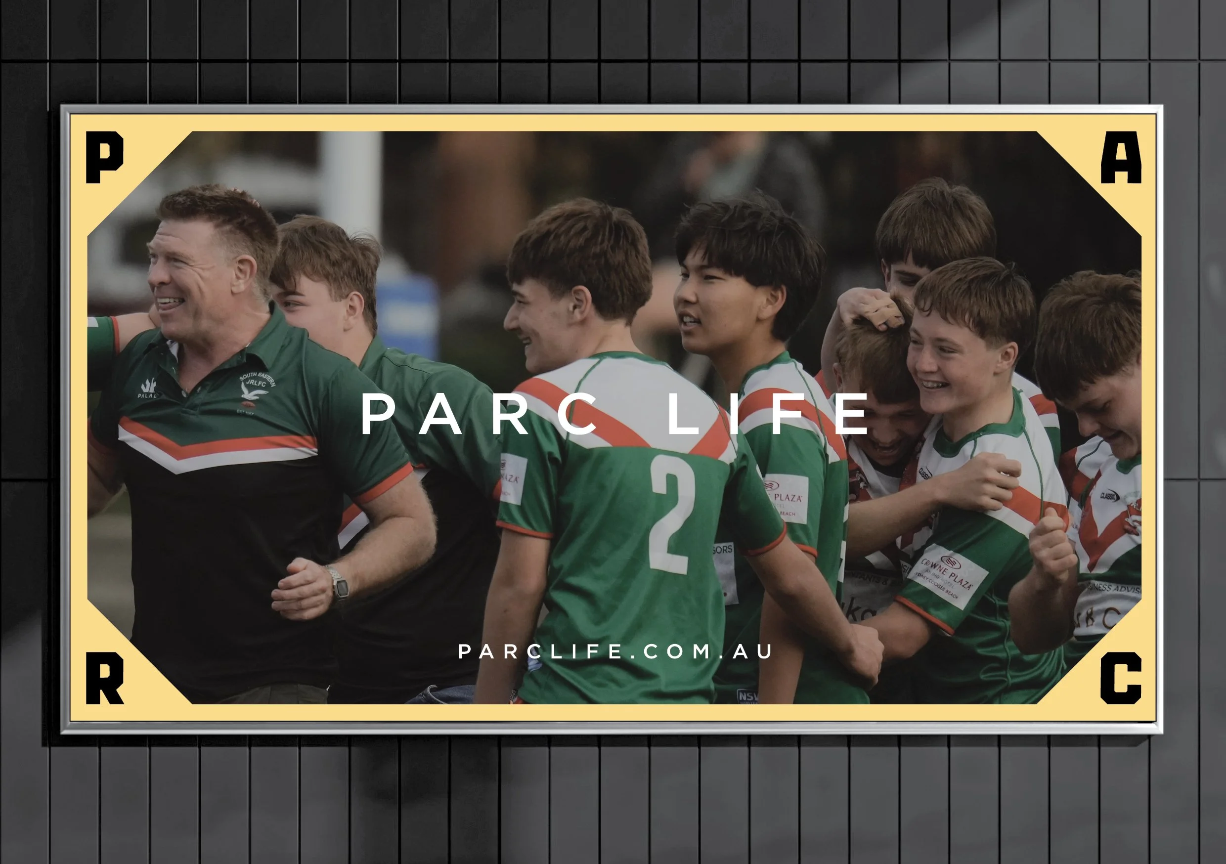
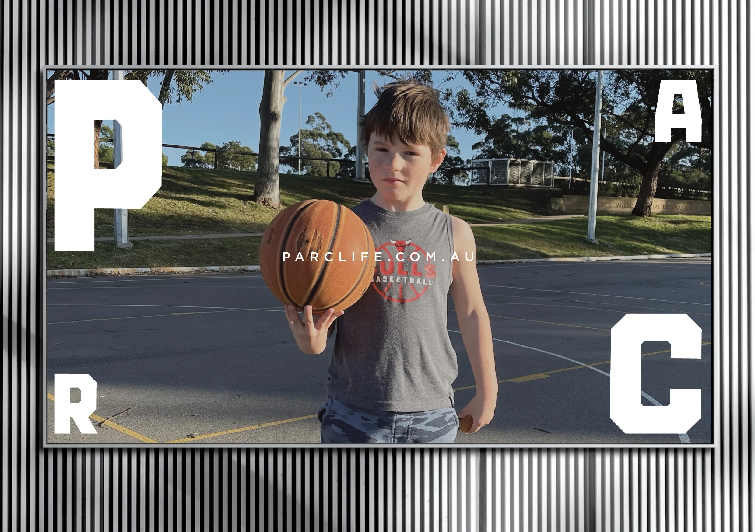
PARCI’ve just created the brand and design system, and the launch campaign for PARC - a new residential and retail development at La Perouse in Sydneys South East. Originally known as Gooriwal to the Muruora-dial people, and a place of profound significance with deep Aboriginal culture, La Perouse was named after French explorer Jean-François de Galaup, comte de Lapérouse, who arrived in 1788 just days after the First Fleet.It served as a key 19th-century military outpost, with the area (finally) returning to traditional ownership in 1984.
PARC - already a familiar place, and a nod to its French heritage, nearby school and residents, will consist of affordable housing, low rise appartments, and townhouses, and is built around an already existing multi-use gathering place. It is a site of significant social interaction with an unofficial team of local groundspeople tending to its walking tracks, playground, gardens and allotments.
With the simple positioning of PARC LIFE, I wanted to focus and showcase the exisiting community in and around PARC - rather than highlight in launch phase, the obvious proximity and benefits of the beaches at Yarra Bay and Frenchmans Bay, the historical sites of Botany Bay and Bare Island, and New South Wales golf club.
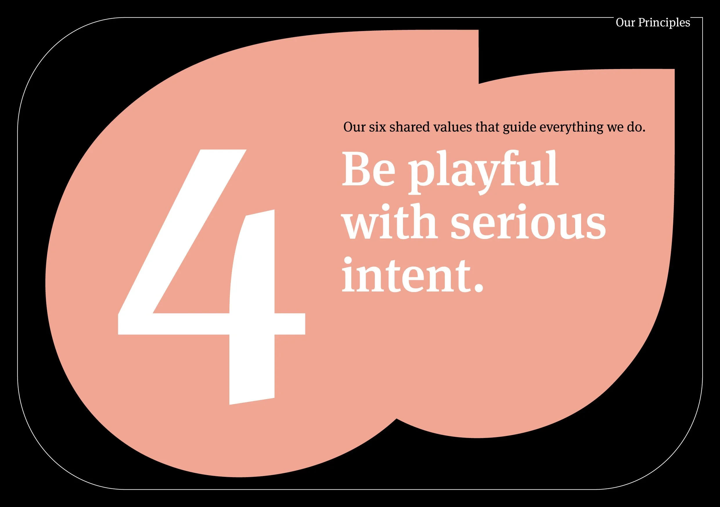
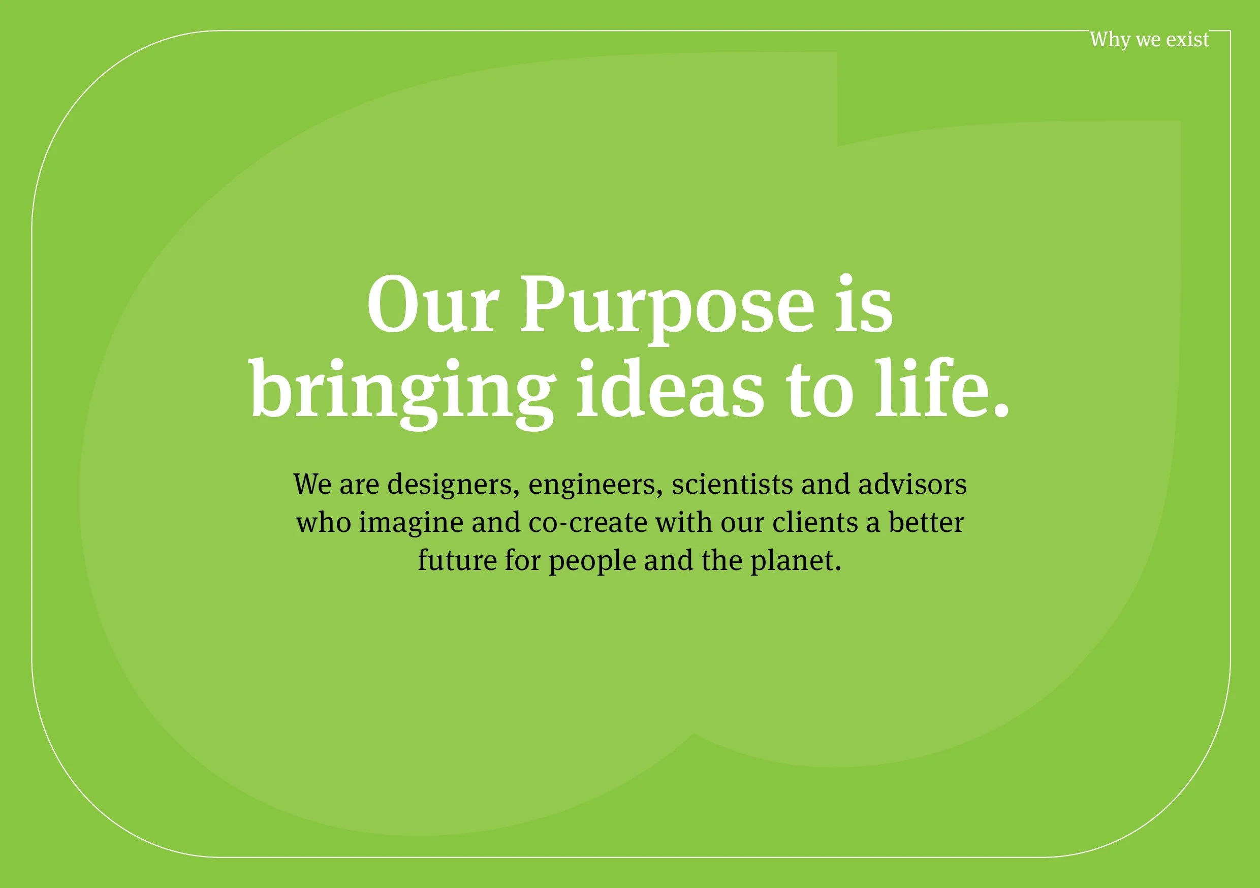
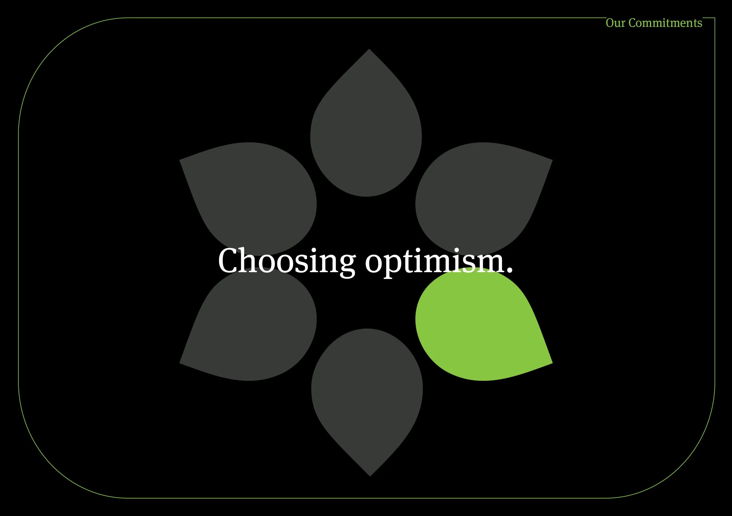
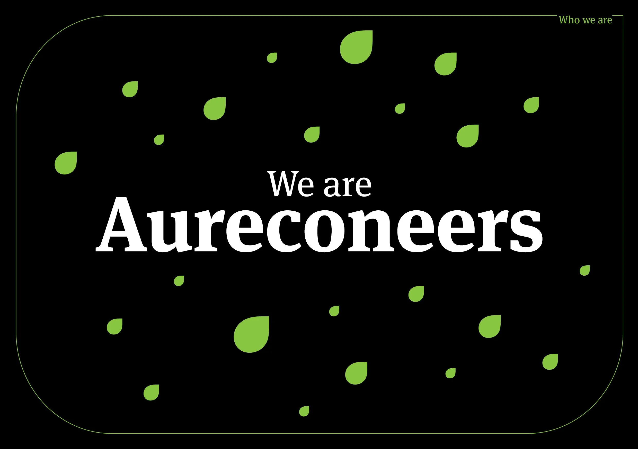
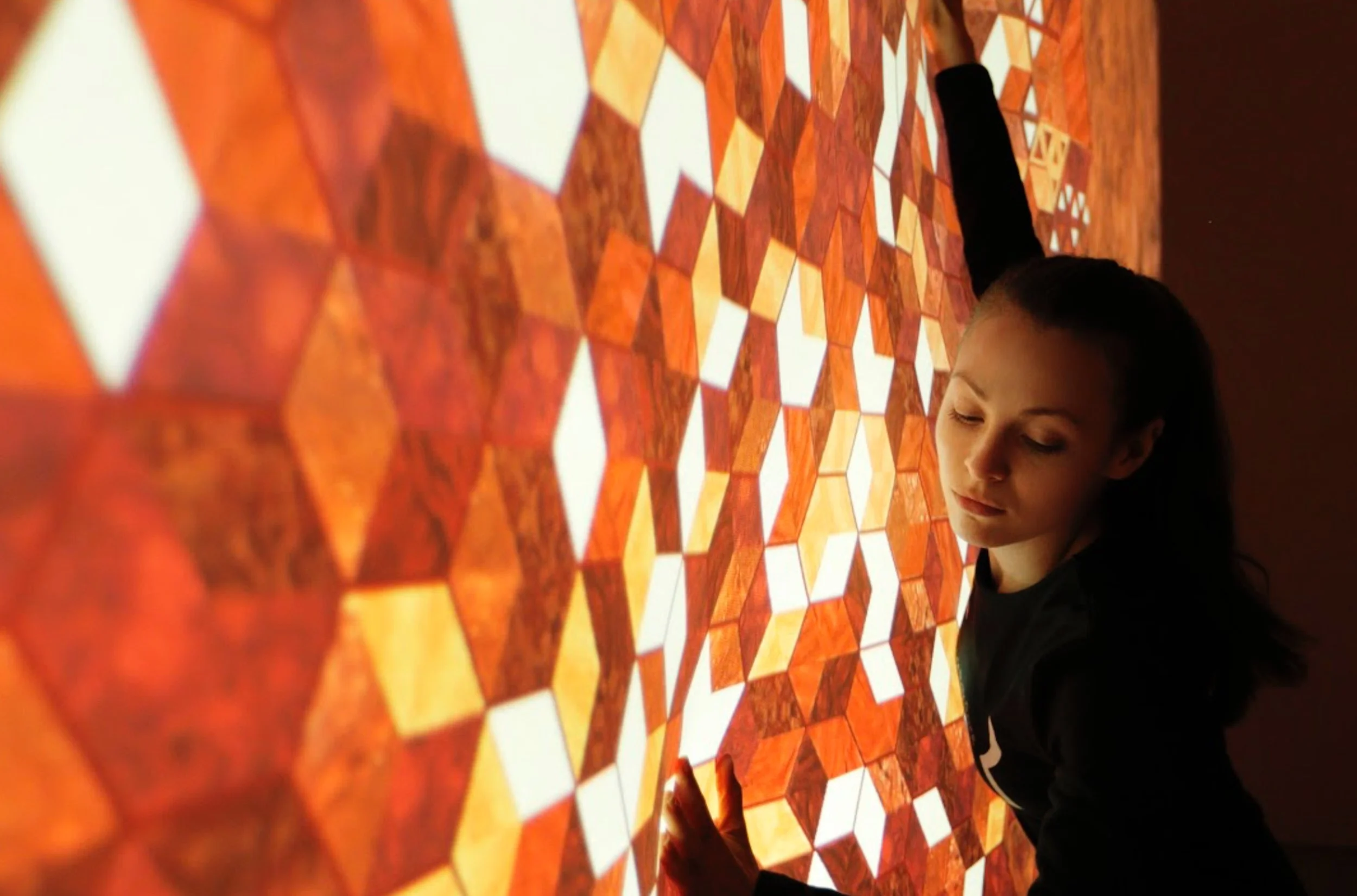
AureconI was recently engaged by Aurecon - an Asia Pacific design, engineering and advisory company - to create the narrative and storyboards, design system and motion design associated with the articulation of The Aurecon Way - their philosophy of leadership, culture, and people.
Collaborating with their (brilliant) in-house design team, we built a series of animations that were used by CEO Louise Adams to deliver Aurecons Purpose, Attributes, Principles, Commitments and Ethos to its 8000 designers, engineers, scientists, and advisors through 30 offices across Apac.
FYI... Aurecon is one of those amazing clients that are a dream to collaborate with - super smart, super lovely people - and a business working across mind-boggling, world-first infrastructure projects, while putting its people, clients, and (real) design thinking at the heart of everything it does.
Because the animation is for internal use, and contains some sensitive information, these are a selection of static slides...just wiggle your screen around and you’ll get the idea...!

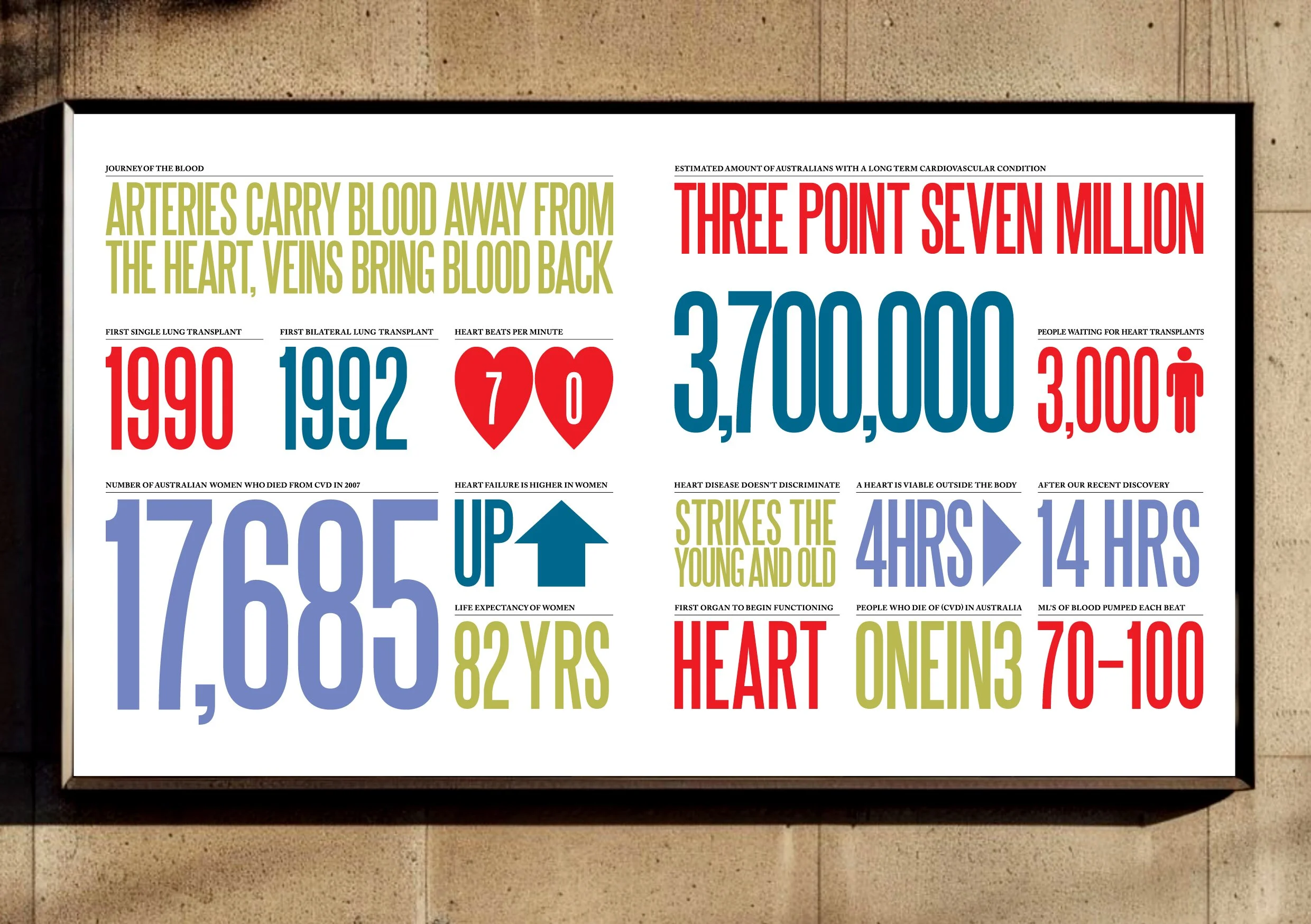
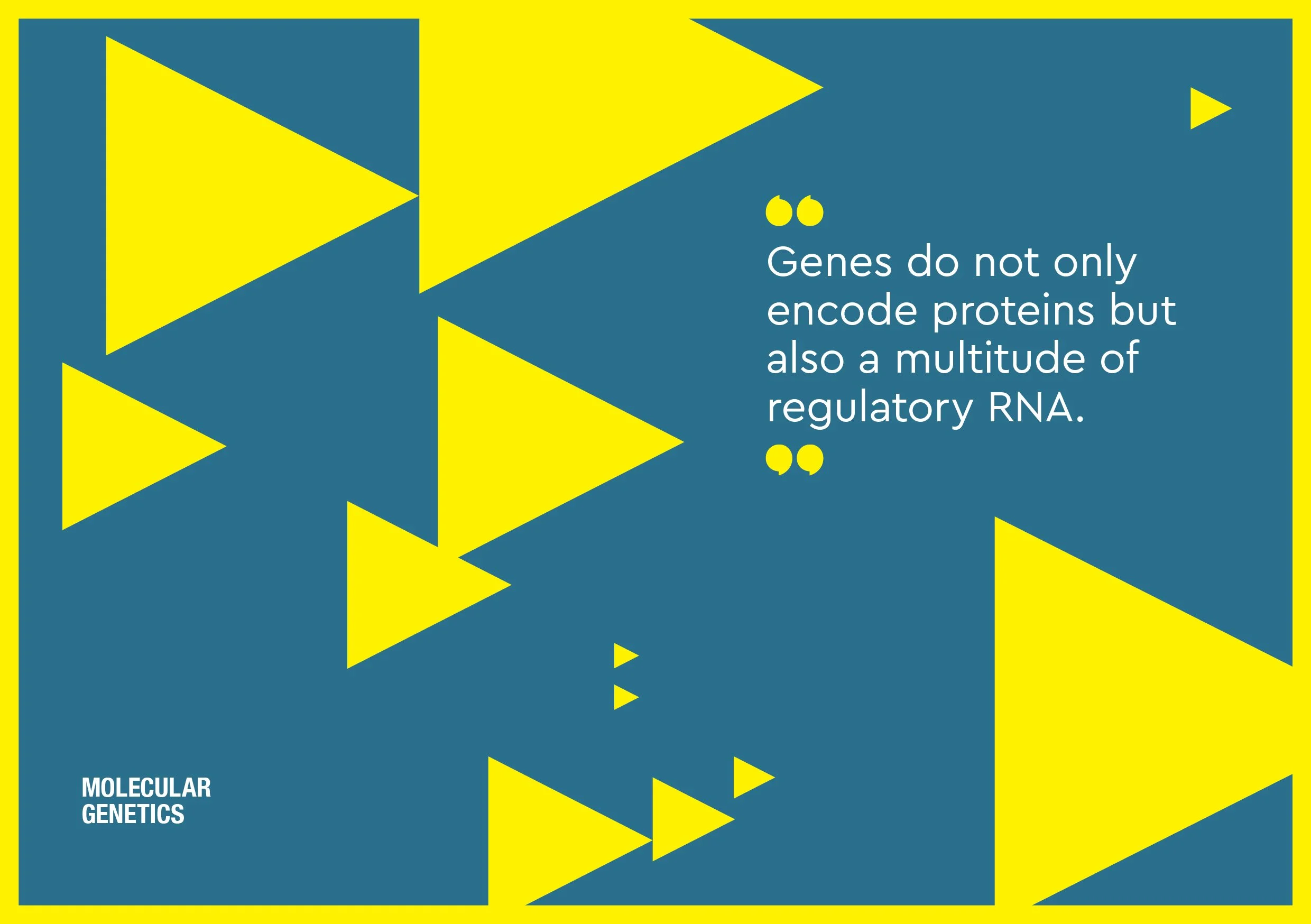
Victor ChangVictor Chang came to Australia in to complete his schooling, and then moved to medical training at Sydney University. He became an intern and later a registrar in cardiothoracic surgery at St. Vincent’s Hospital. A pioneer of the modern era of heart transplantation, Victor Chang established the National Heart Transplant Unit at St. Vincent’s Hospital in 1984.
He became widely known as a man of vision, as a caring surgeon, as a researcher and as an ambassador for Australia and the people of South East Asia. During this time he nurtured a vision to establish an internationally recognised cardiac research centre at St. Vincent’s.
With his tragic murder during a botched extortion attempt in Sydney on July 4, 1991, efforts to realise Victor Chang’s dream accelerated, resulting in generous donations from the Federal Government, the late Kerry Packer, and the Australian public. With these funds St. Vincent’s Hospital established the Victor Chang Cardiac Research Institute, which was launched on February 14, 1994, and on November 1, 1996 the late Diana, Princess of Wales opened the Institute in its then new premises in the Garvan Building.
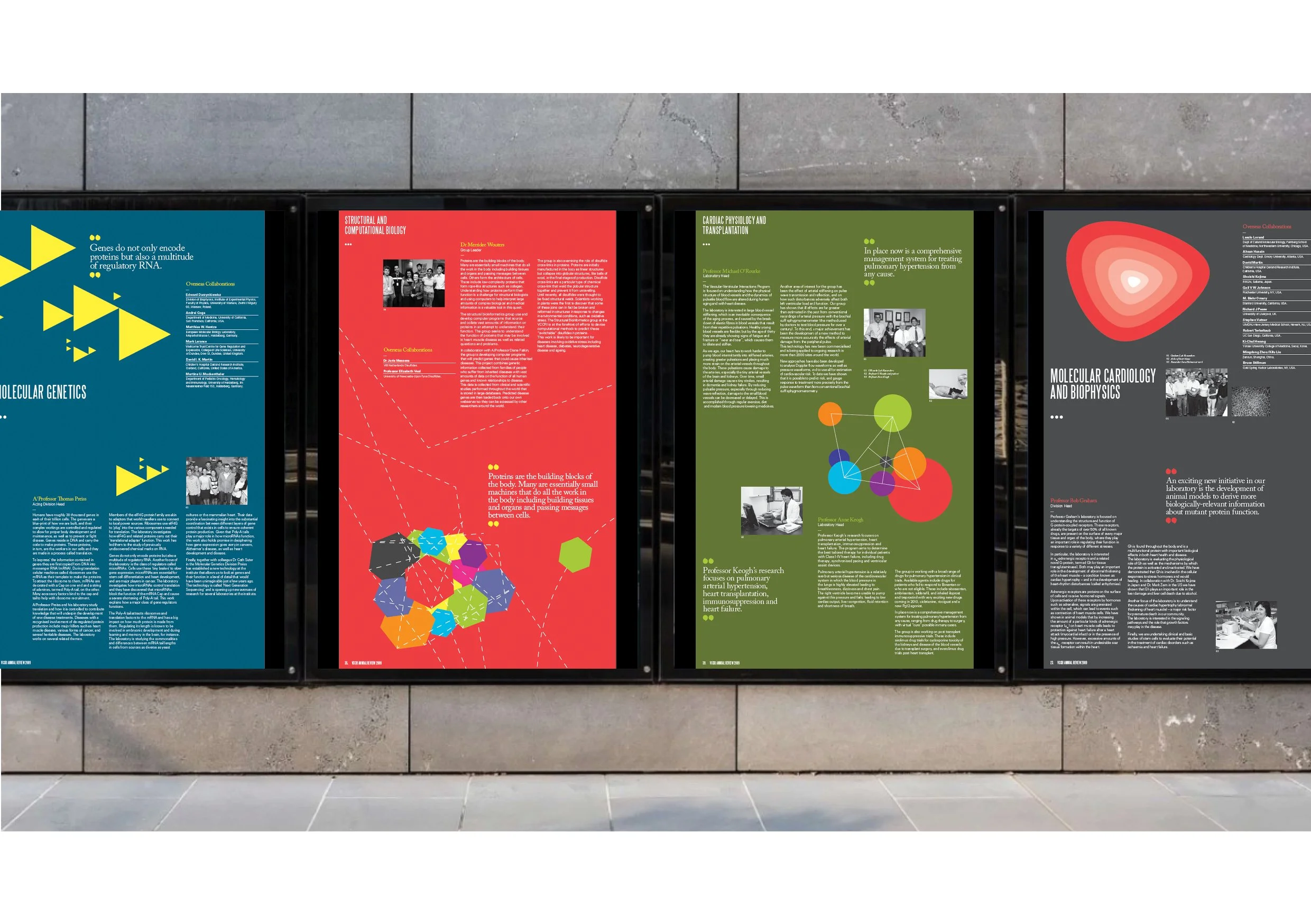
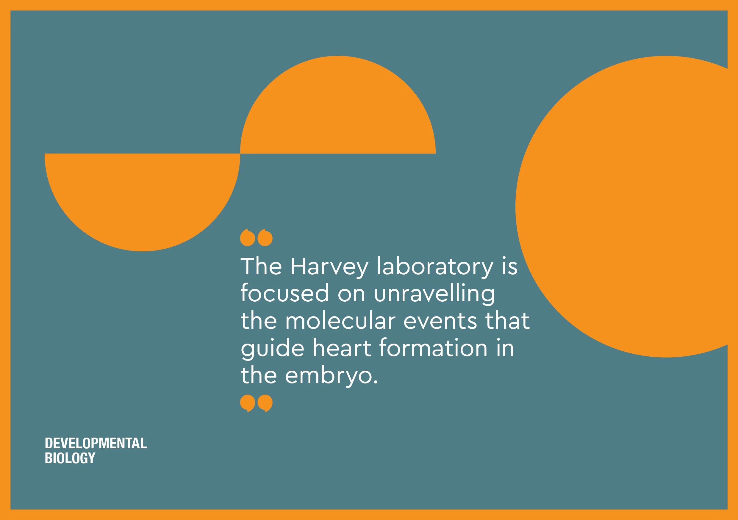
Over the years we donated our time and partnered with our generous suppliers to create the Annual Reports and Reviews, and campaigns for the Institute.
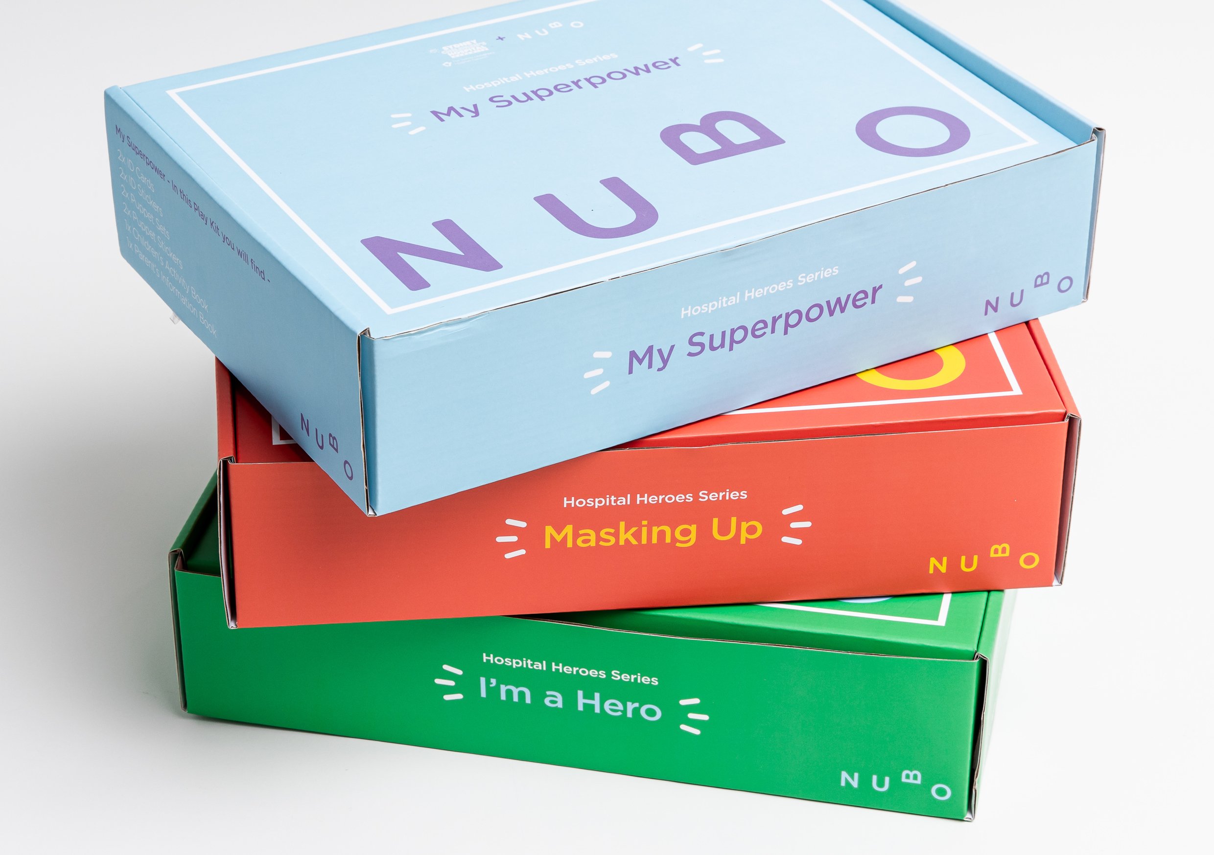
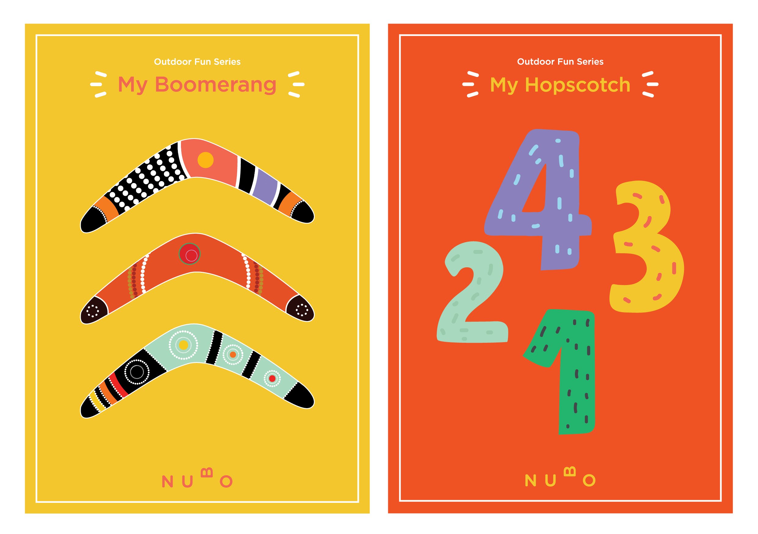
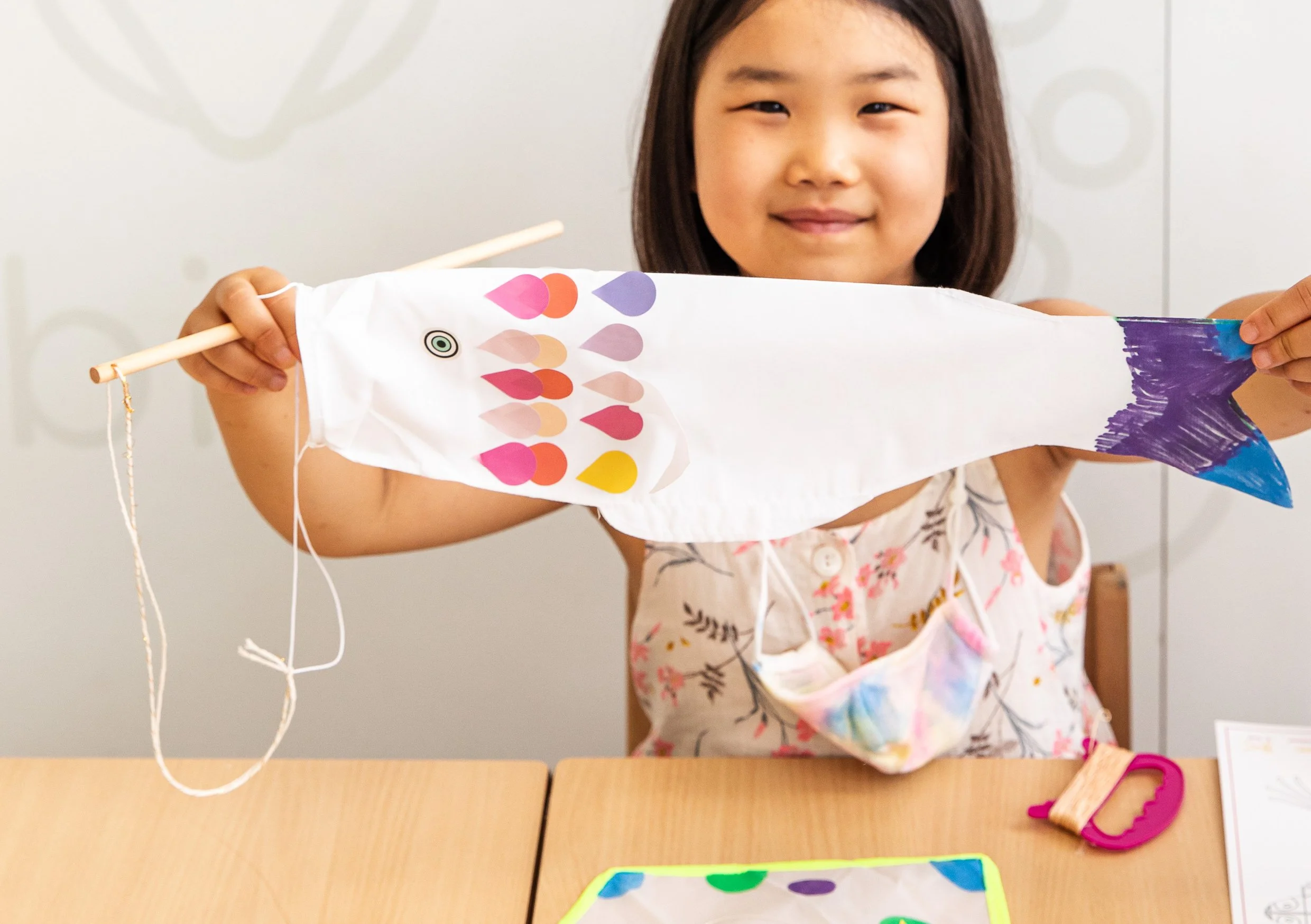
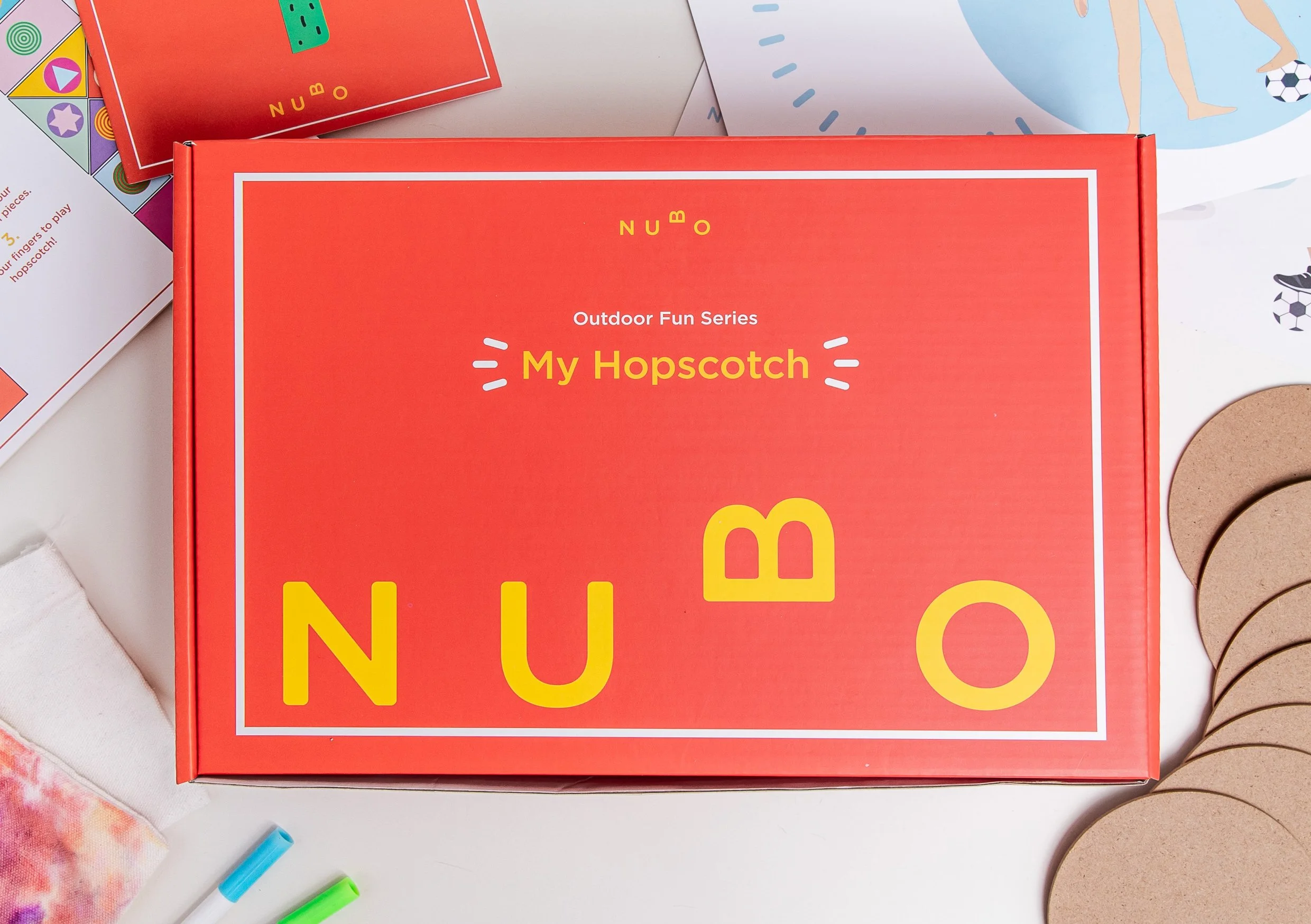
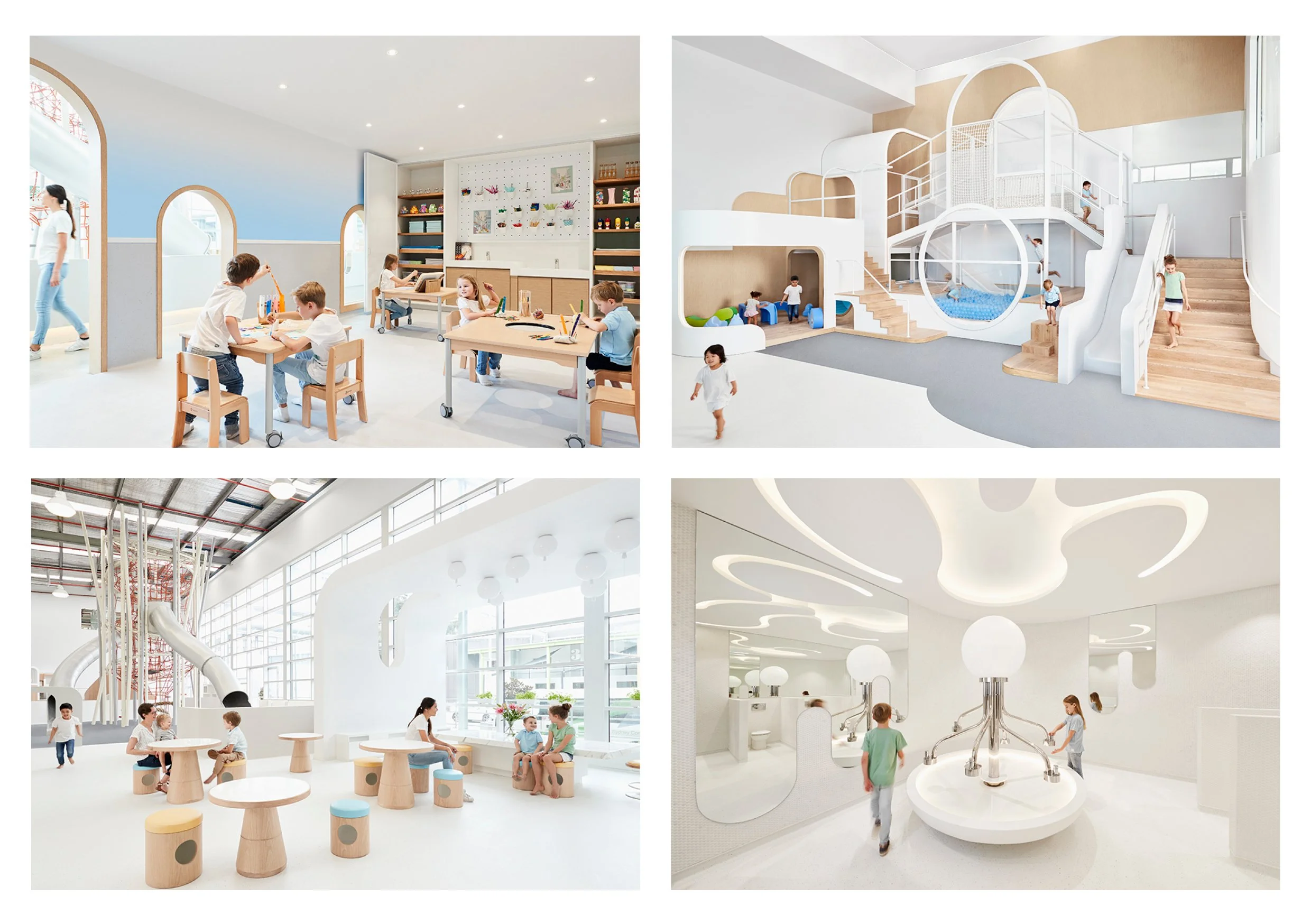
NUBOChildren are the best clients...although workshops and presentations can get a bit messy and chaotic - aprons are supplied...! Working with the founders of Nubo, onsite at their amazing learning and play centre, we created the Nubo Playkits - a set of bespoke activity boxes for children and parents to take away and continue the Nubo experience at home.
The first set - Outdoor Fun Series - were built around outdoor activities - making and flying a kite, decorating and throwing a boomarang, creating your own game of hopscotch - and all boxes contained stickers, worksheets, making materials, information books, and colouring sheets that related to each specific themed box.
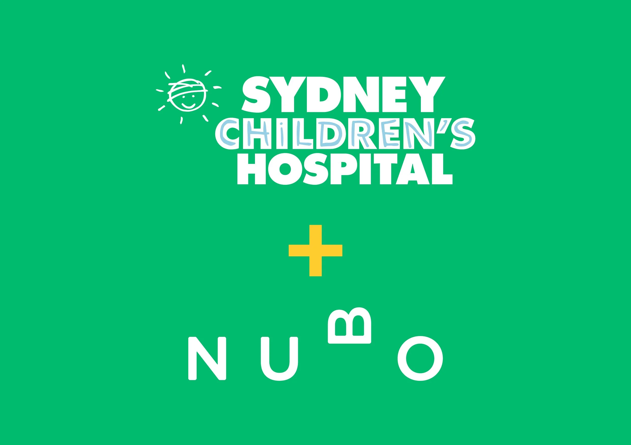
For the second set - Hospital Heroes Series - we partnered with Sydney Childrens Hospital. These boxes were for children (our VIPs - Very Important Patients) and parents to use during their stay, to educate and entertain while undertaking an often daunting and traumatic experience. These kits were designed for use in the hospital playroom, or hospital beds.

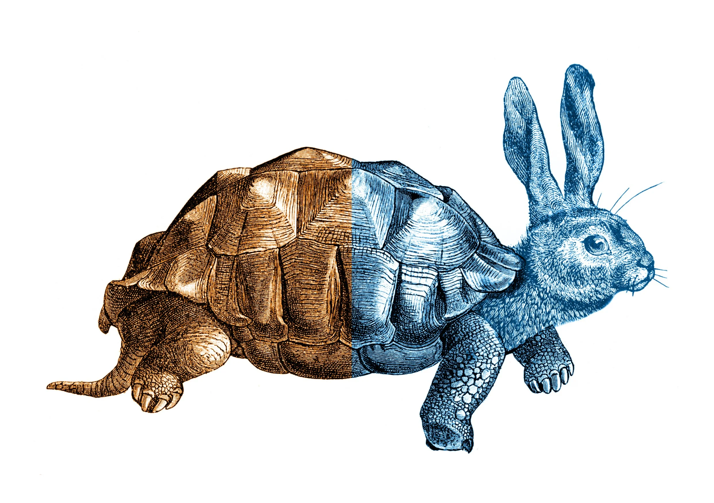
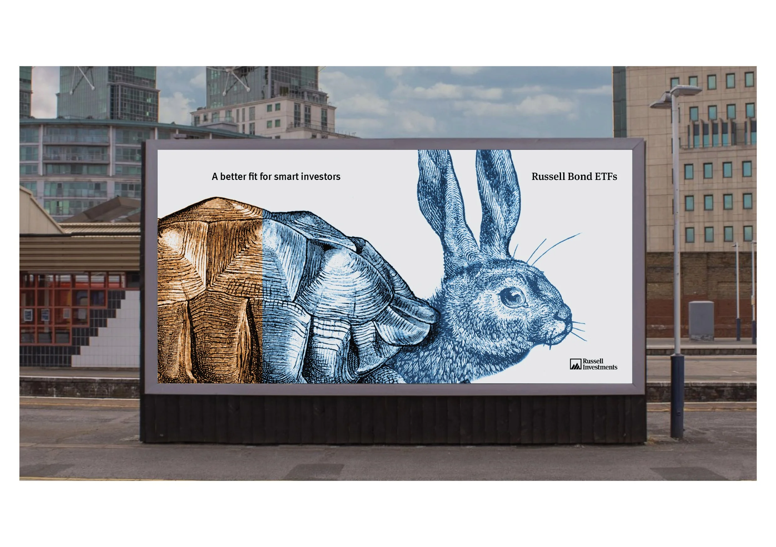
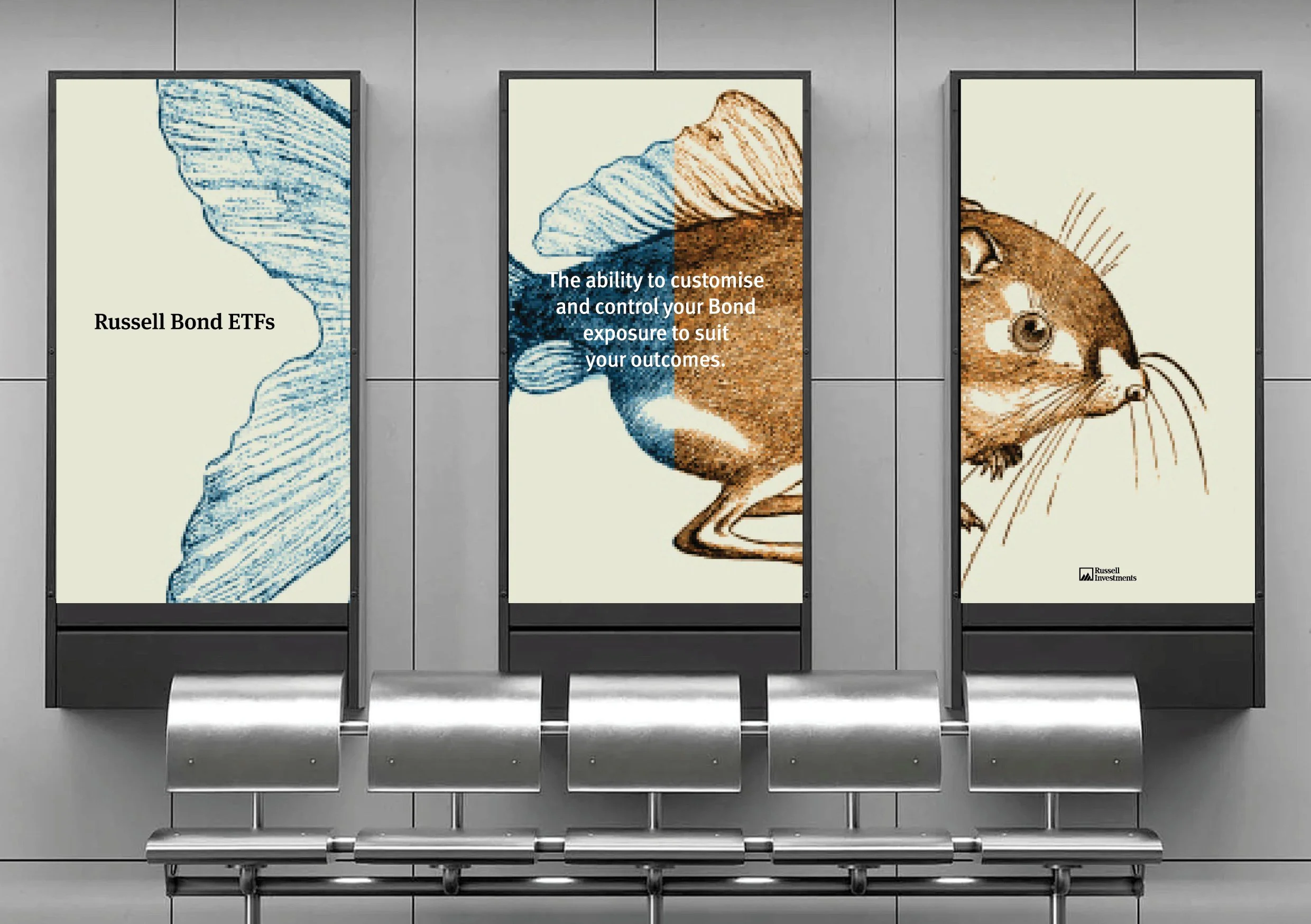
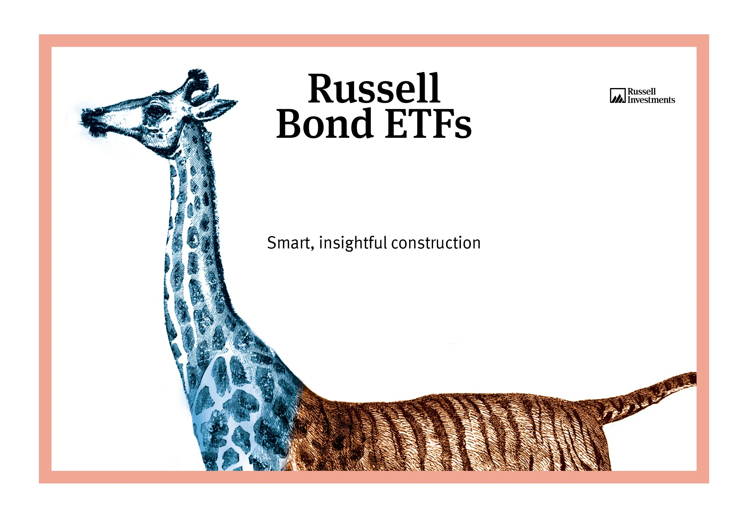
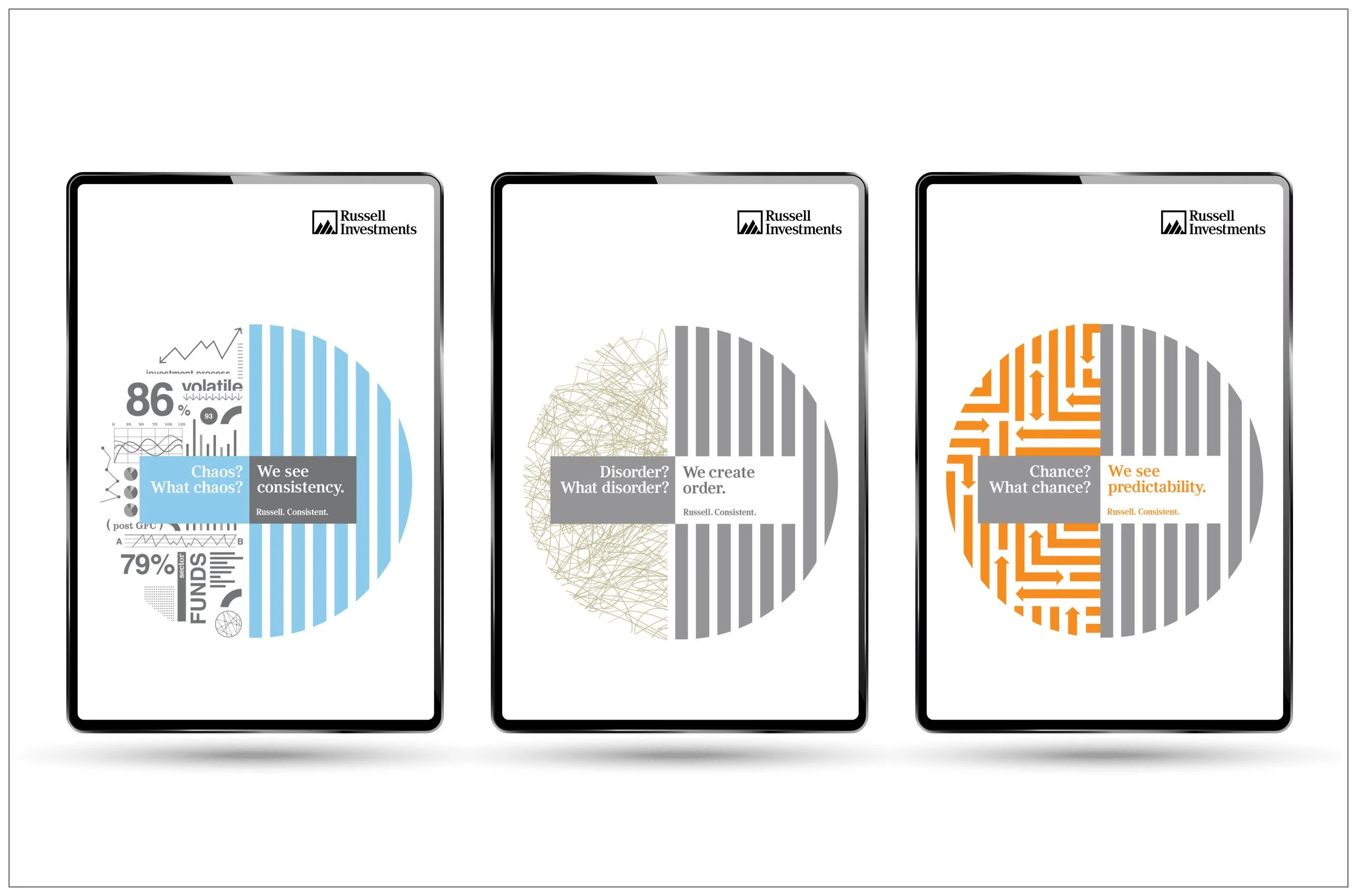
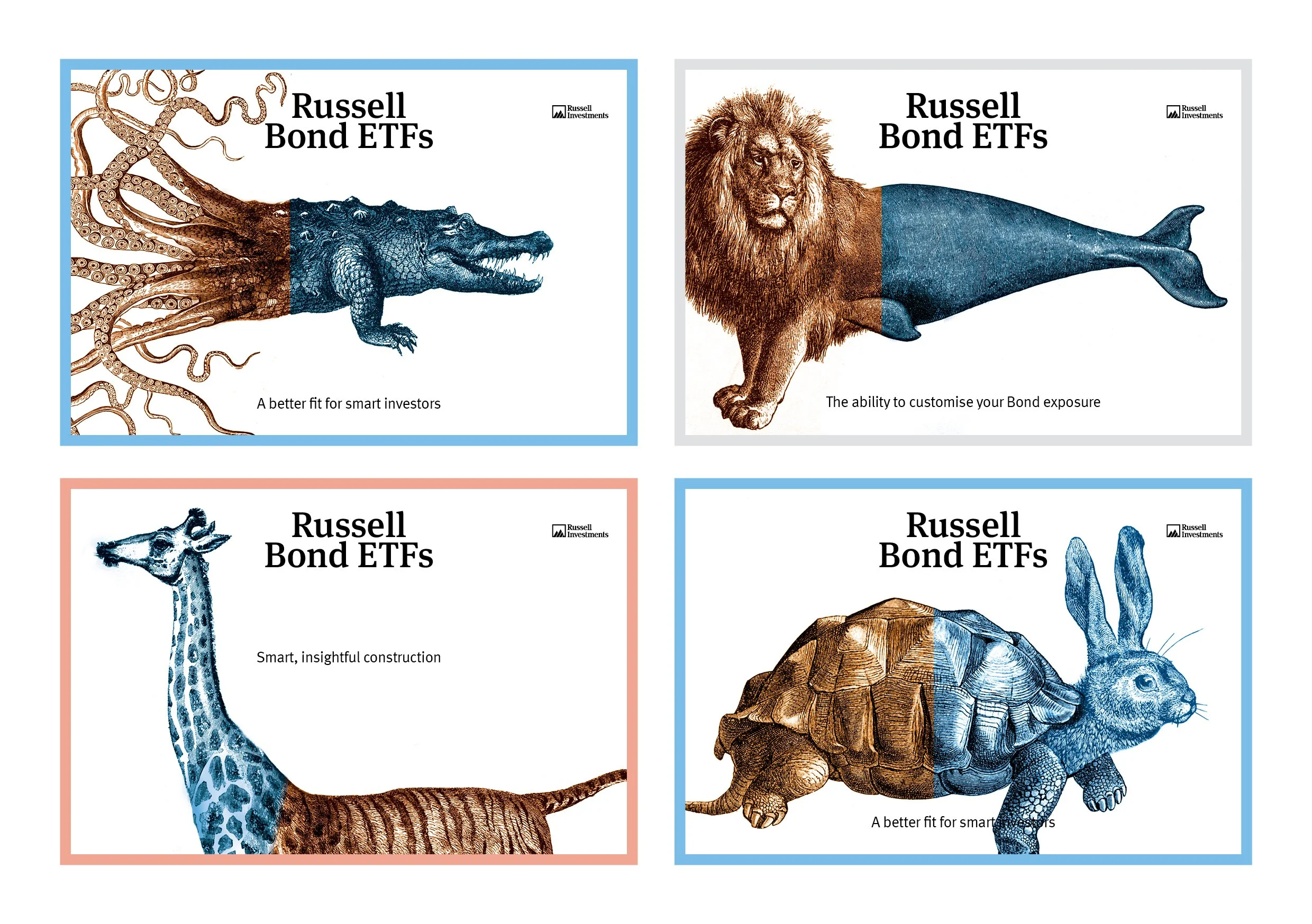
Russell InvestmentsIn 2014, before I merged my agency Stop.Edit. into Ogilvy Australia, we had a brilliant client in Russell Investments, and over the years we collaborated with Elan, Emma, and Craig (and Russells brilliant receptionist Sue) across multiple Brand Platforms & Campaigns.
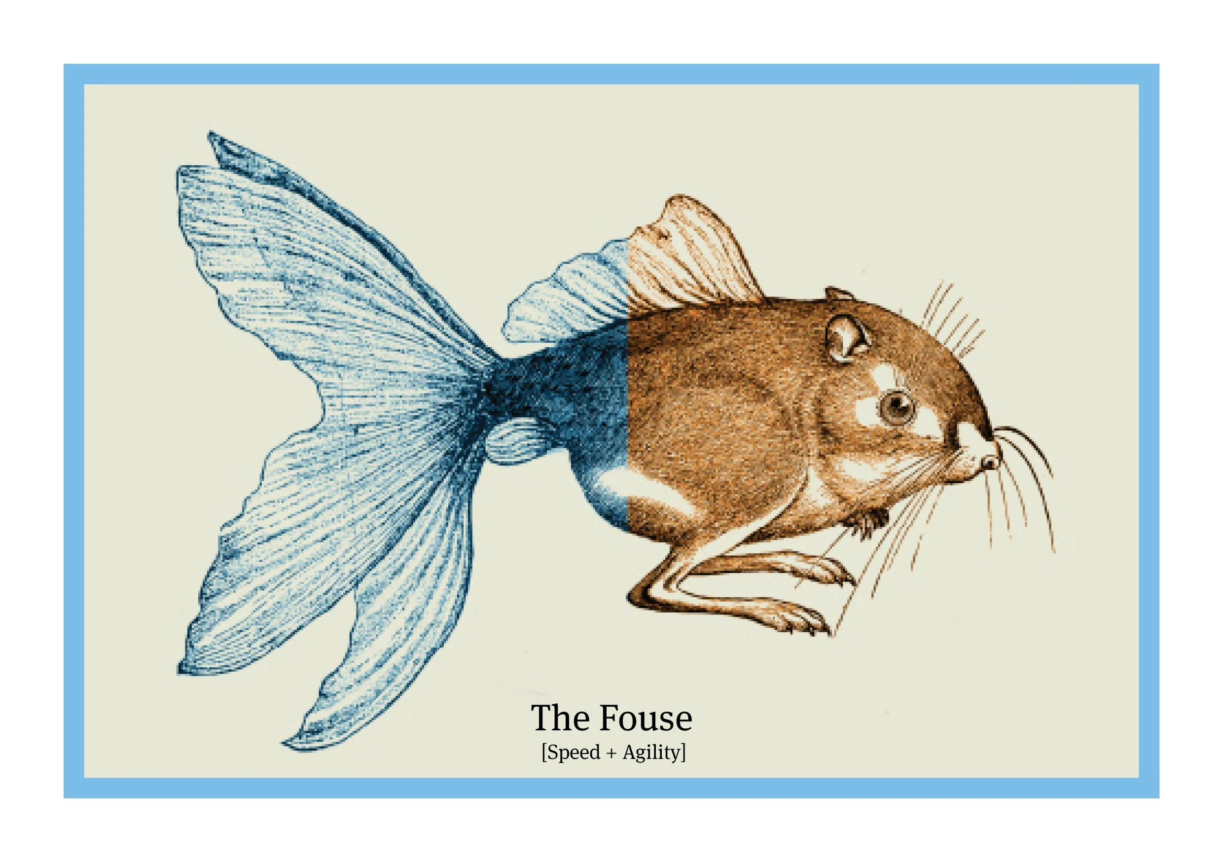
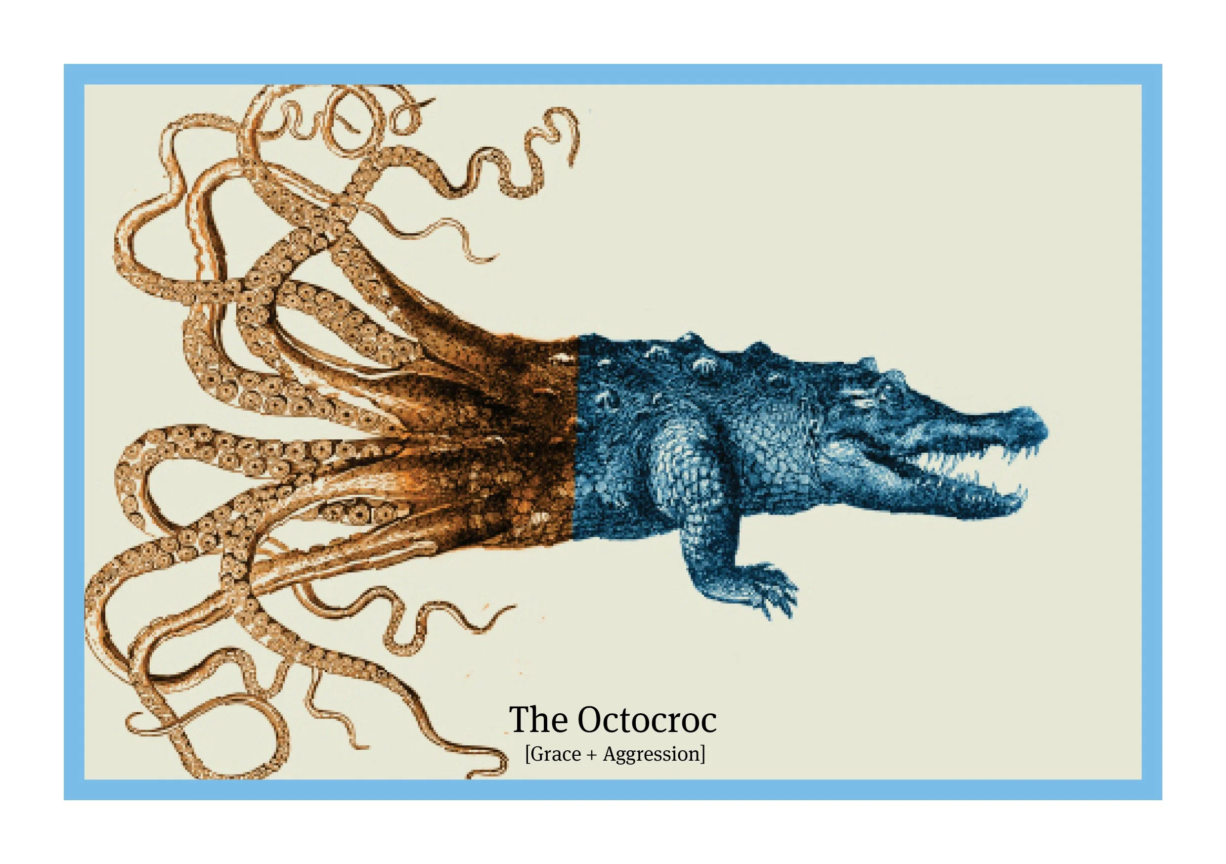
This specific campaign was built around the unique ability to customise and construct the Russell Bond ETFs to your bespoke requirements, rather than buying individual and restricted bonds. We created the Russell Menagerie - taking the best attributes from each animal and mashing them together to make unique (but sometimes freaky) beasts - The Tortare for example was constructed using the patience of the tortoise, and the endurance of the hare.
Russell Investments, founded 90 years ago in Tacoma Washington, and now headquartered in Seattle manages $557b assets on behalf of institutions, advisors and individual investors.
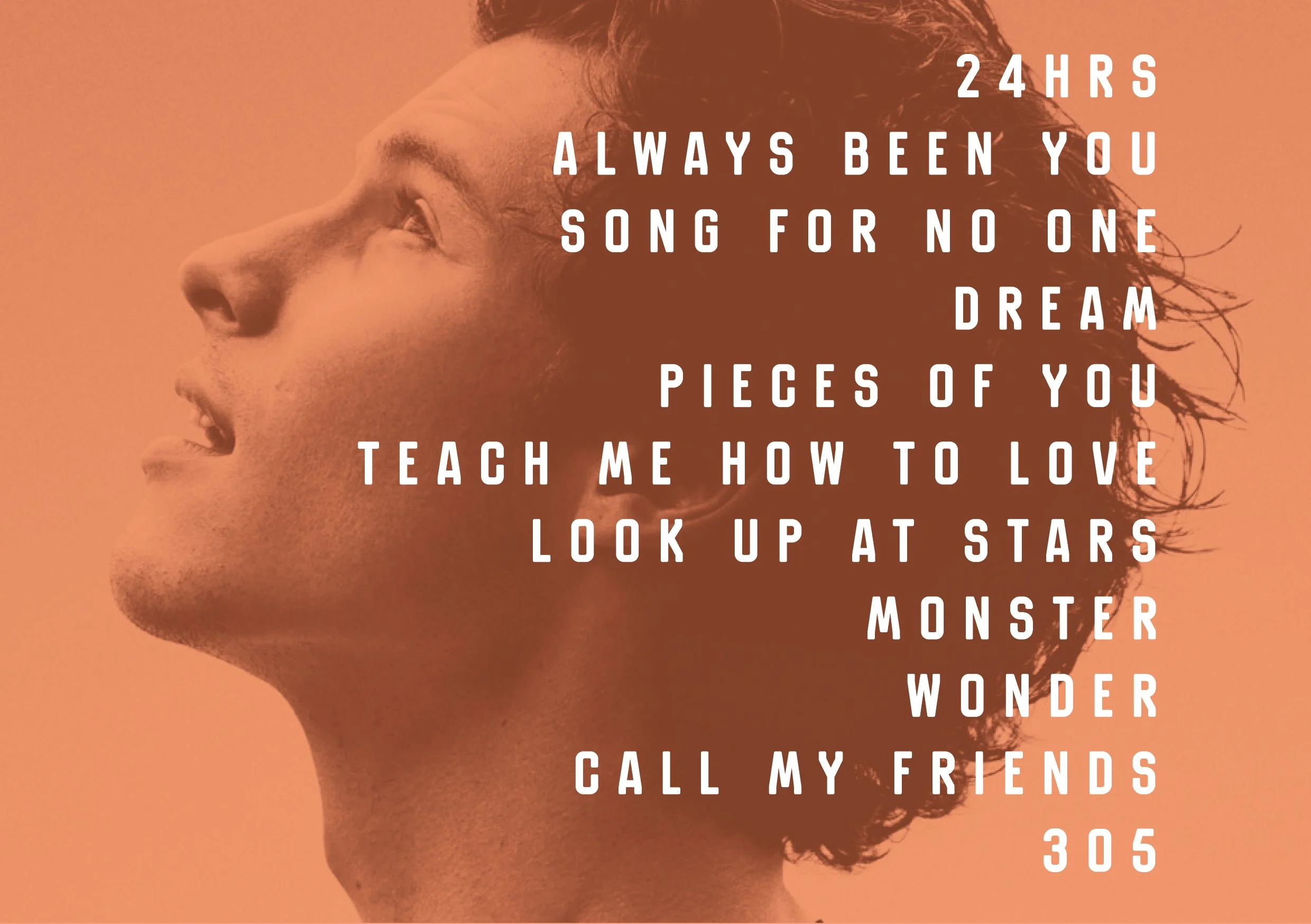
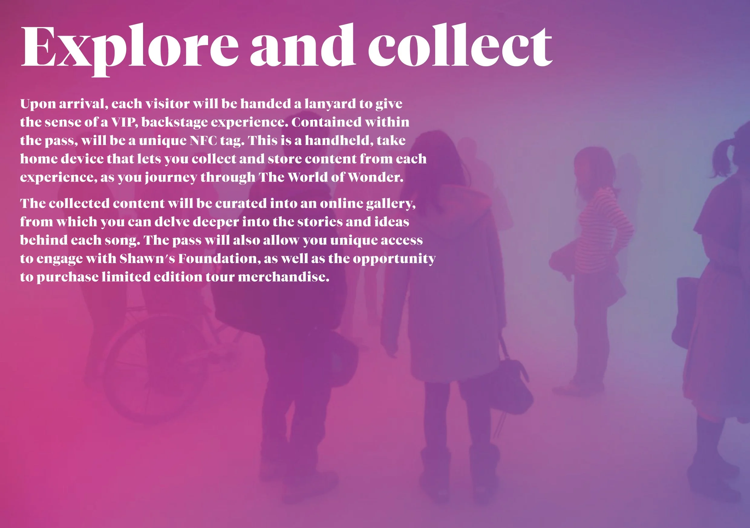
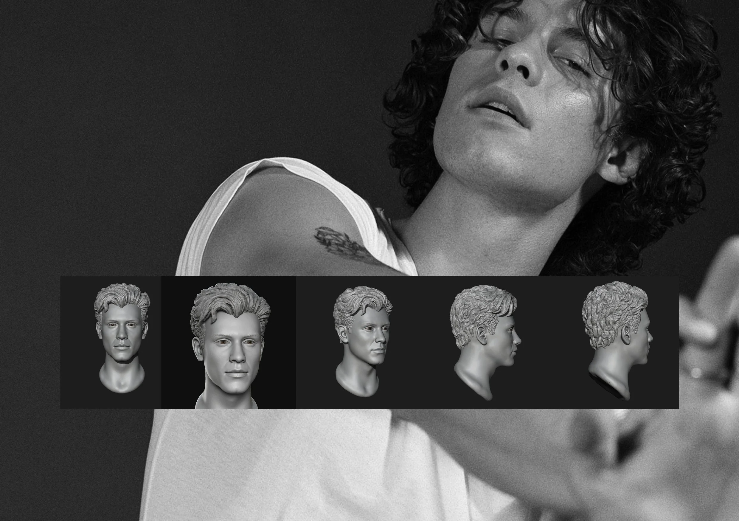
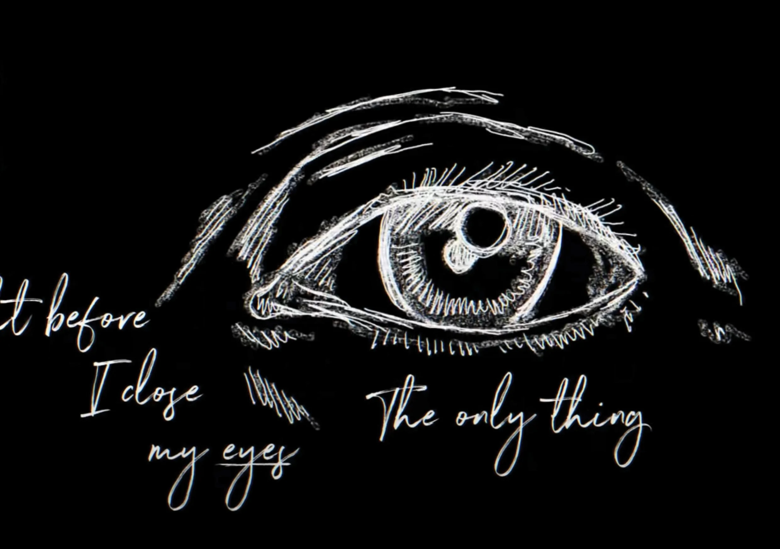
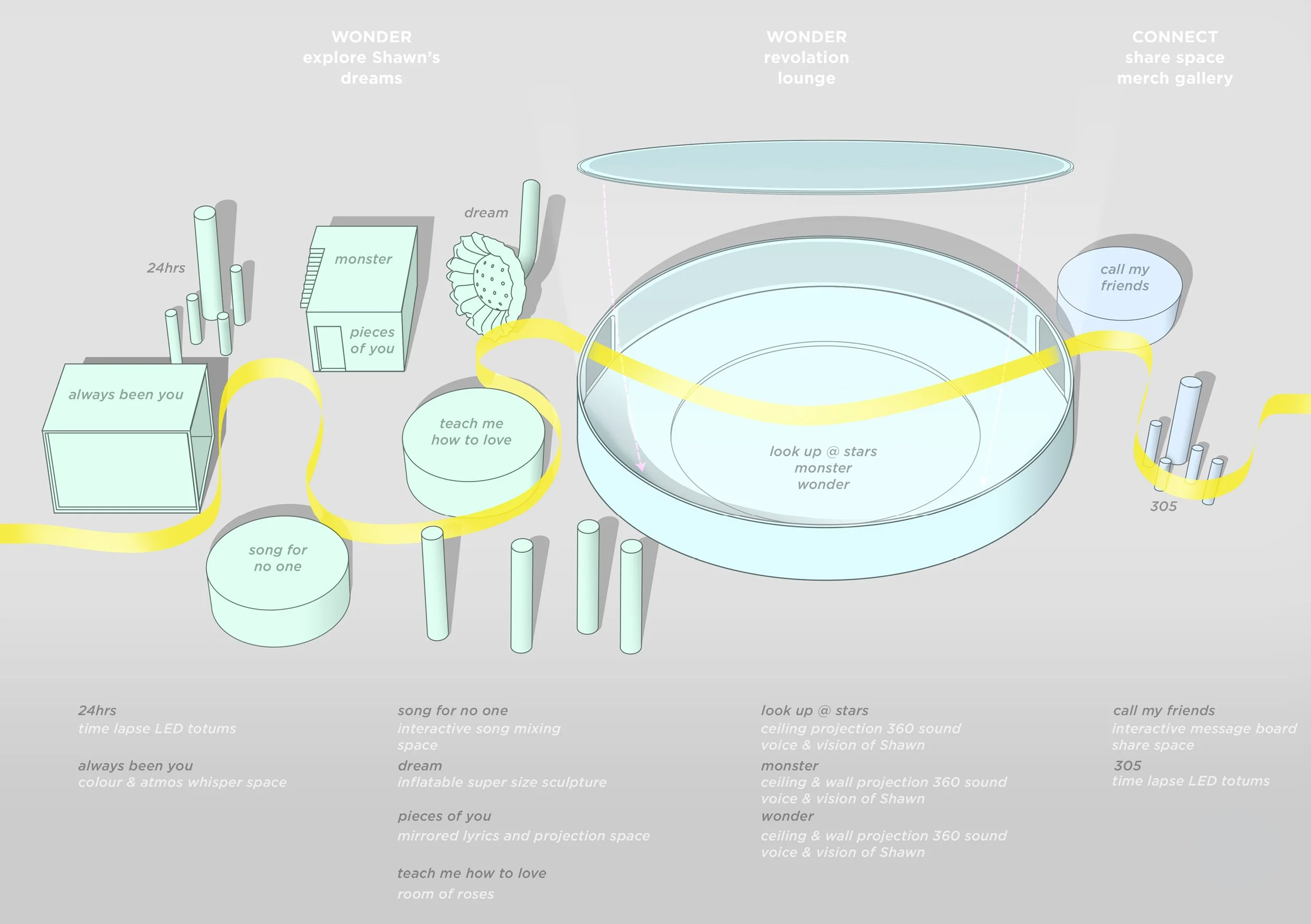
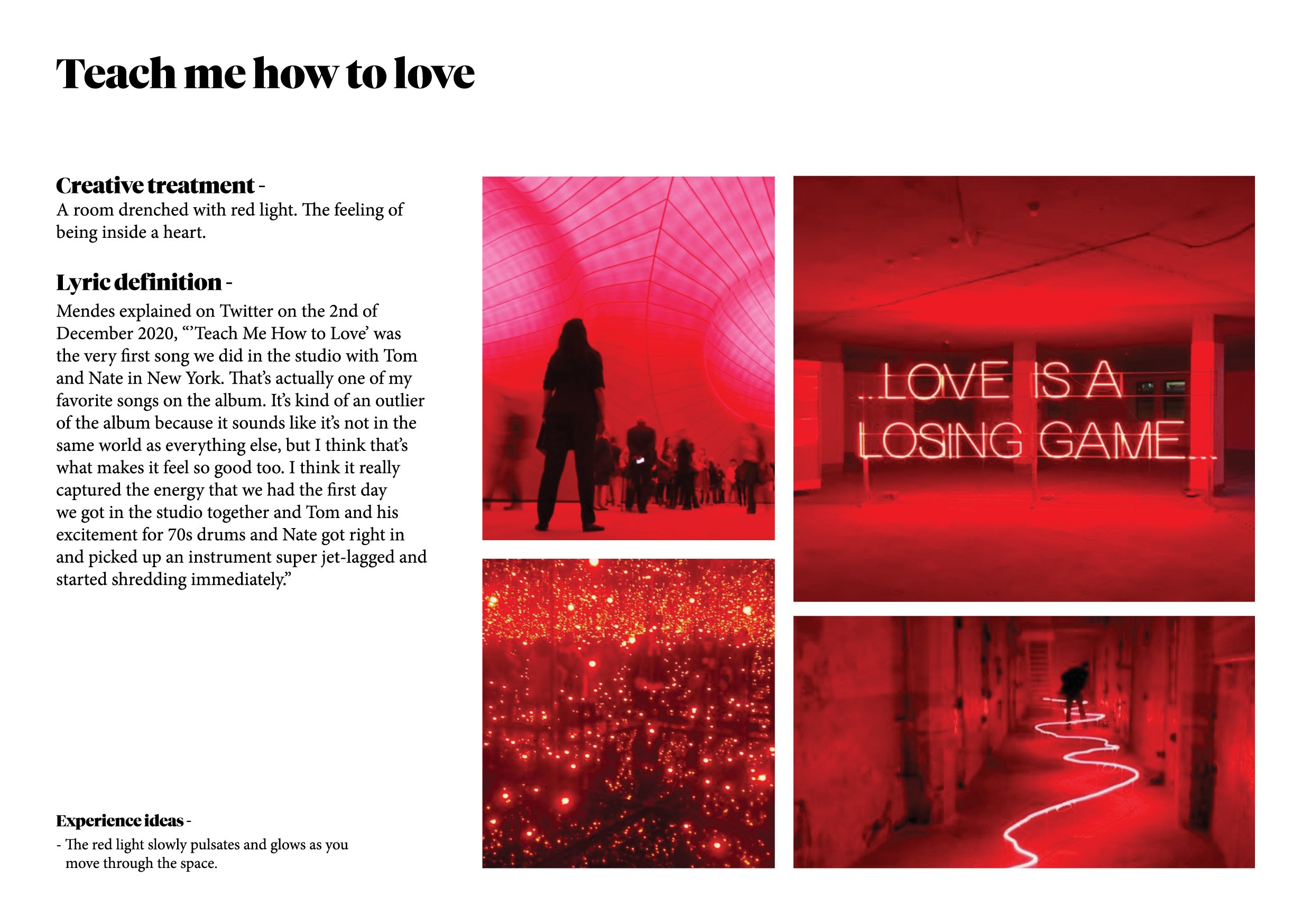
Shawn MendesThe client brief was pretty clear and straight forward, and the strategic approach we took reflected that clarity. The creative idea, and therefore the production wasn’t so simple to execute. Working with the lovely and brilliant team at Vandal, we were approached by Shawn Mendes’ management team to provide creative concepts associated with a touring experience - The Shawn Mendes World of Wonder - to amplify his newly released album, Wonder.
The brief asked ‘What is the Shawn Mendes World of Wonder?, how do we bring the Wonder album to life in a very unique experience, one that appeals to a very connected fanbase. An experience that needs to be more than just a collection of projections of the YouTube videos and other content connected to the album. One that matches, and if possible exceed the feeling a fan gets at a Shawn Mendes live concert.’ There was a requirement to weave in The Shawn Mendes Foundation story, and also merchandise.
Our solution was to build a fully immersive physical and digital world that would reference and amplify each song of the Wonder album according to its listing... Track 1. Intro, Track 2. Wonder, Track 3. Higher...etc, for the 14 tracks. Mindful of sensory overload, we varied the experiences - some were full on immersive rooms with massive screens and projections, others were quiet and simple, and relied on scent or heat to deliver the experience. In the middle of the journey was a large auditorium space to reflect and relax, before continuing the experience. This space would the the ‘Wonder zone’ and would follow the song track ‘Discover zone’, before travelling to the ‘Connect zone’ which would contain Shawns Foundation and merchandise.
Westfield Plusxxxx


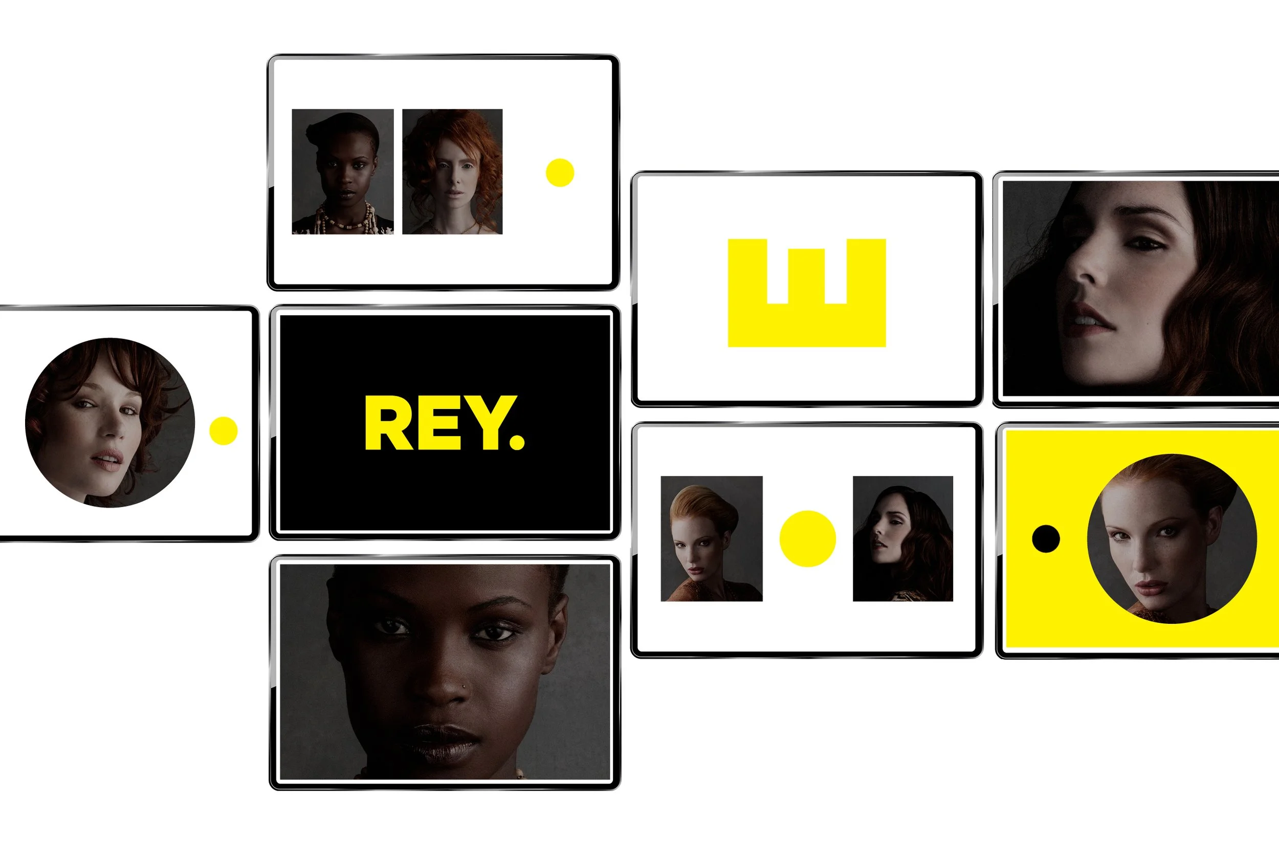
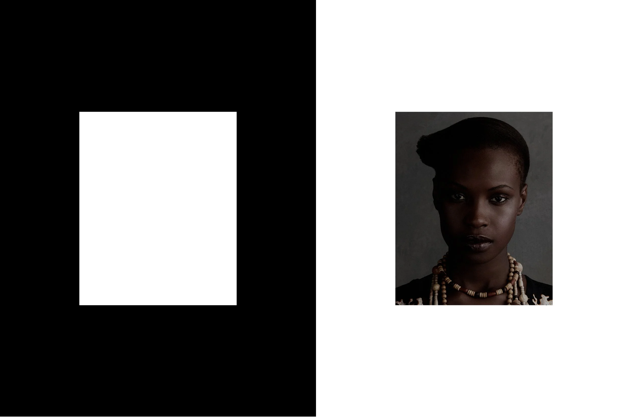
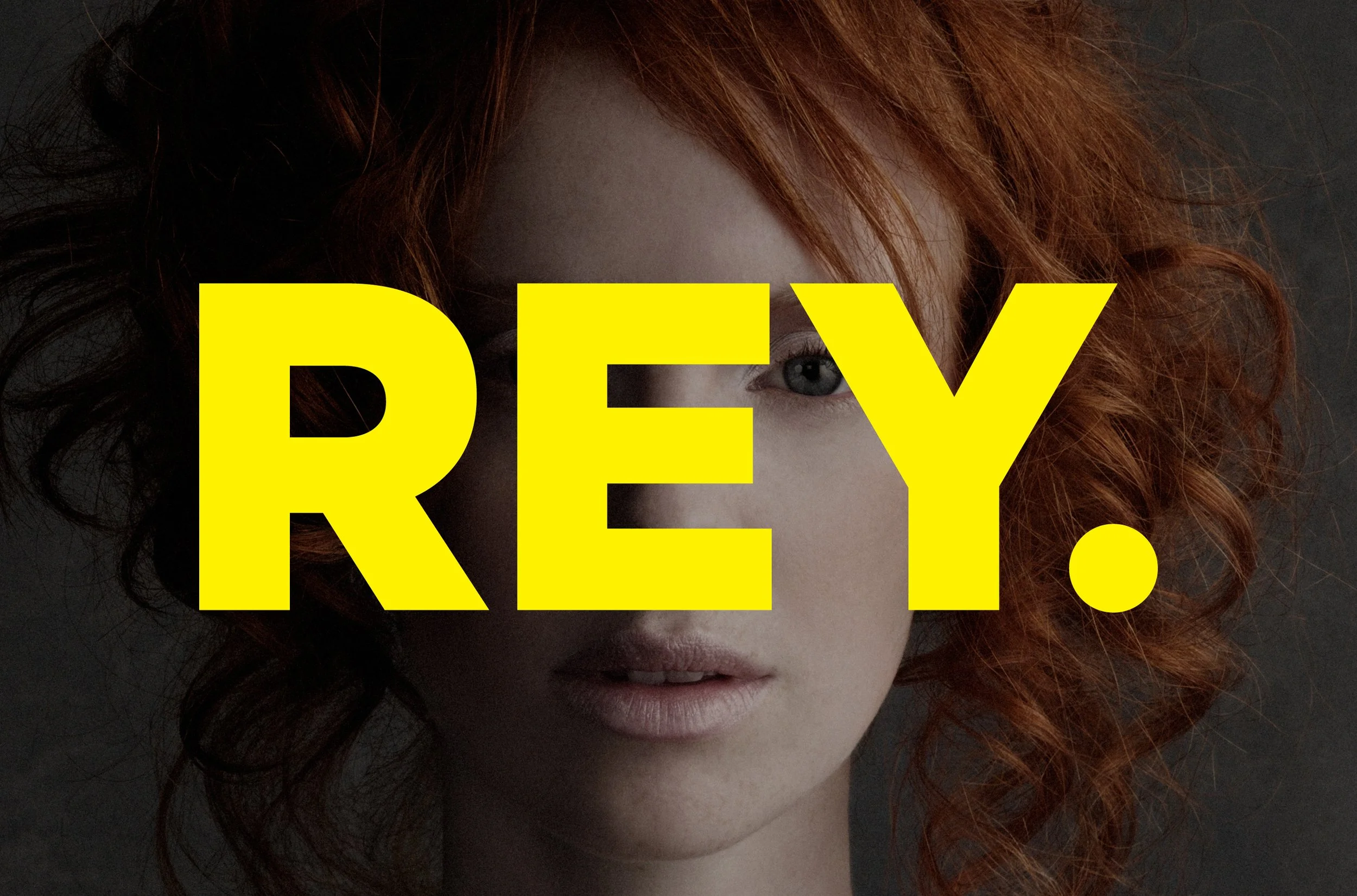
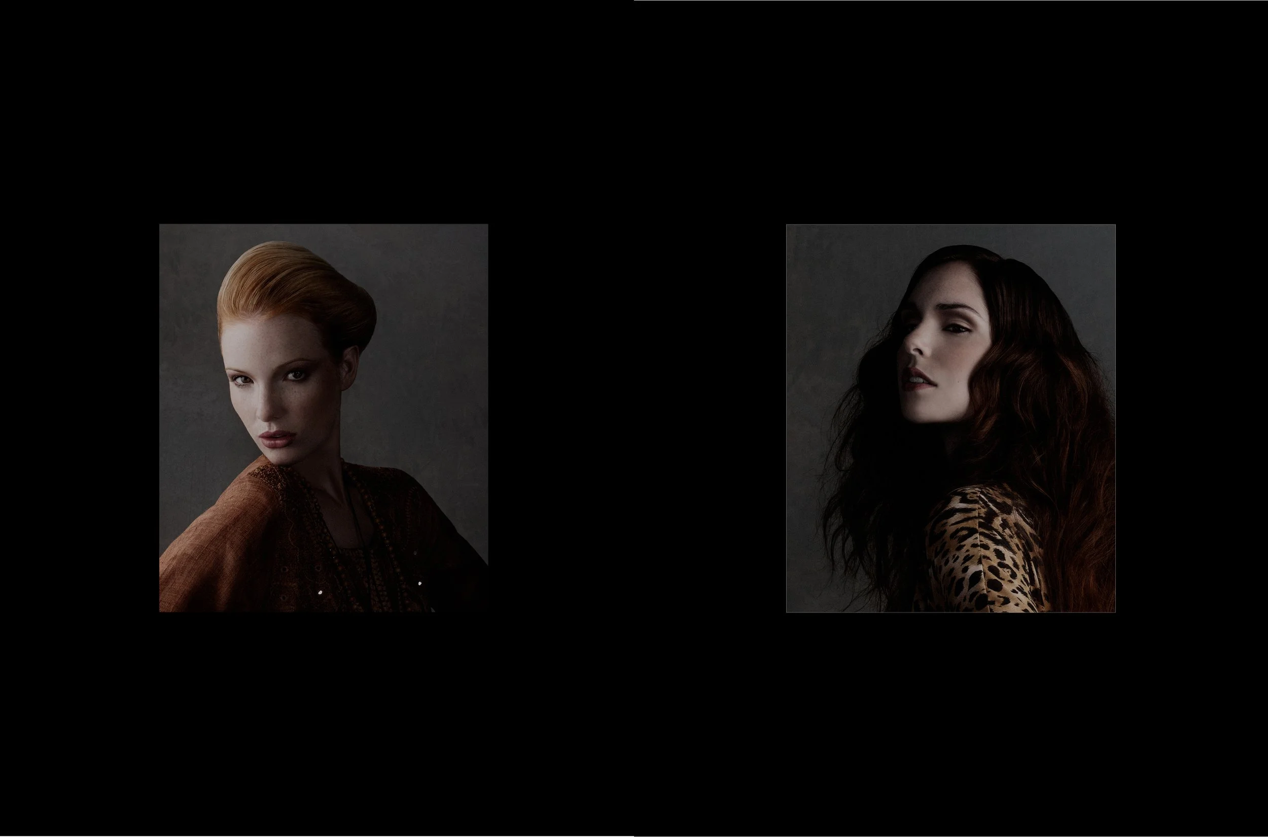
REY.xxxx

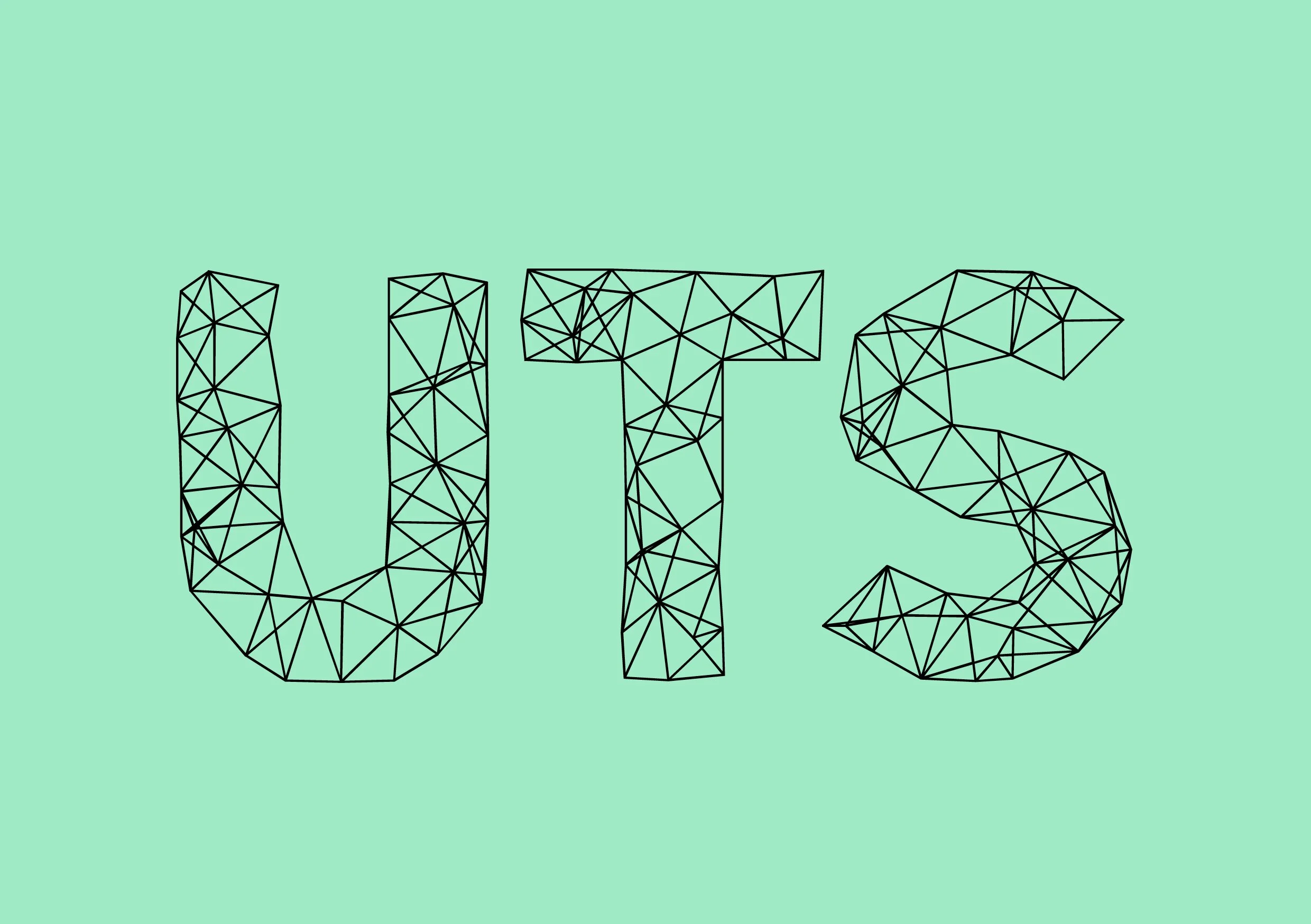
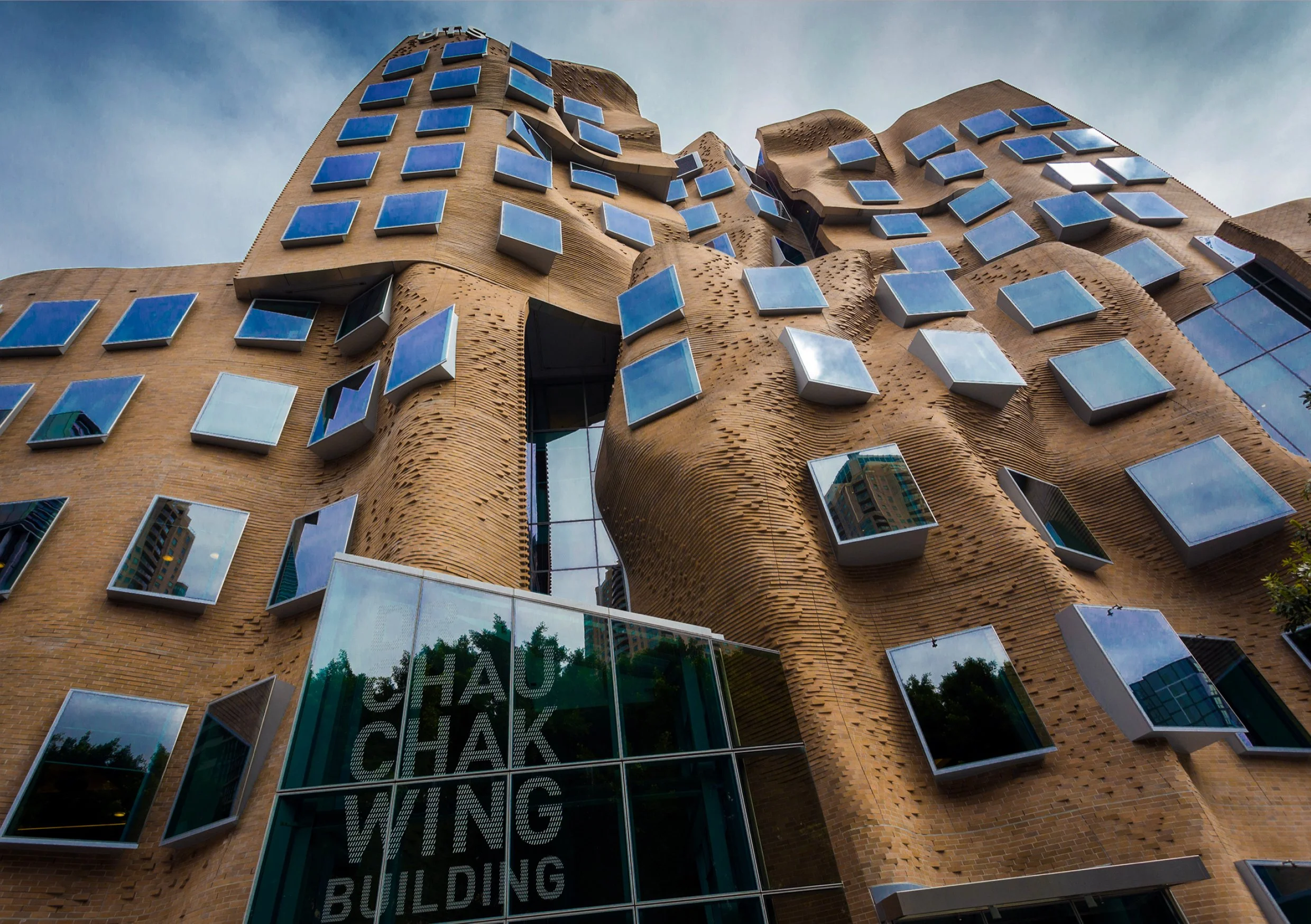
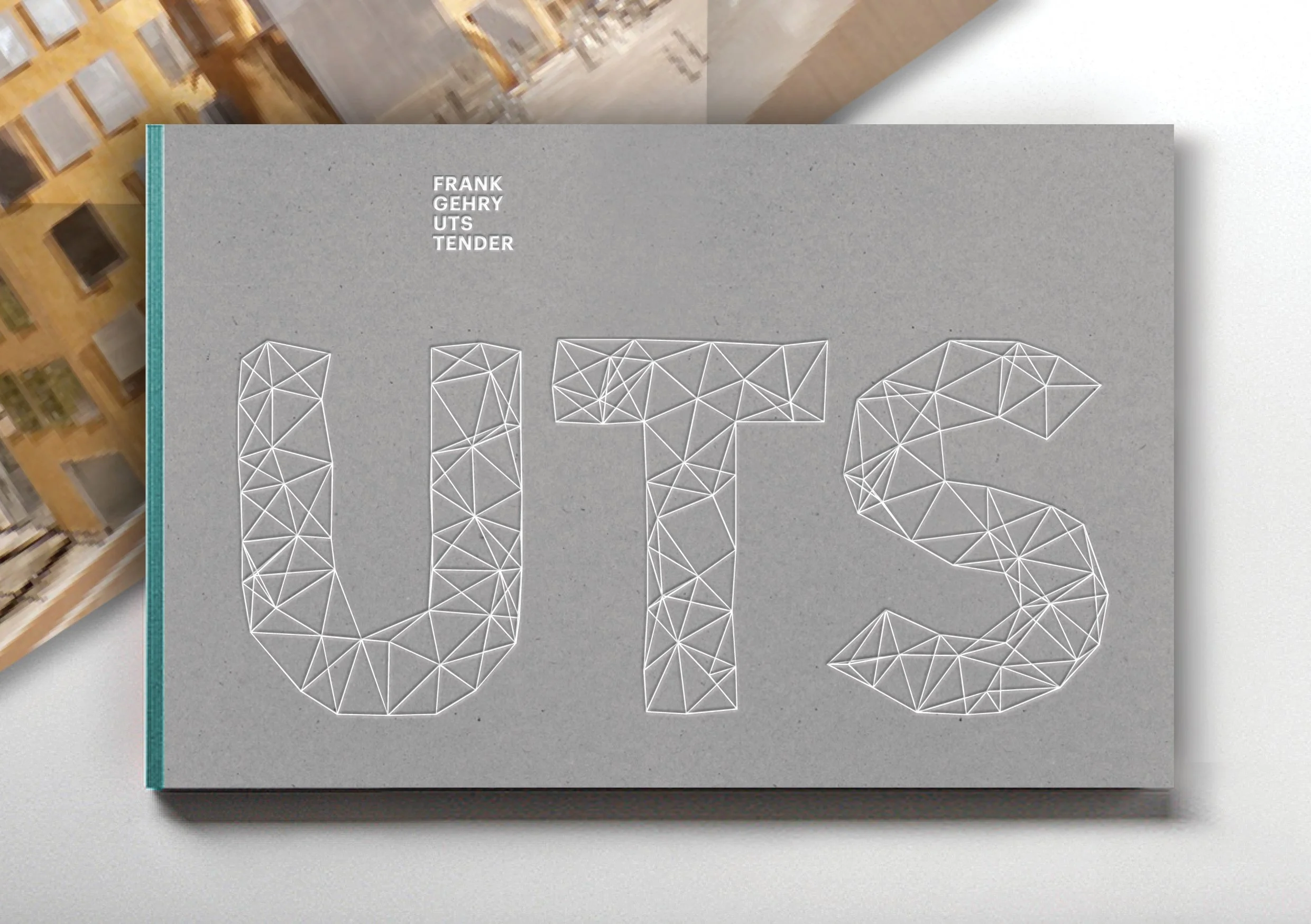
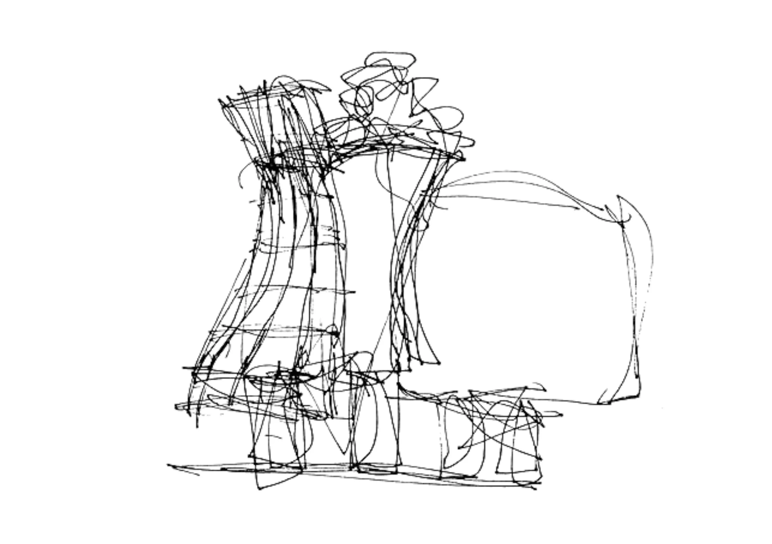
Frank Gehry x UTSxxxx


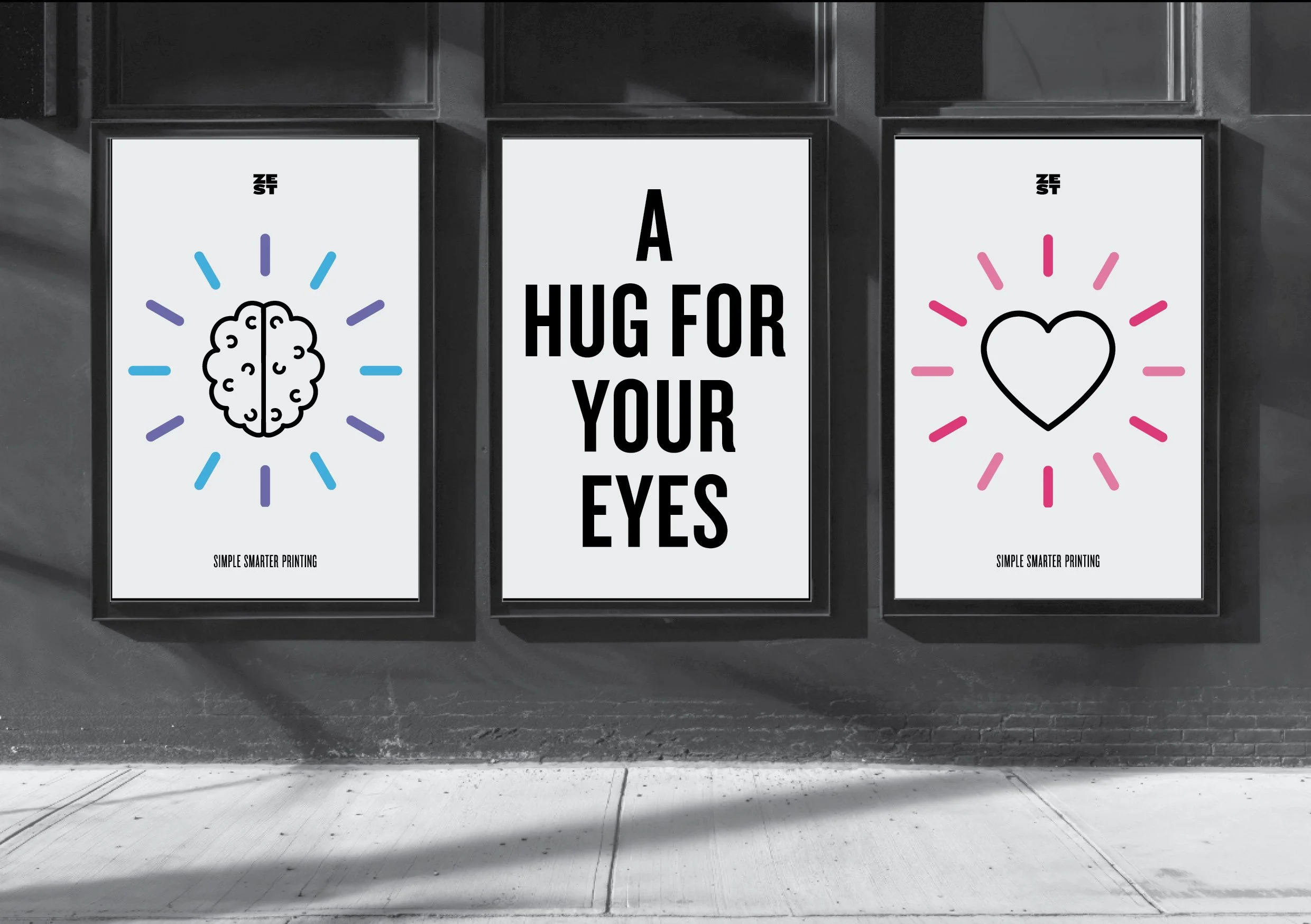
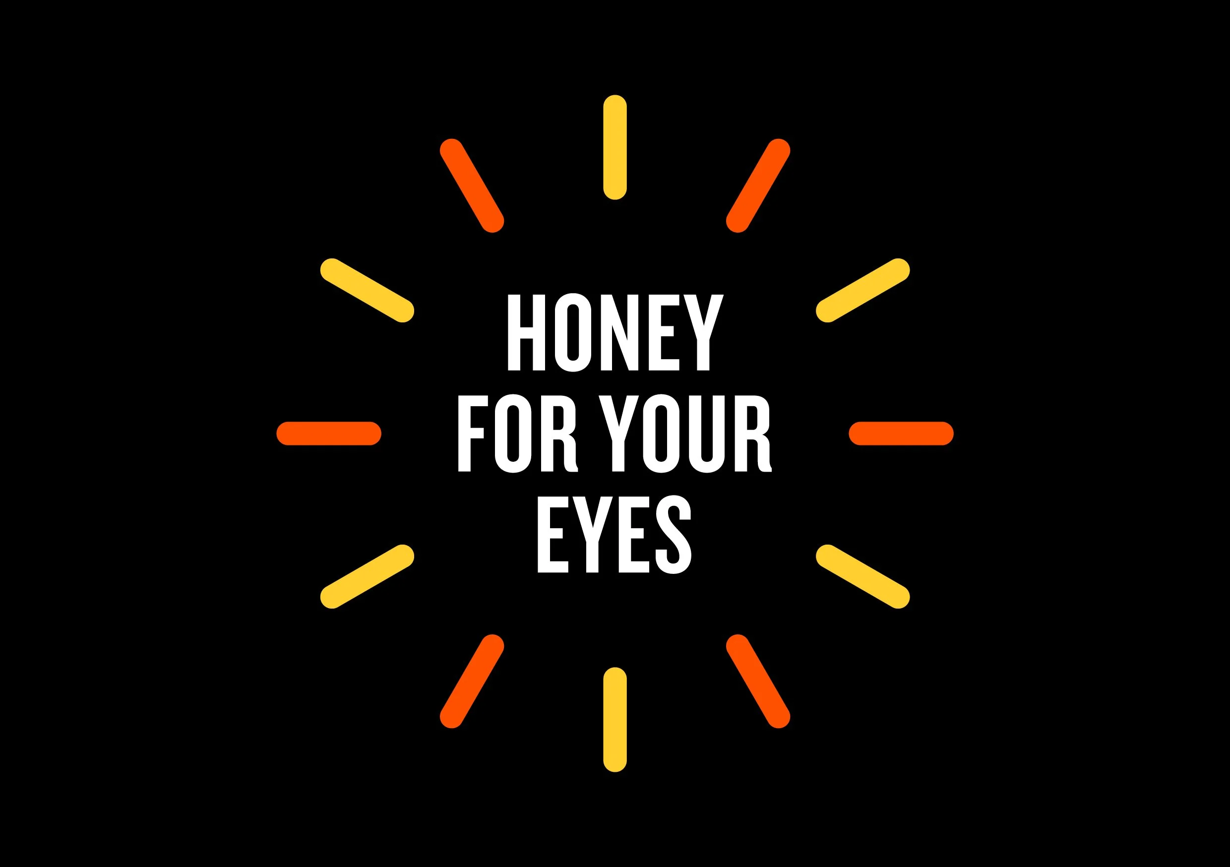
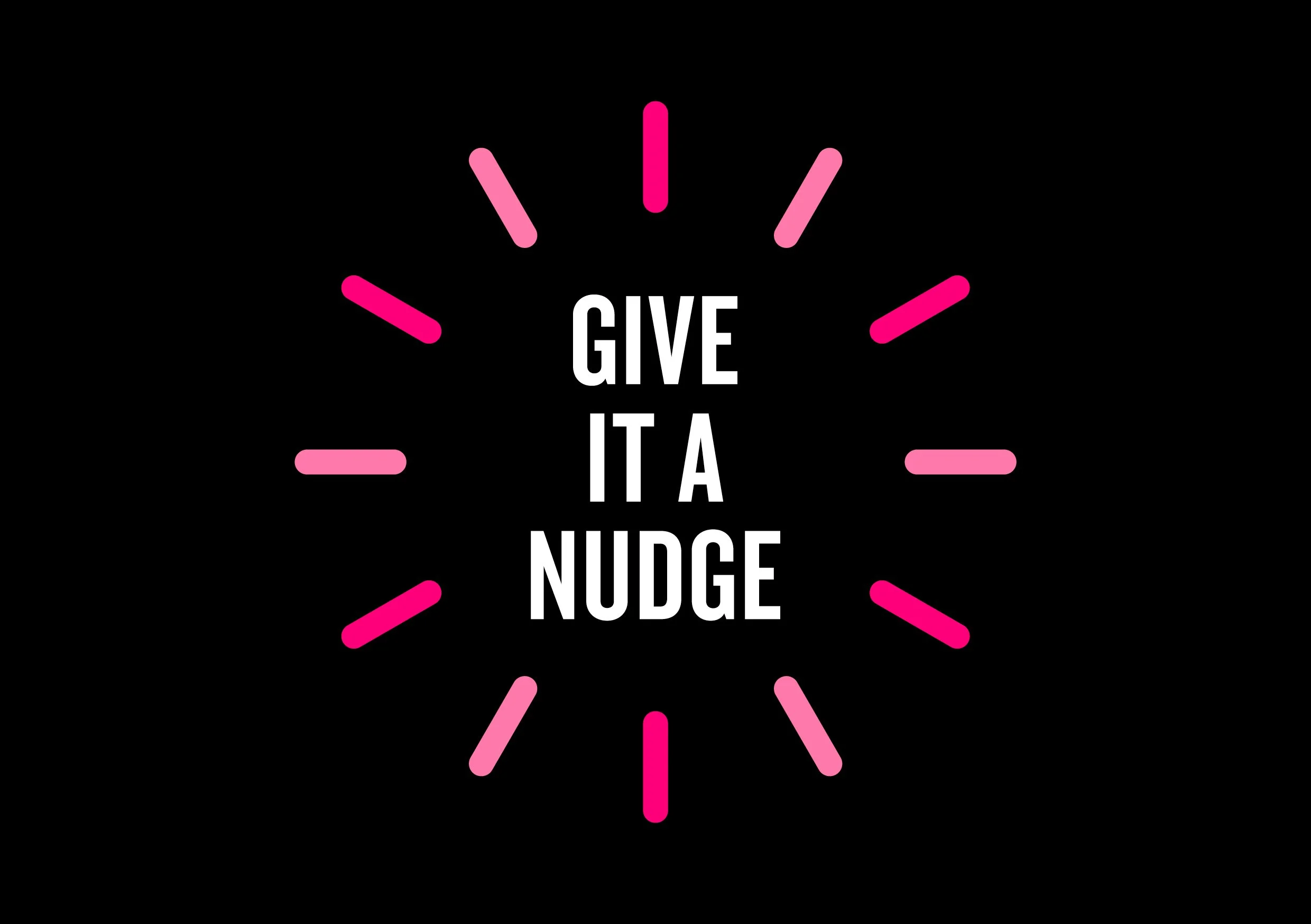
ZEST PrintForest Print Services had been servicing the Sydney market since 1970, but a change of ownership called for a rebrand built with more personality and character - one that was contemporary, but not clinical - it still needed to look, feel, and sound like a print shop where traditional offset techniques would sit alongside a new digital infrastructure and partner print model.
Having spent many hours working alongside print minders, I used some of the terminology (but not the swearwords) that I picked up along the way - for example, give it a nudge is used when wanting to raise the ink levels slighly.
I created the name, with a new positioning of Simple Smarter Printing, building out a identity and design system that has a bit more Zest, Zeal, Zing, and Zap...
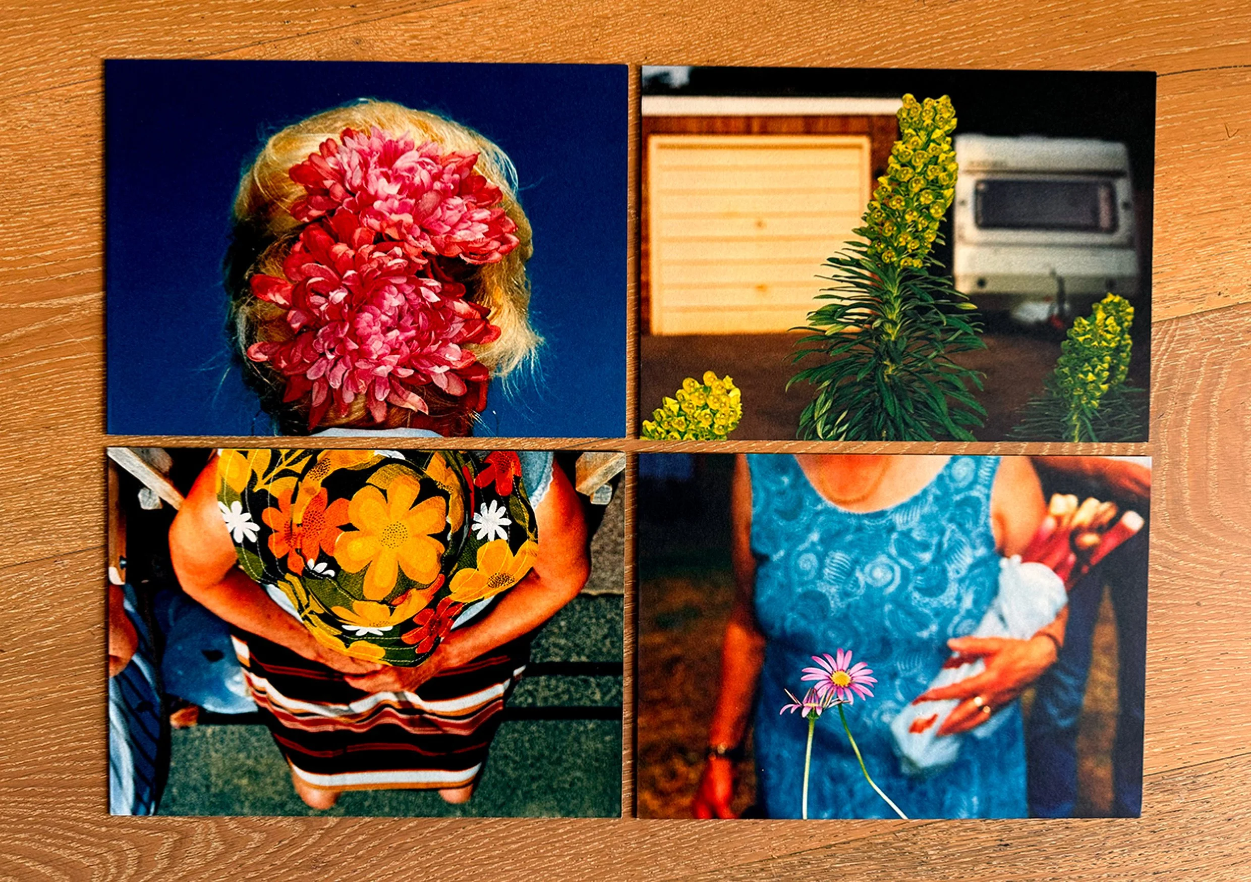
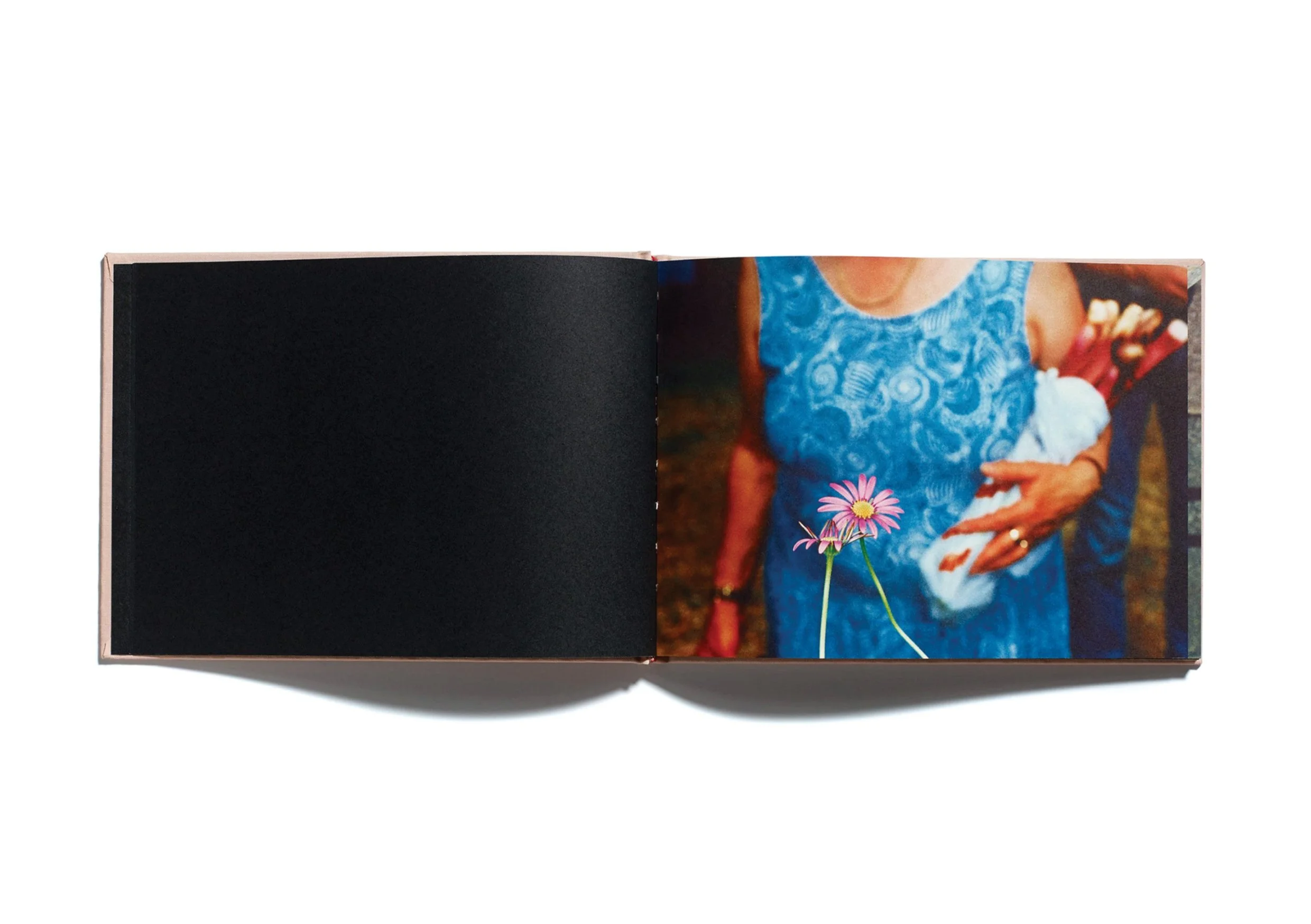
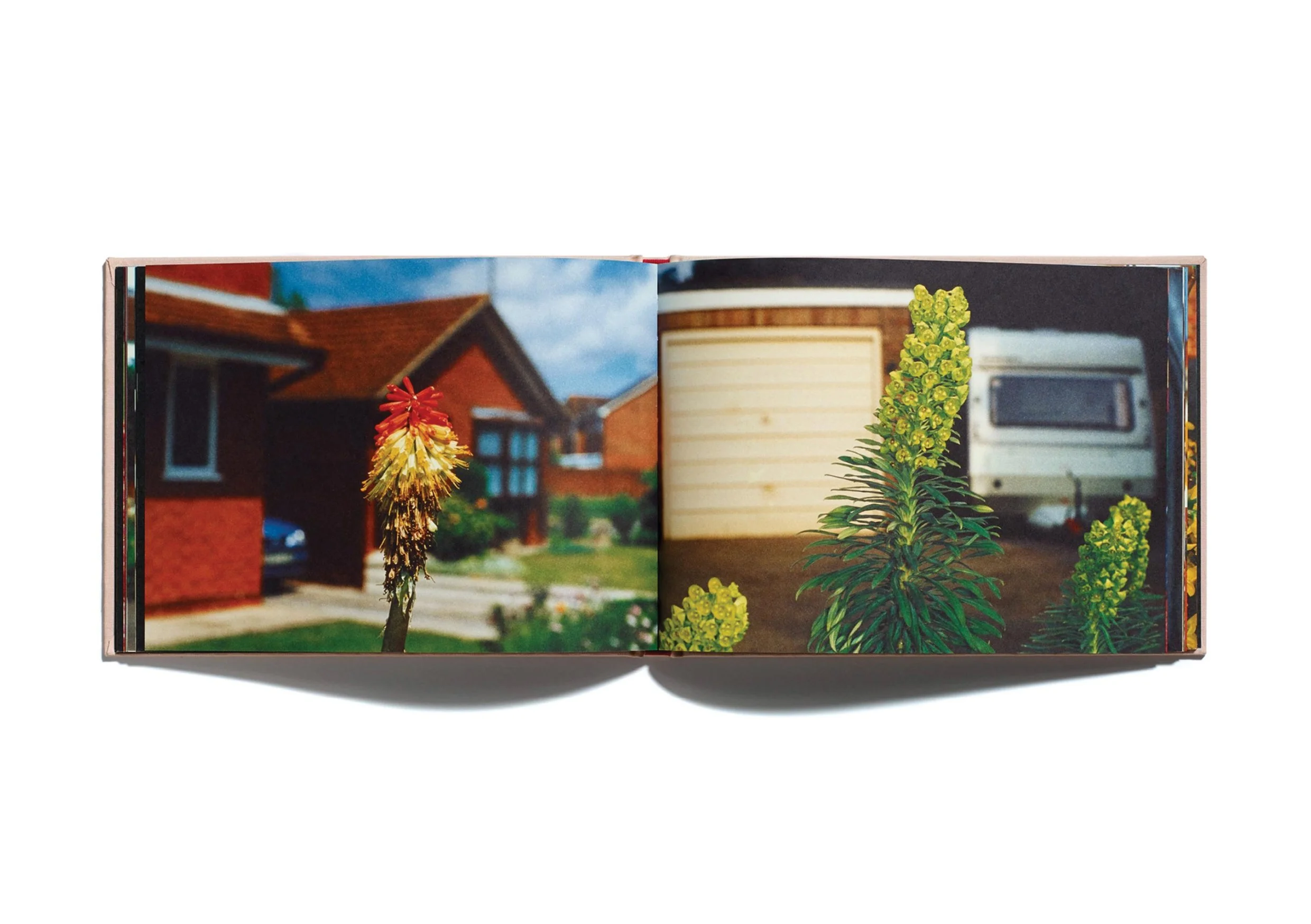
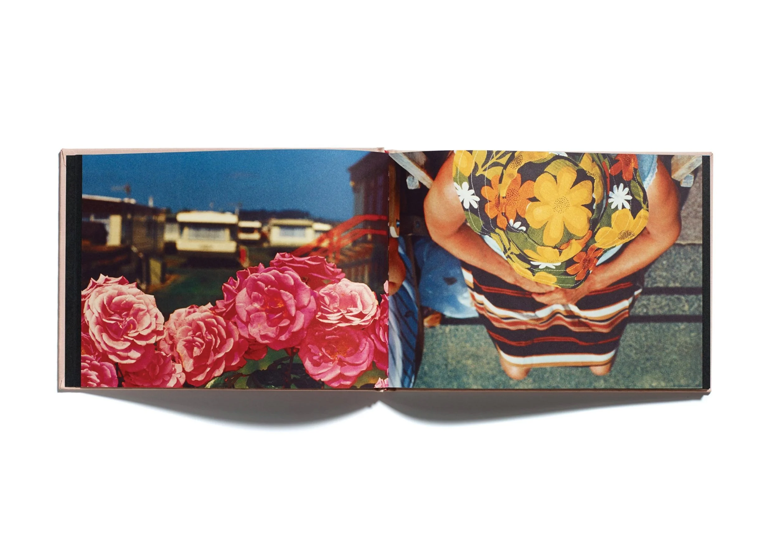
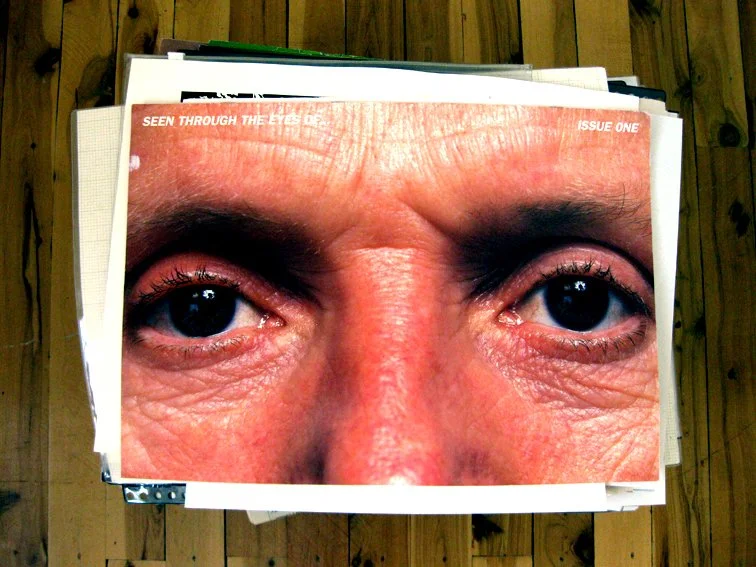
Martin Parr - FlowersAfter graduating from Saint Martins, I landed my first proper design job as a very raw Junior Designer, at Browns London. I’d previously worked with Pentagram founder, Alan Fletcher at Phaidon on the Jon Jerde book, so that gave me some kodos with Jonathan, Mike and Graham. But it was my alliance to Liverpool FC that probably swung it - I literally had one foot in the door when Mike shouted from the back of the studio ‘are you red or blue...? if you’re blue, get out...!’
I had many, many, many late nights, and weekends didn’t exist for a while, but I crammed so many extra years of learning - often very steep and very painful - into my 3 years there, and worked with amazing photographers like Davy Jones, John Wildgoose, Martin Langfield, John Reardon, David Stewart, Robin Broadbent, Jon Ross, as well as Magnum Photographers Bruce Gilden and Martin Parr.
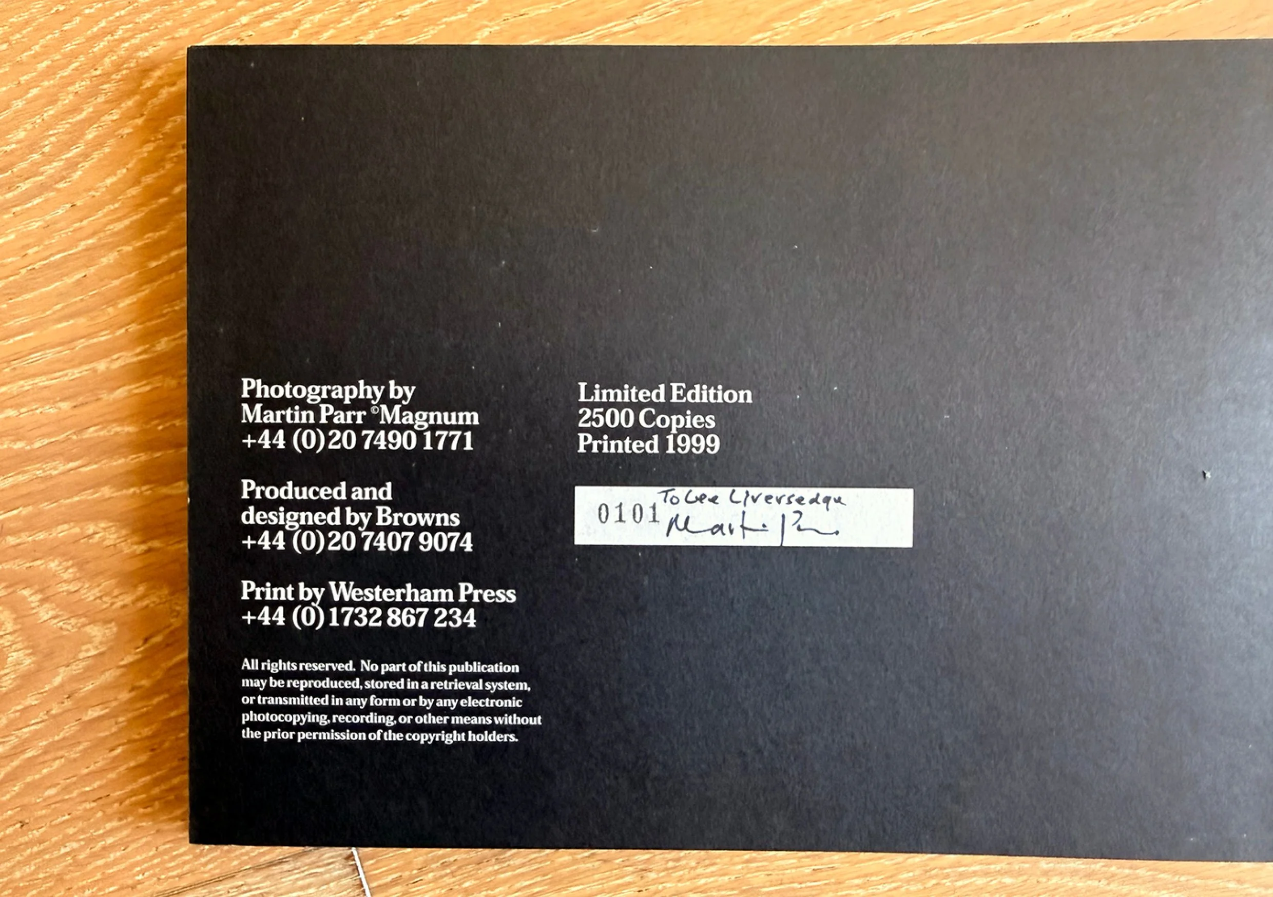
Jonathan and I designed Flowers in 1999. Martin was an incredible man, very quiet and humble, and for the most everything we proposed sailed though smoothly...although there were many occasions (and quite rightly) Martin gave me a good ticking off for cropping his images.
The book had a limited run of 2500. It was printed by Westerham Press on Munken Lynx and Elk, and was wrapped in beautiful pink cloth. We launched the book with Martin and Magnum at Defina in London and Bloom in NYC, as well as venues in Paris and Hamburg.
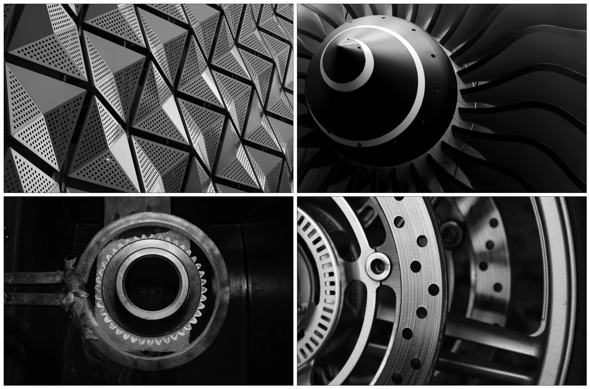
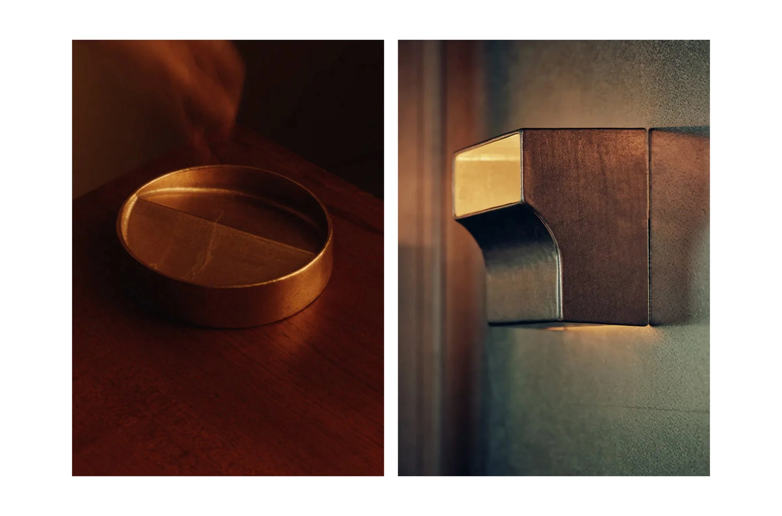
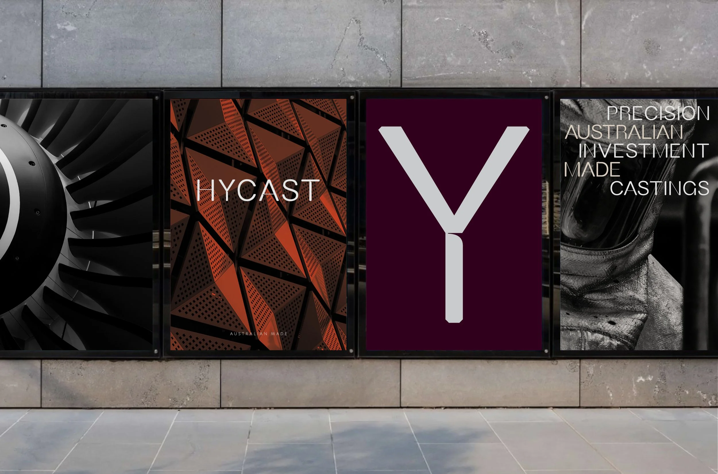
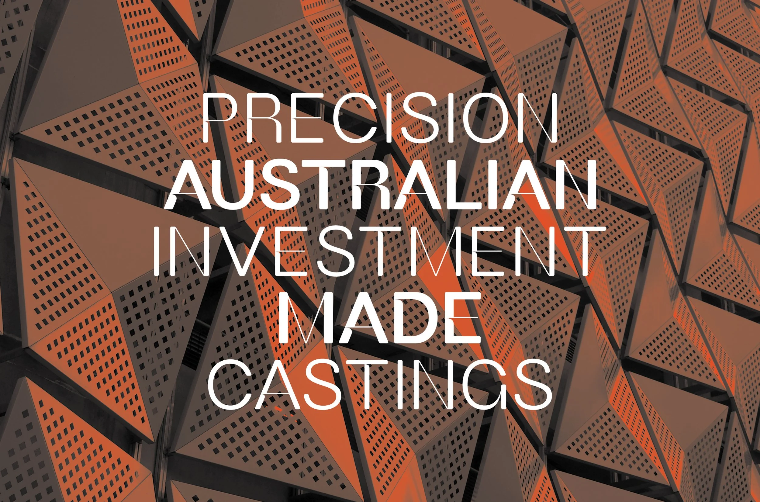
Hycast Metalsxxxx


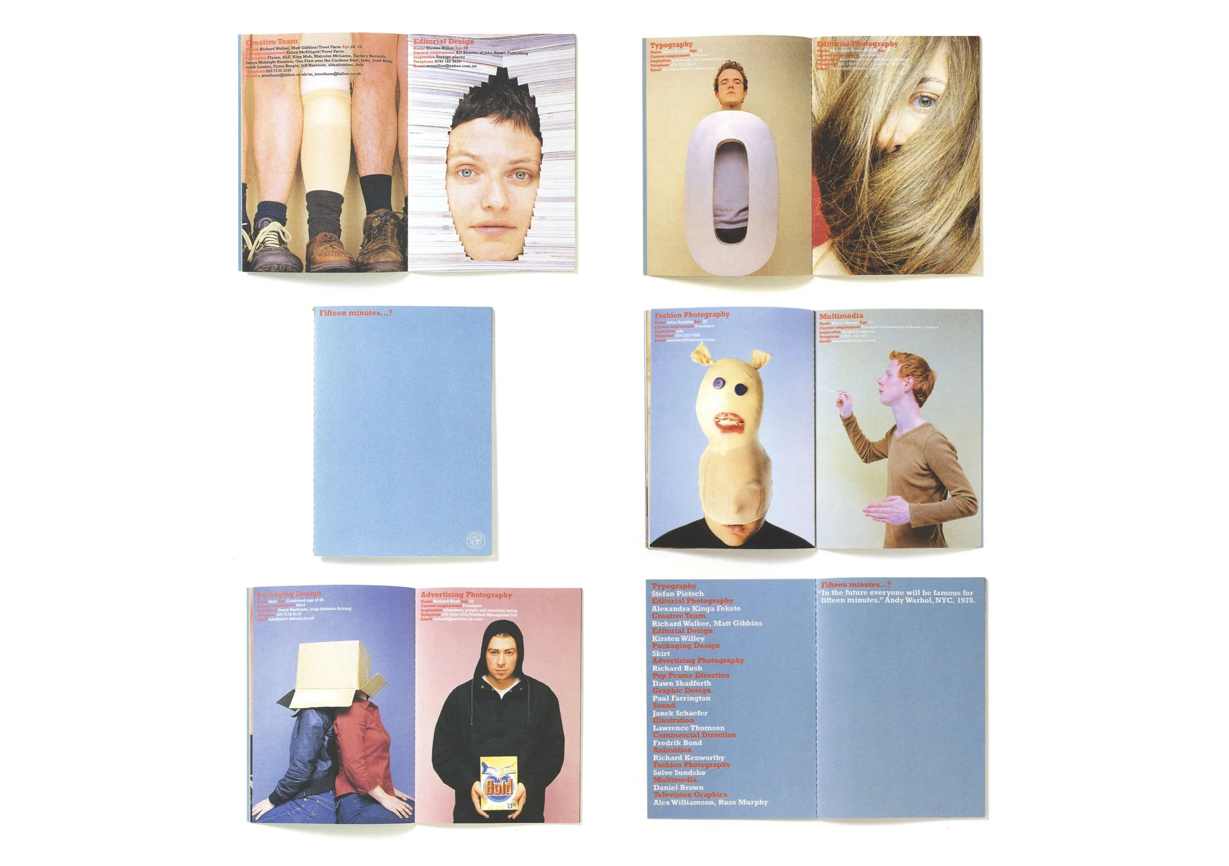
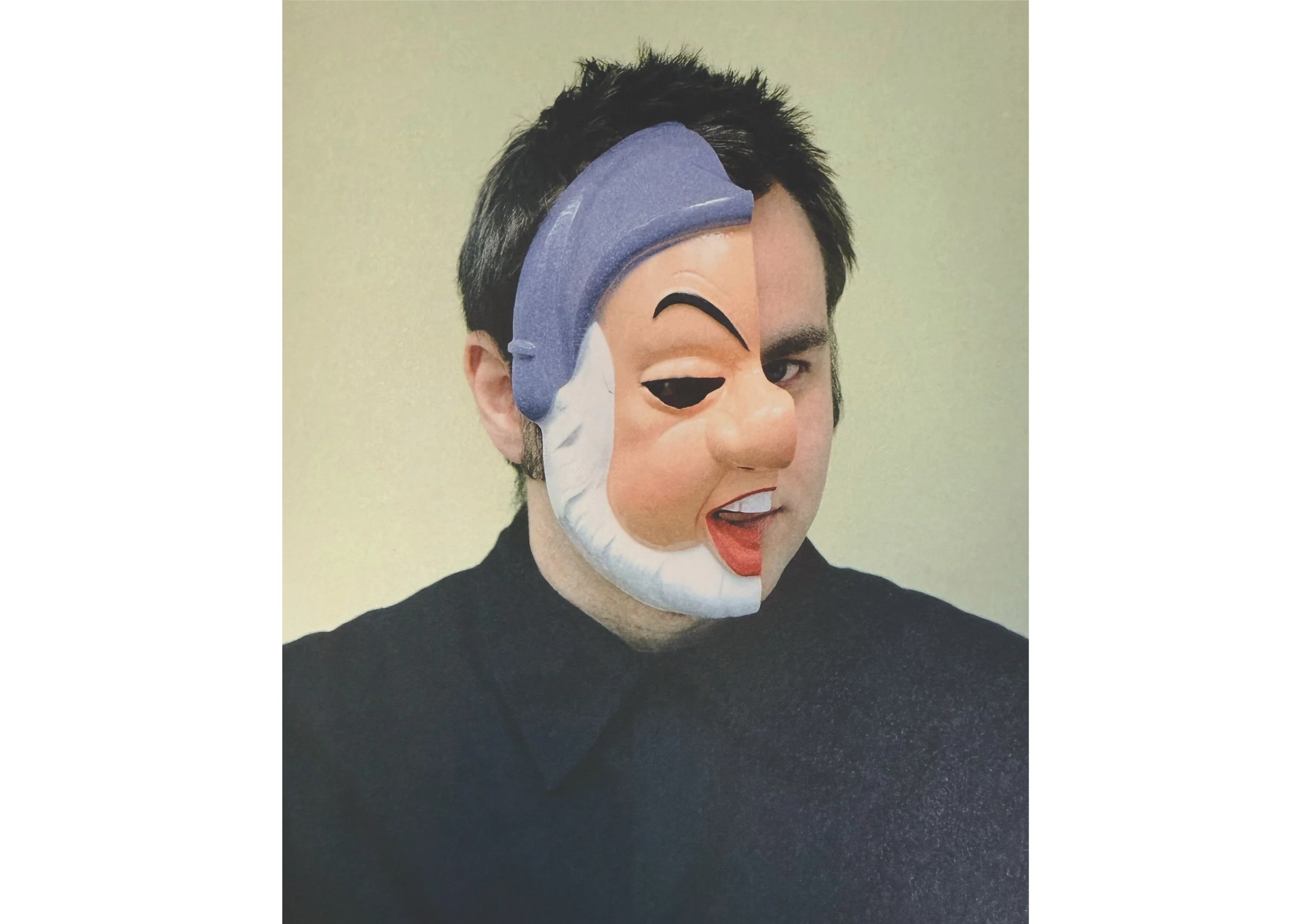
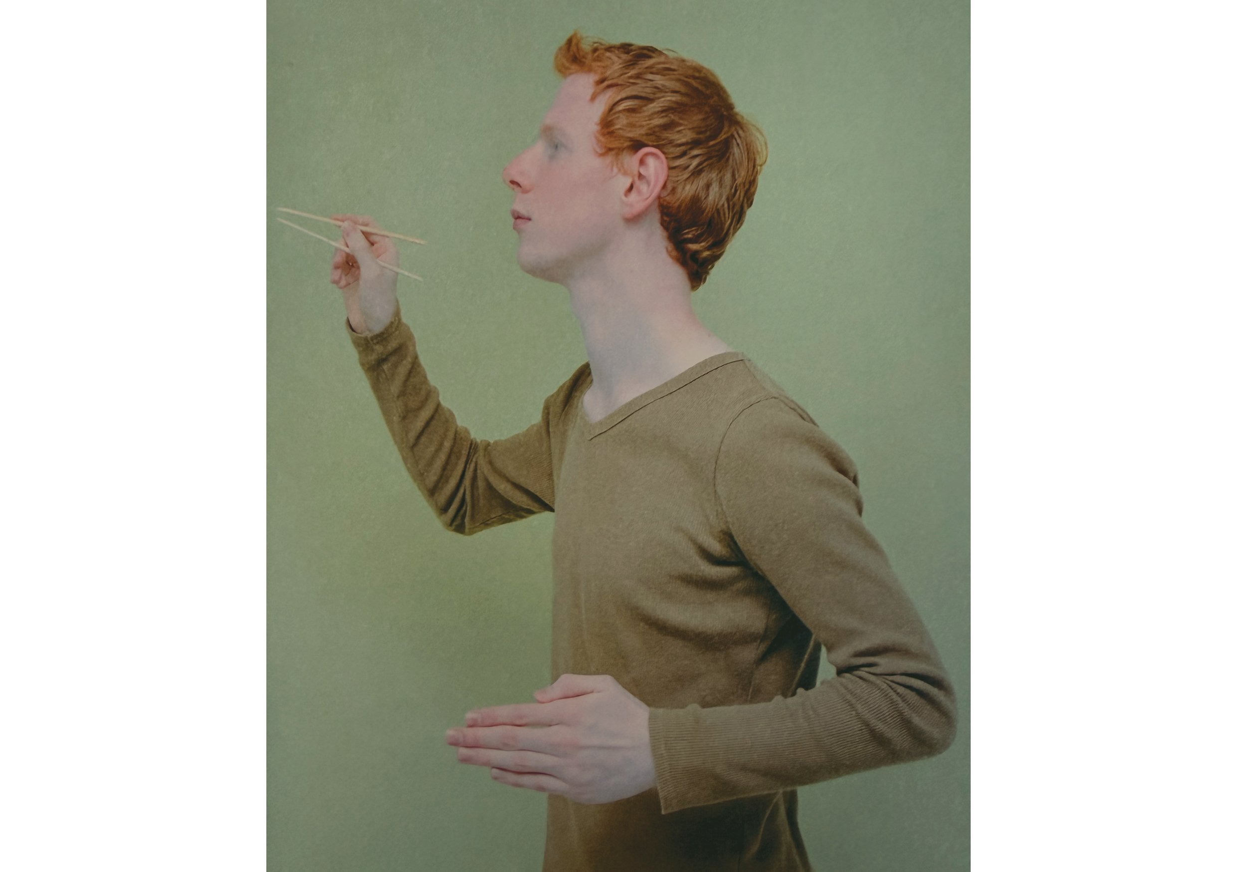
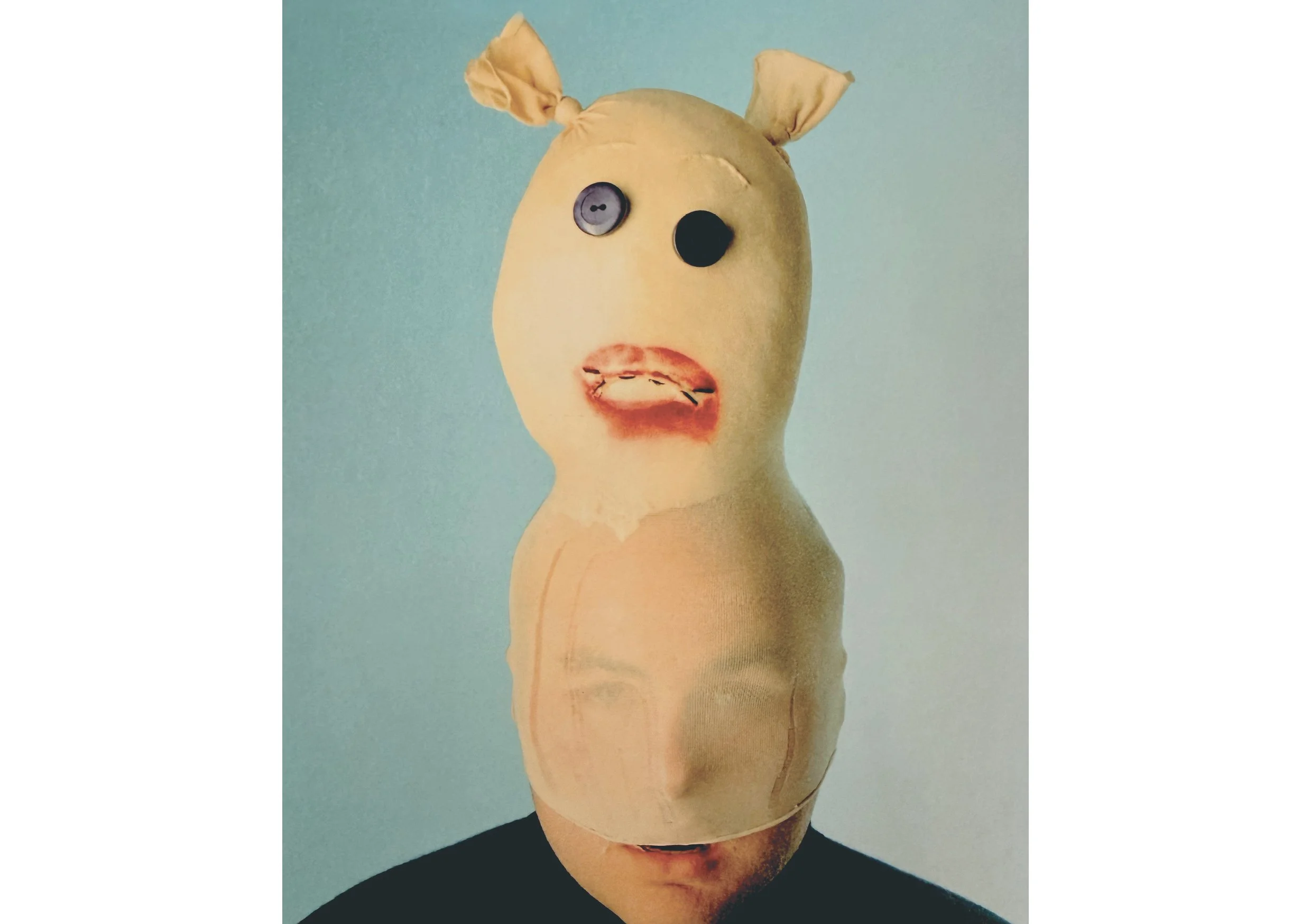
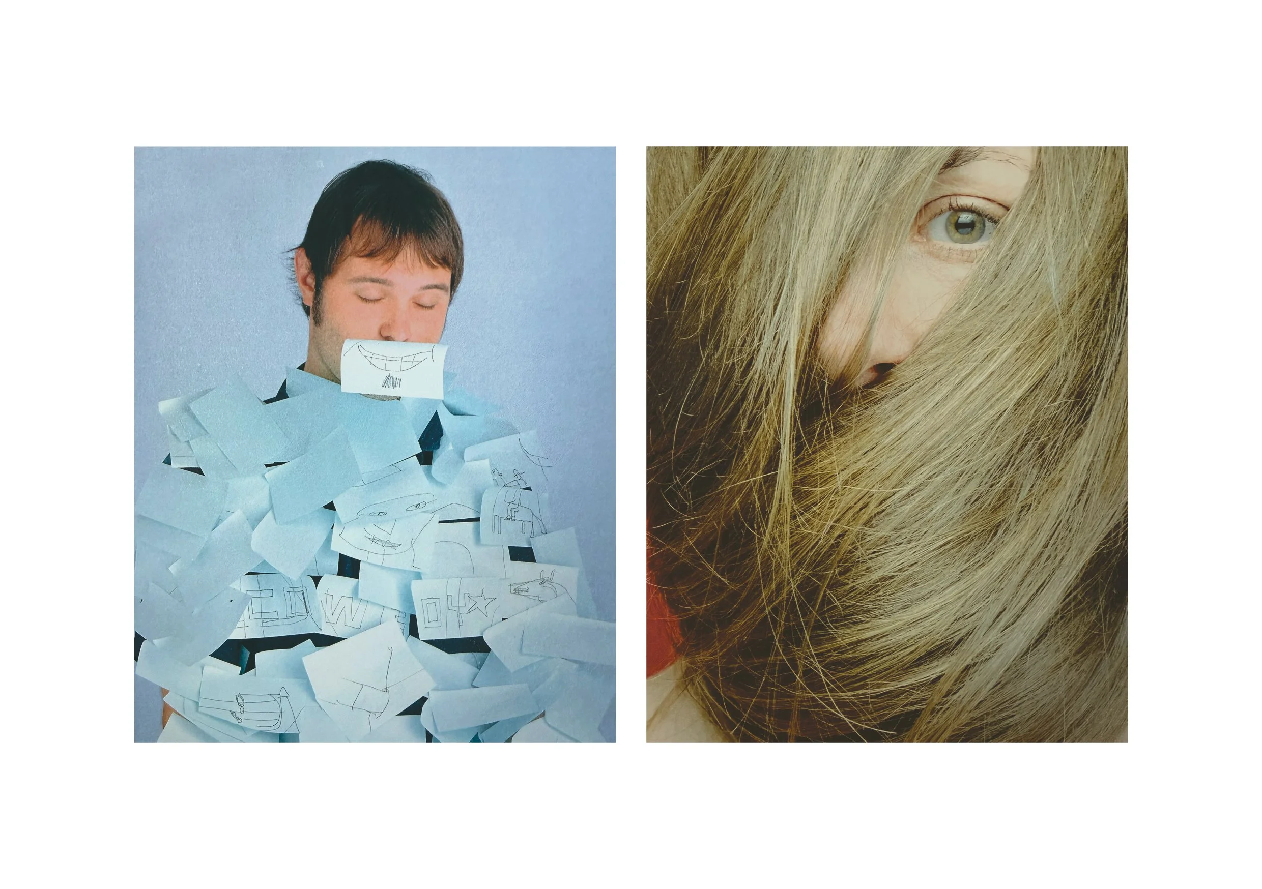
Creative ReviewCreative Futures was Creative Review’s new talent program that ran from 1990 to 2008. It provided a platform for young talent via a special issue of the magazine and an exhibition that featured in the windows of Selfridges thanks to their sponsorship. Many of the celebrated talent went on to great things - Bruce Duckworth and Angus Hyland in 1990, Paul Neale in ‘91, Tiger Savage in ‘94, Tom Hingston in ‘96, Chris Cunningham in ‘98.
Jonathan and I created the campaign - shot by David Stewart - and exhibition for Creative Futures in 1999. We built it around Andy Warhol’s infamous ‘In the future, everyone will be world-famous for 15 minutes’ quote and we asked the 15 creatives to bring a prop that reflected (or not) their area of expertise to the shoot.
The 1999 Creative Futures featured Dawn Shadforth forPop Promo Direction, Daniel Brown for Multimedia, Fredrik Bond for Commercial Direction, and Sølve Sundsbø for Fashion Photography...they all went on to do big things in the creative industry.
The campaign, exhibition and book were featured in both D&AD and Graphis Annuals of 2001.
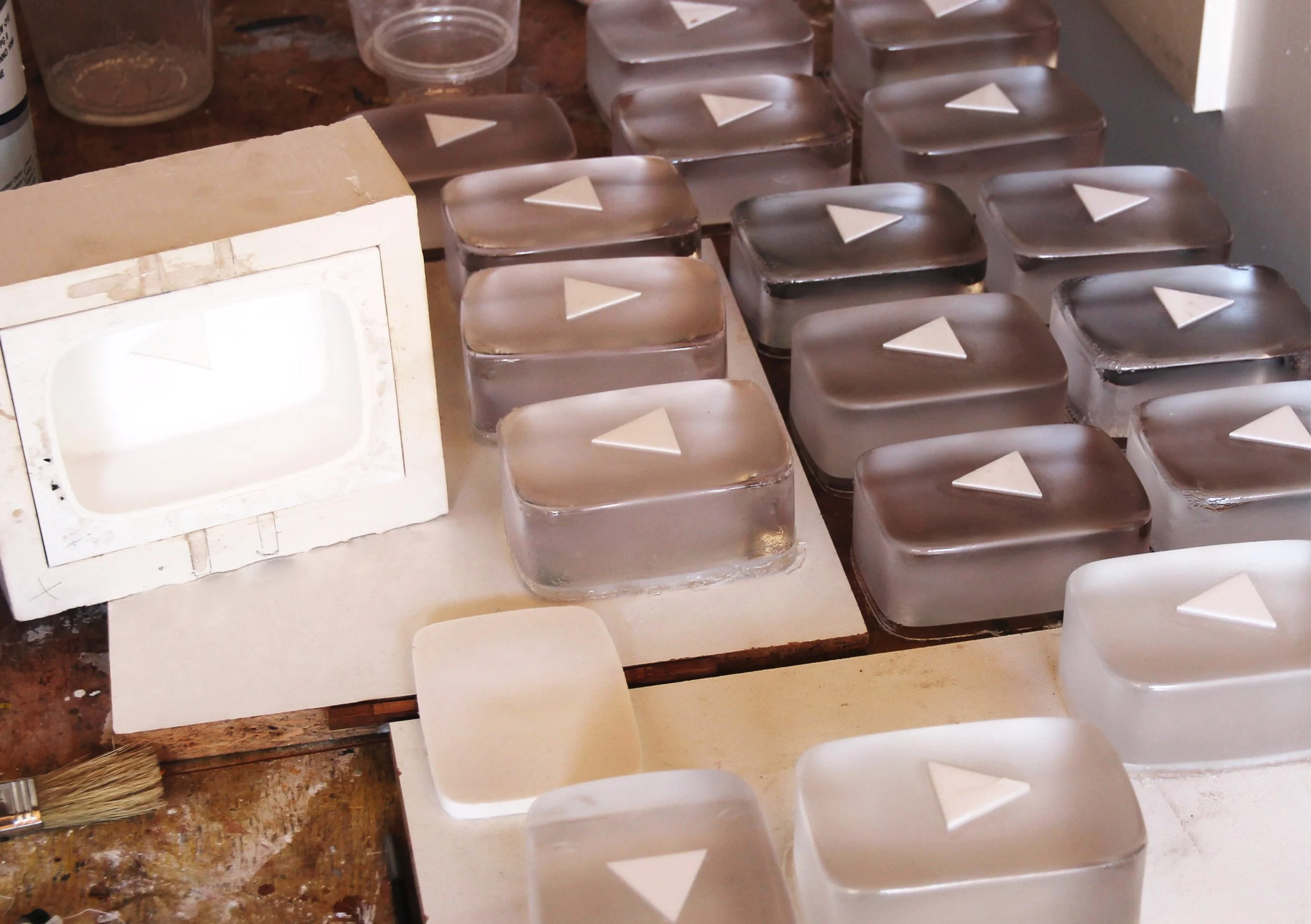
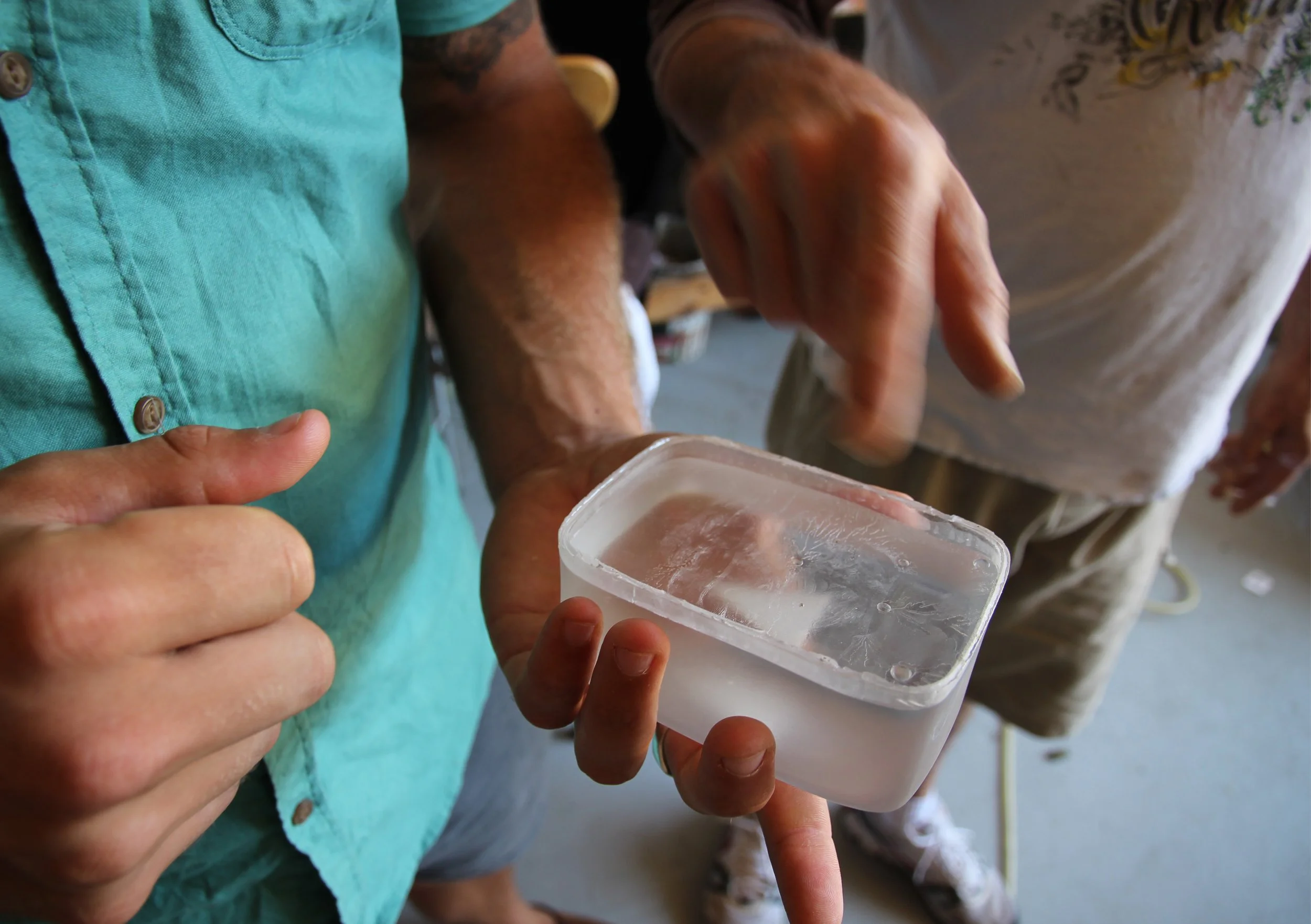
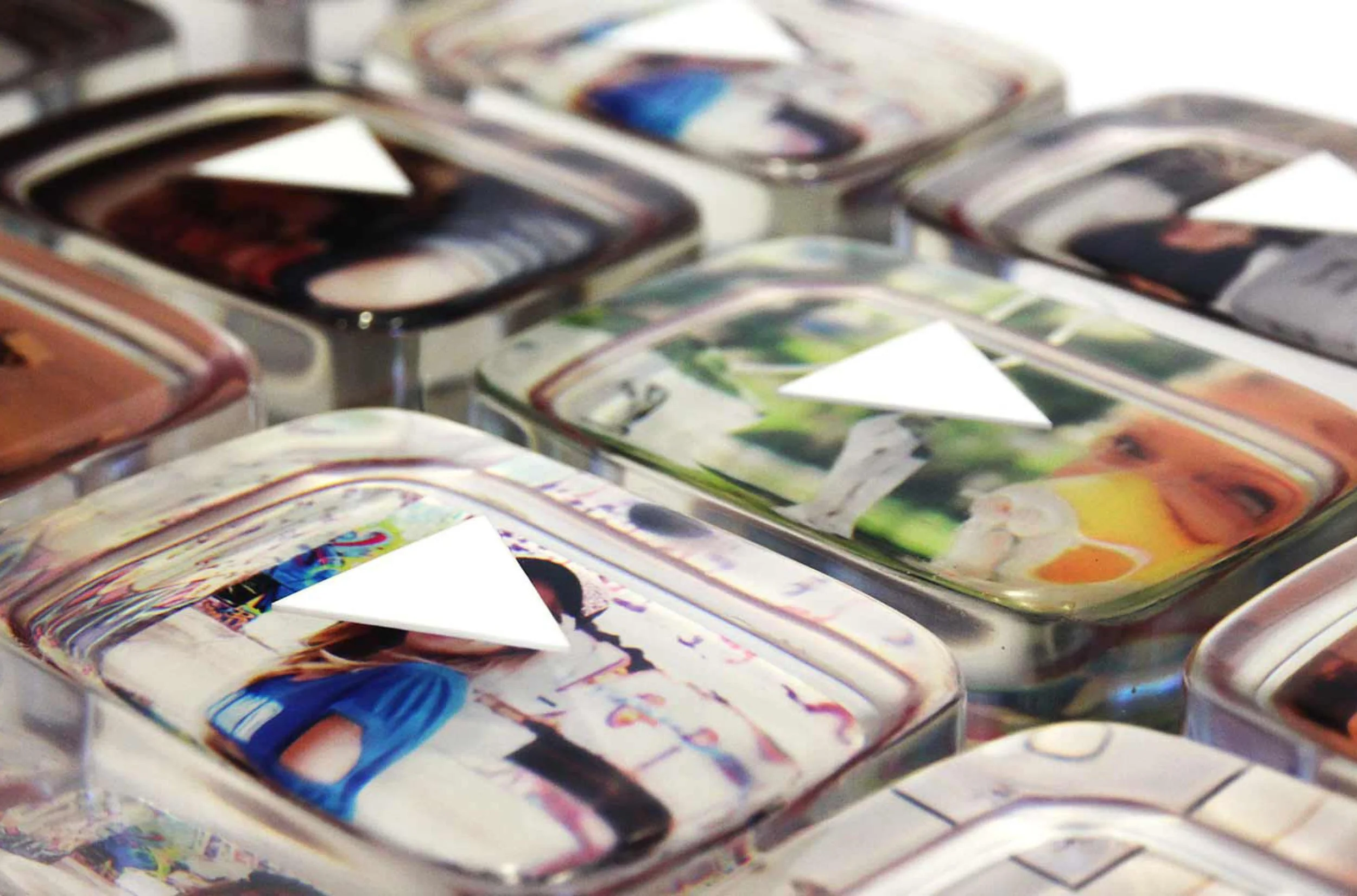
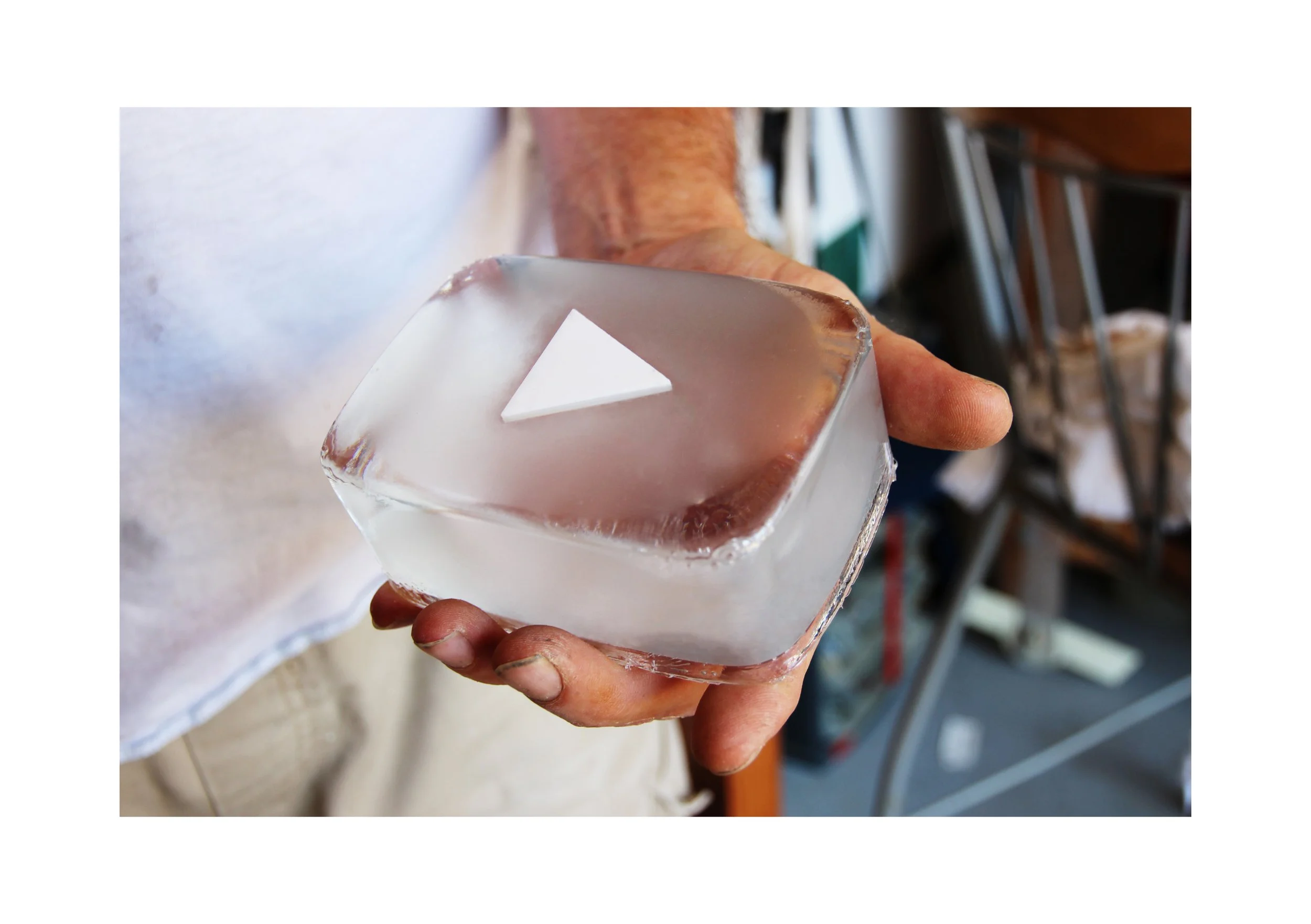
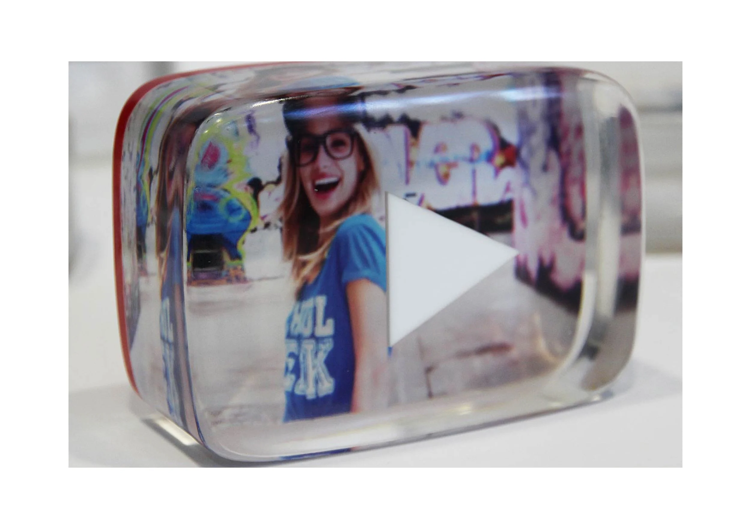
YouTube Awardsxxxx
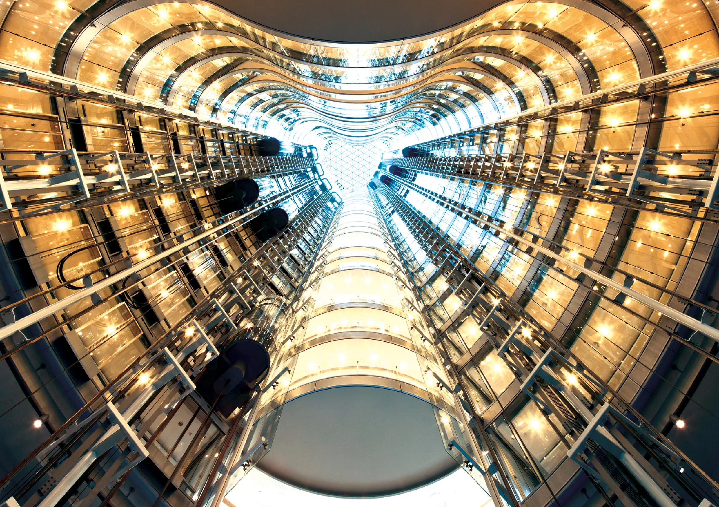
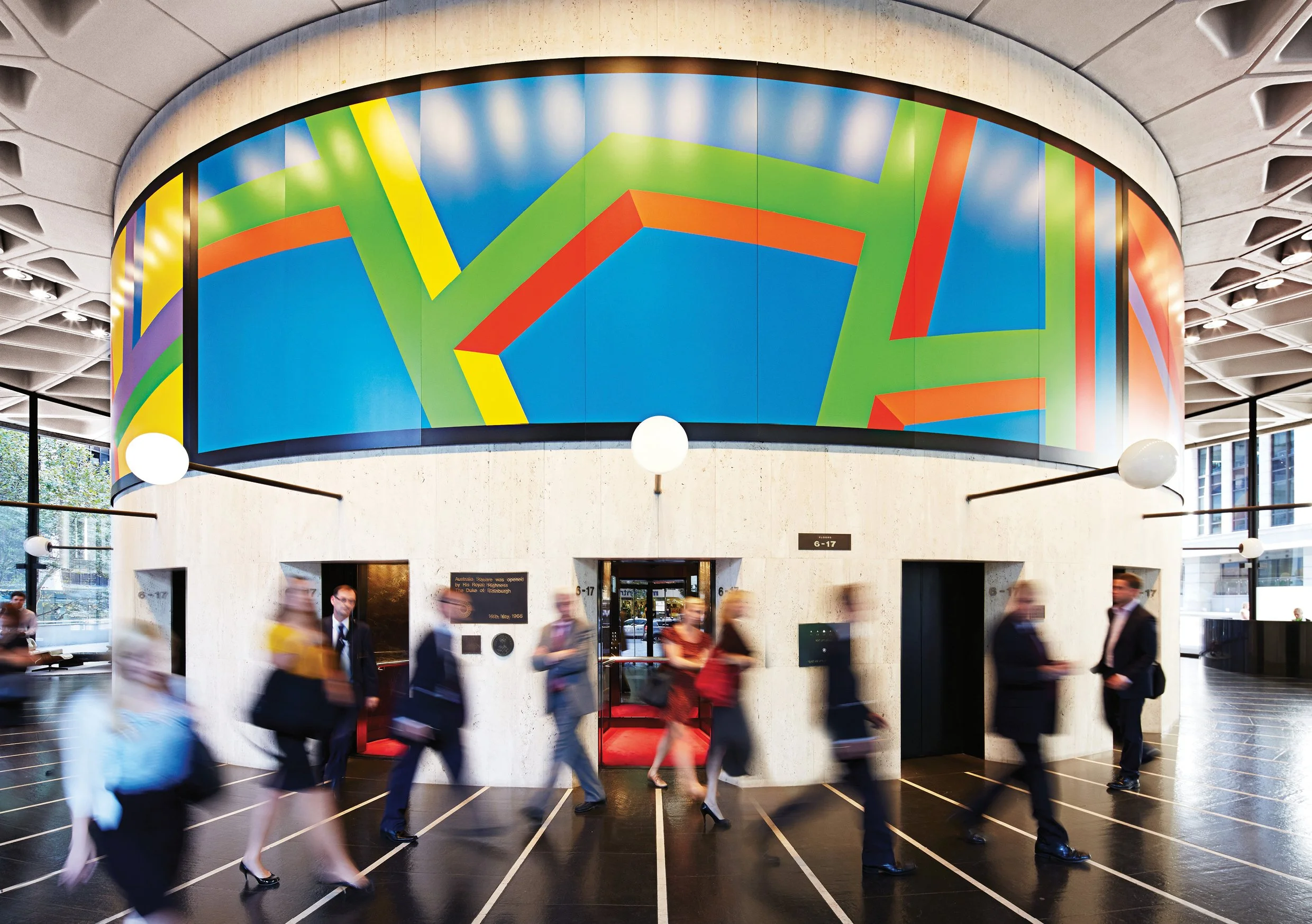
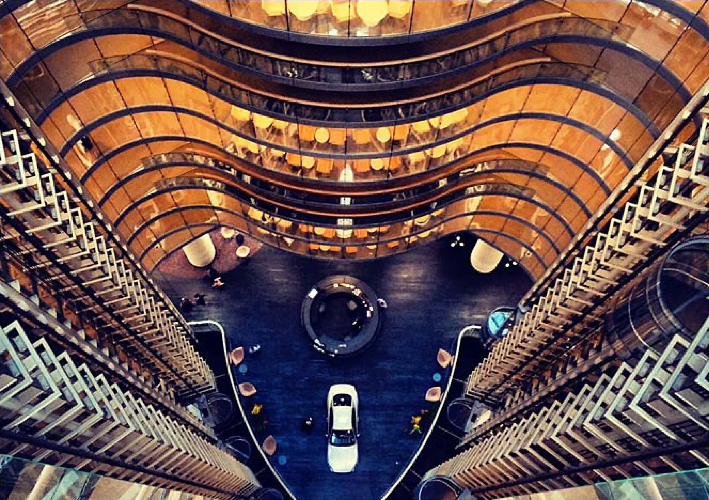
Platform by Dexusxxxx
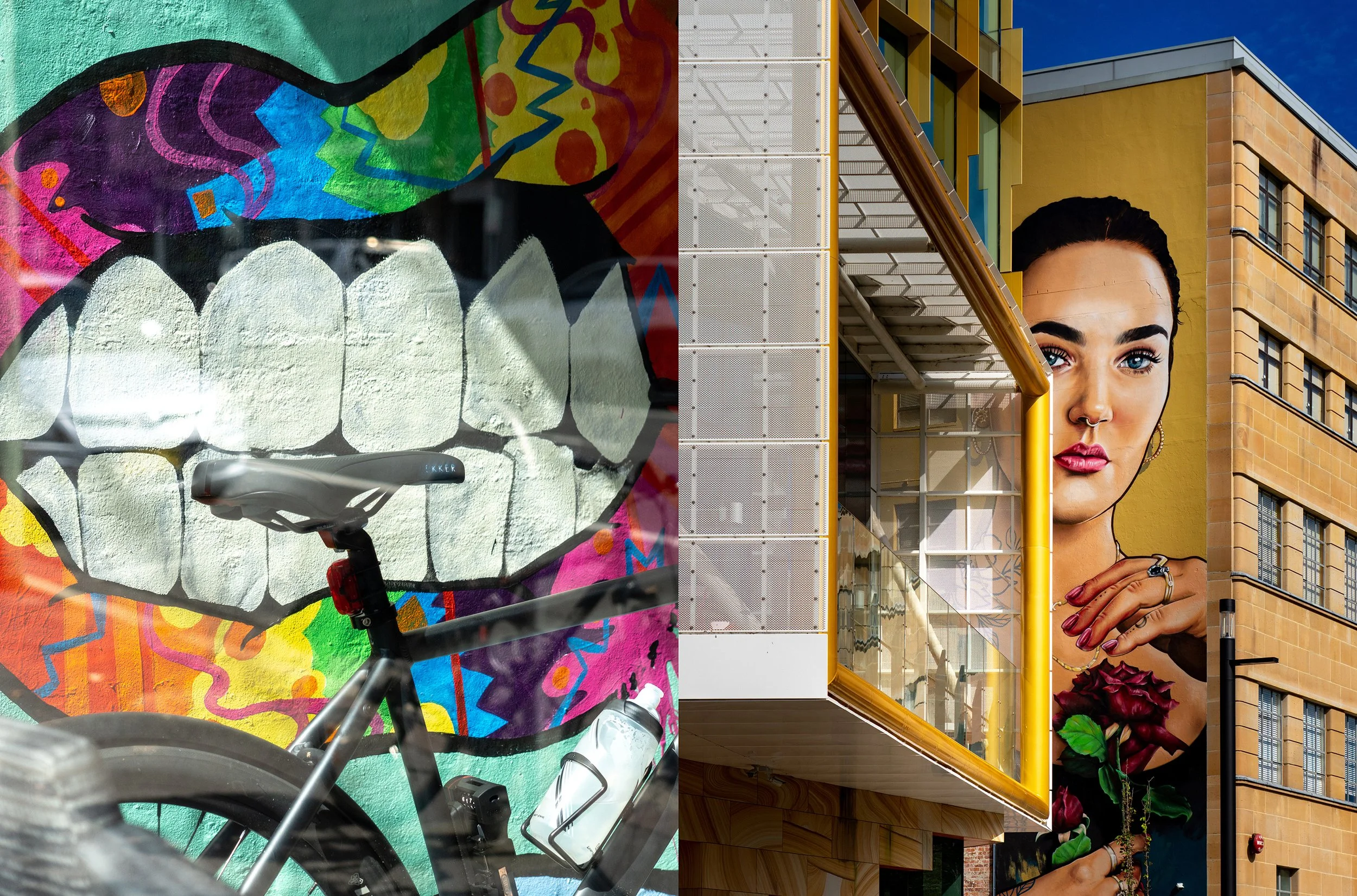
Various ProjectsA selection of archived work across naming, brand creation and identity, campaigns, and experiential projects.
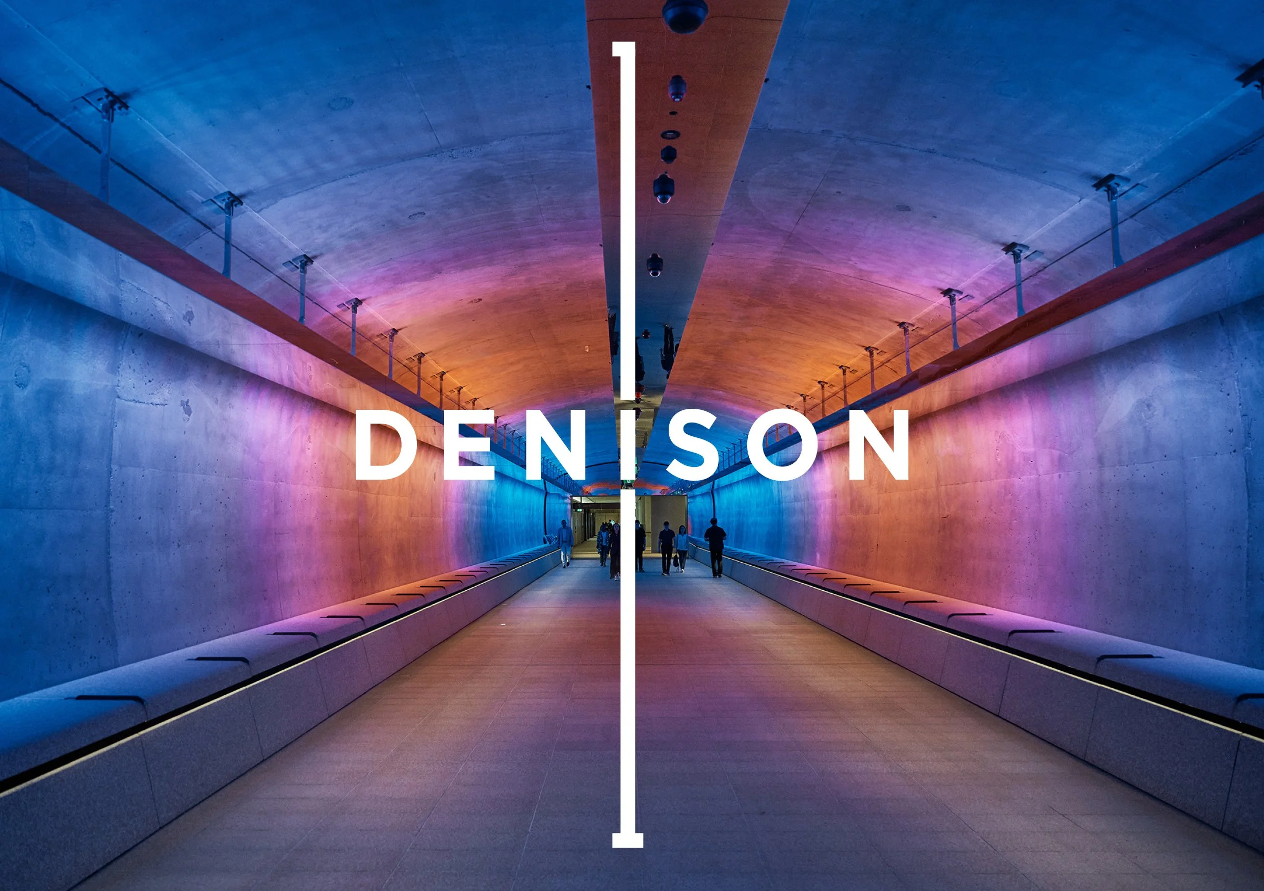
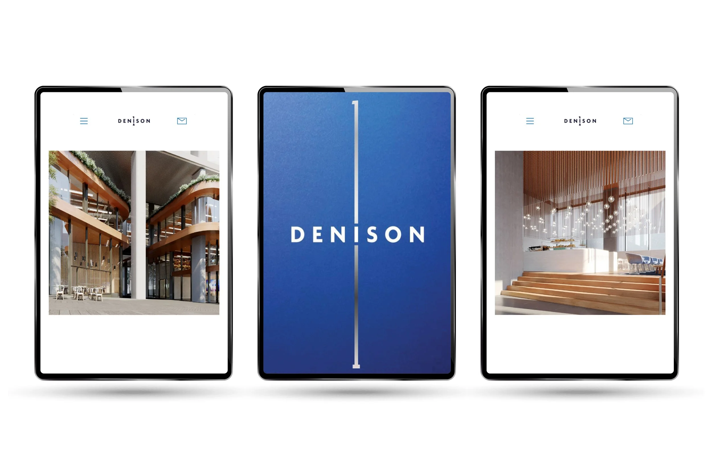
1 Denison Street for Winten

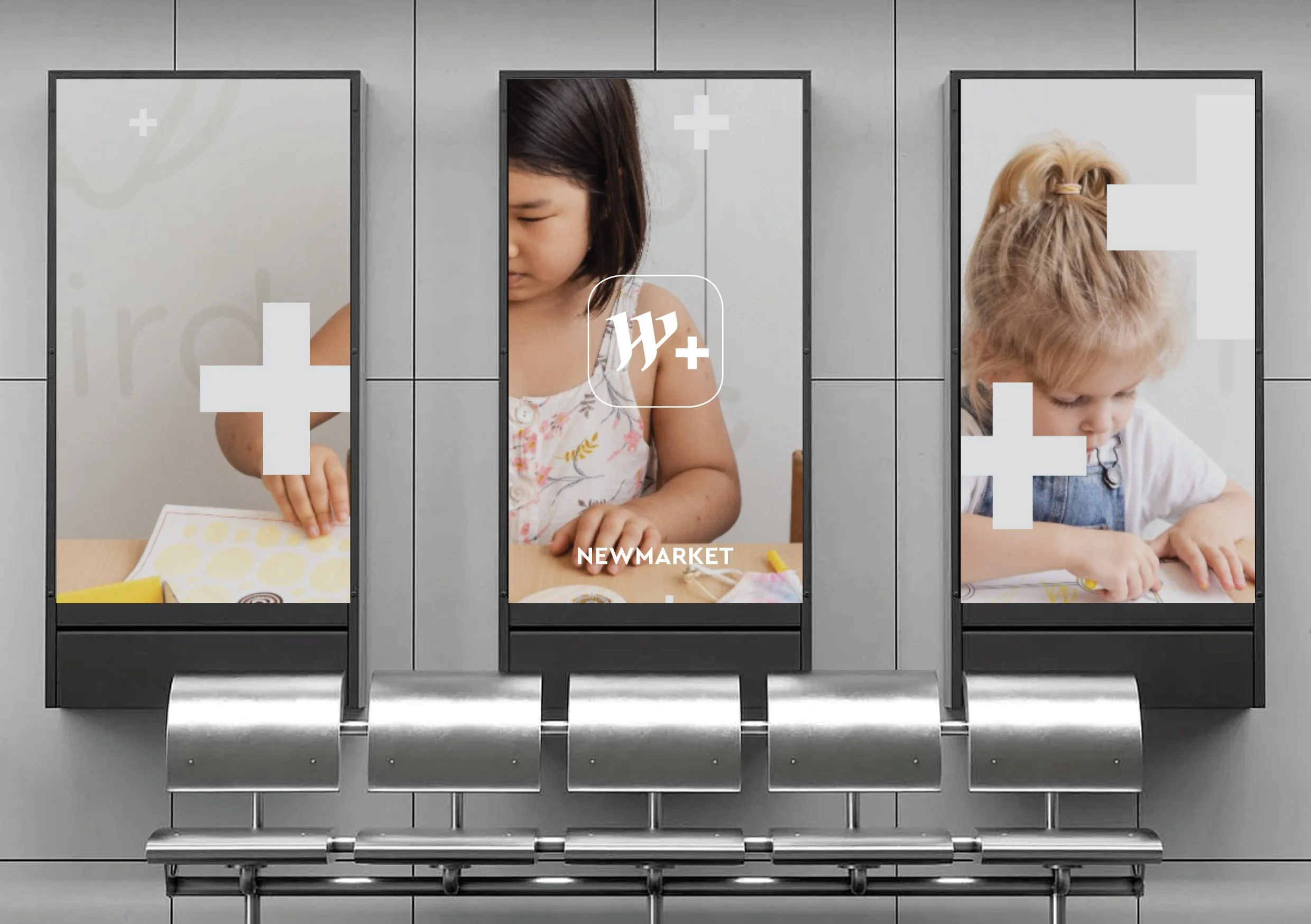
Westfield Newmarket

Alchemy & Tea
Carrington Place
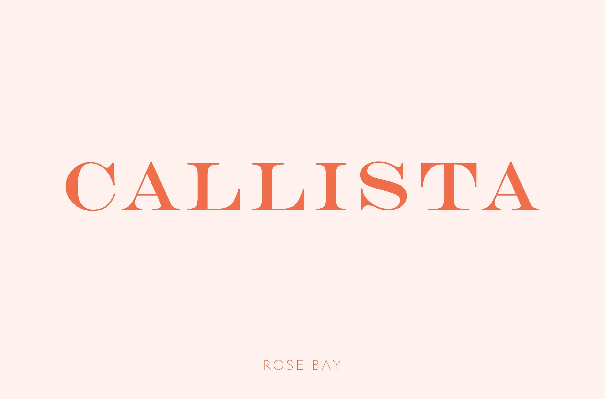
Callista Rose Bay
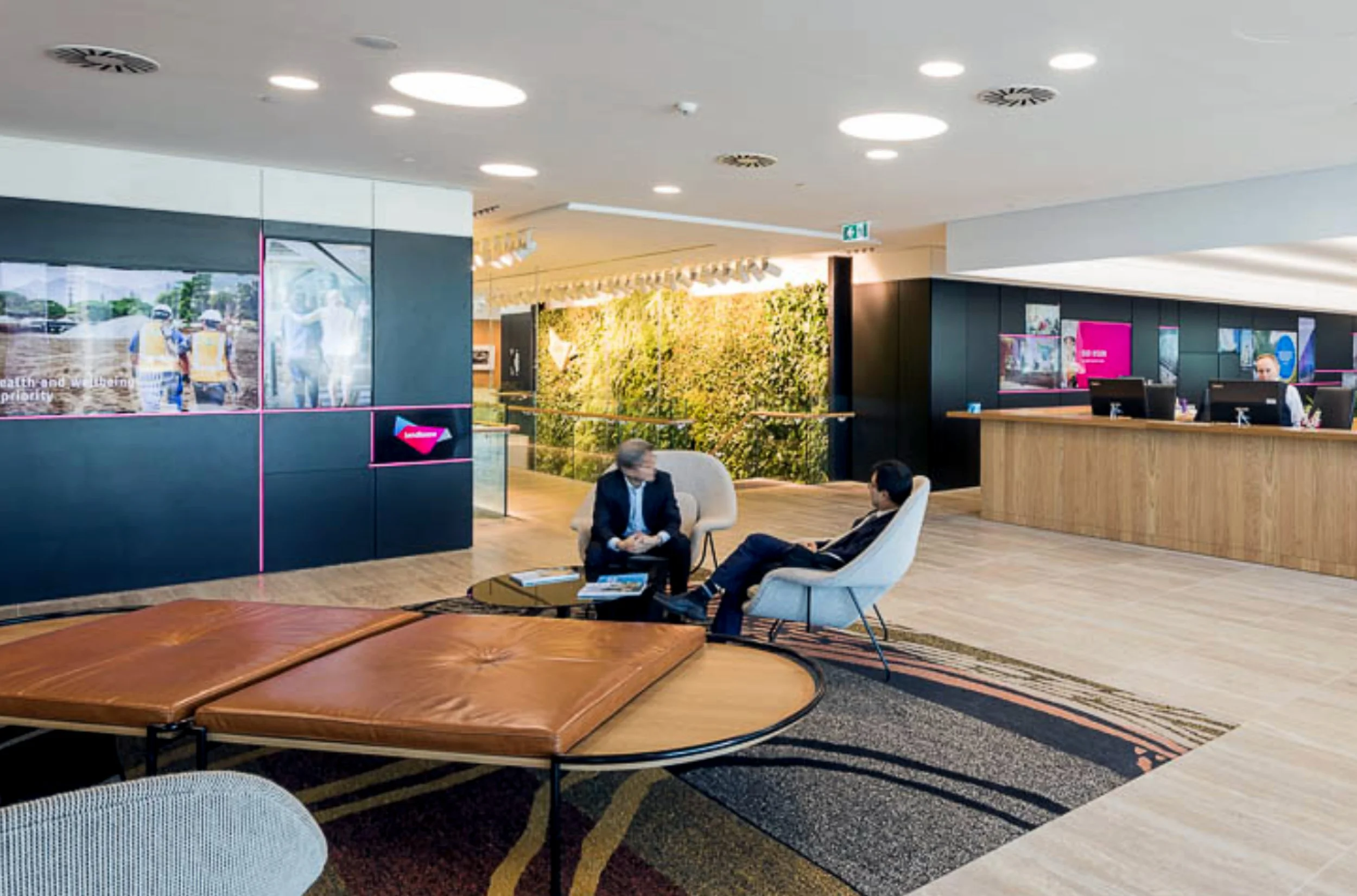
Lendlease HQ at Barangaroo

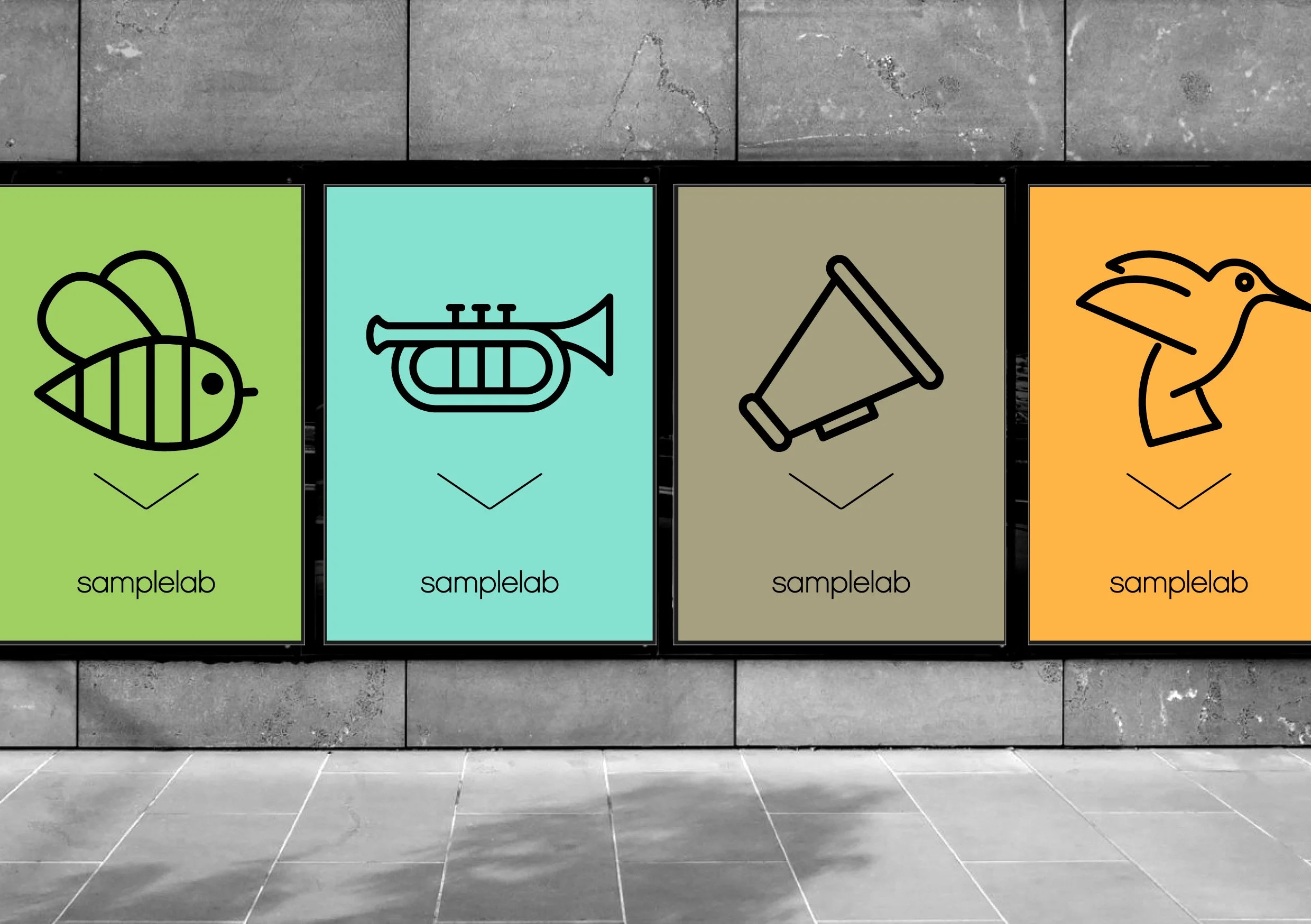
samplelab

Coke Summer
AusFilm

YouTube Fan Fest
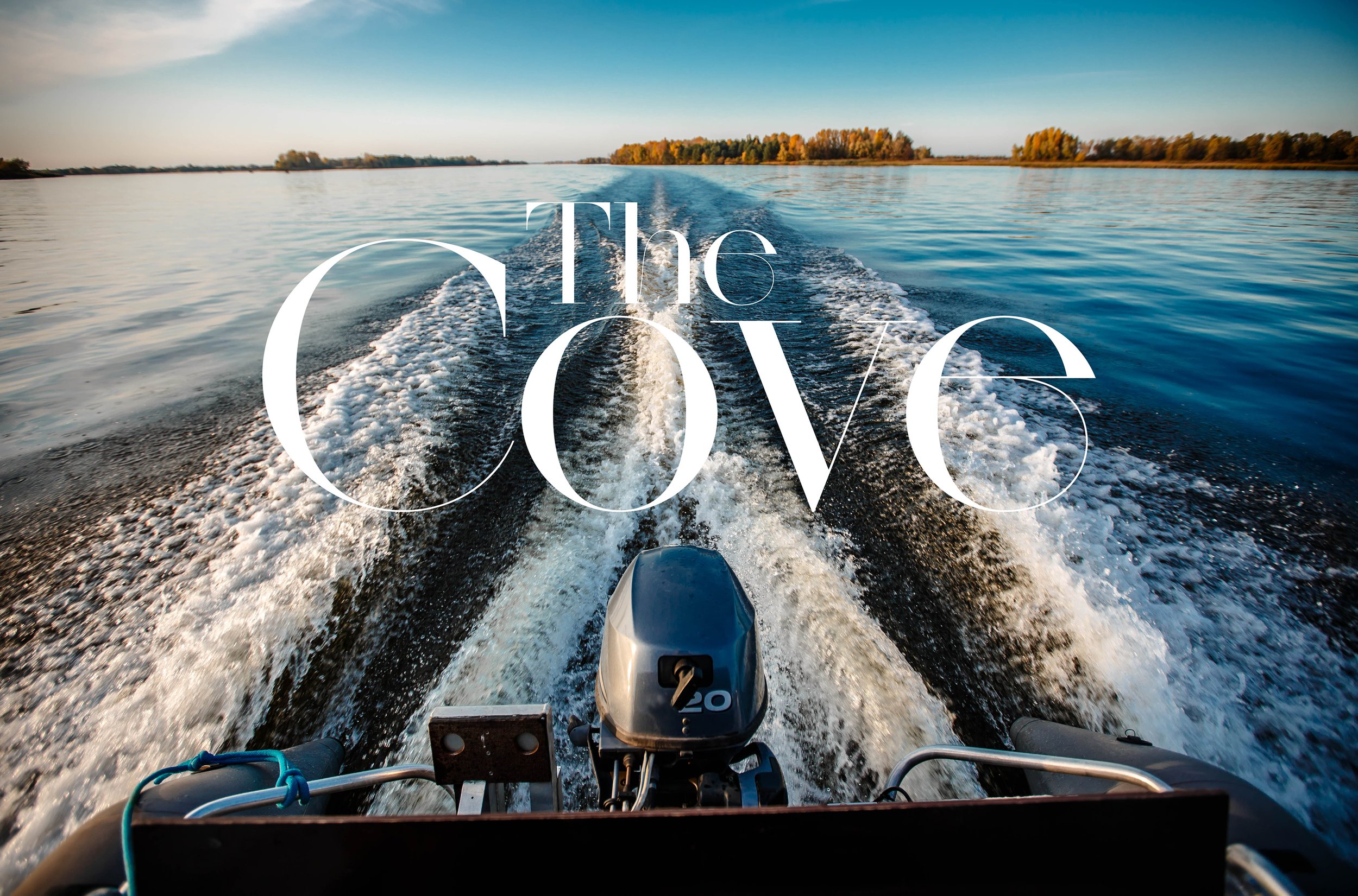
The Cove
Guinness Storehouse
ION
McGee Consulting
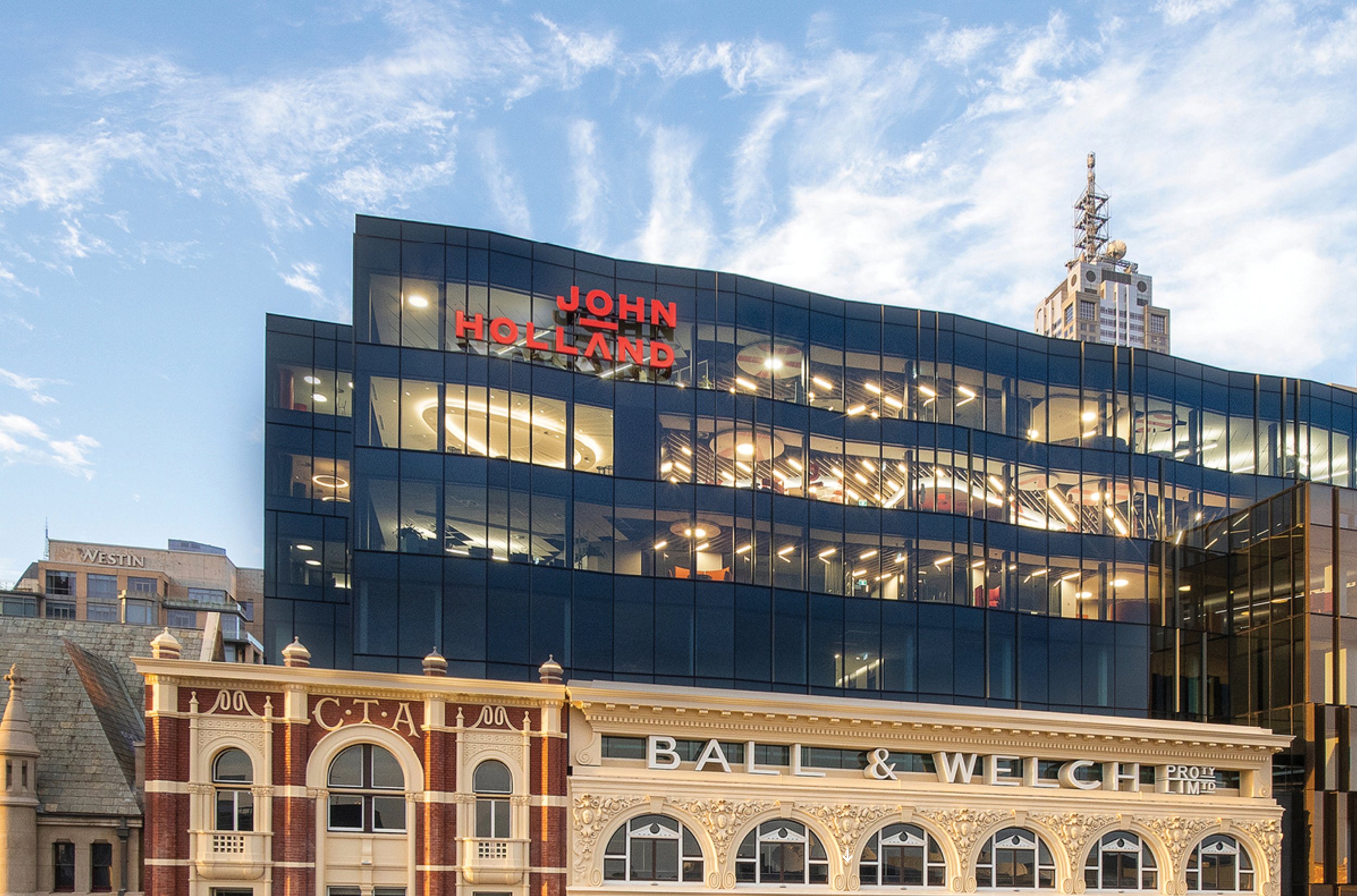
John Holland

Koda Capital
Russell Investments
The Art of the Brick for Lego
Innovation Lab App for Lendlease
NoVo Newcastle
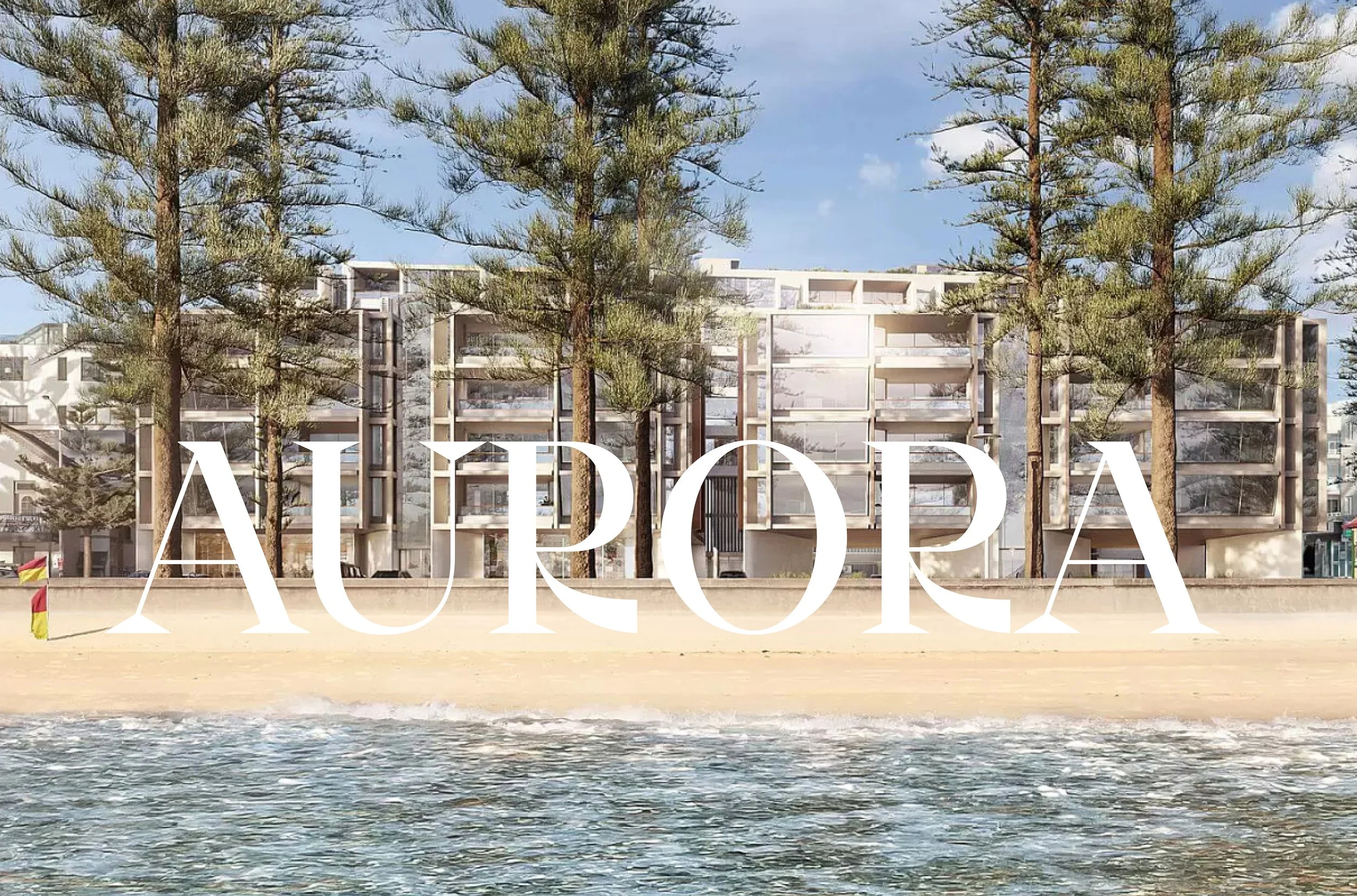
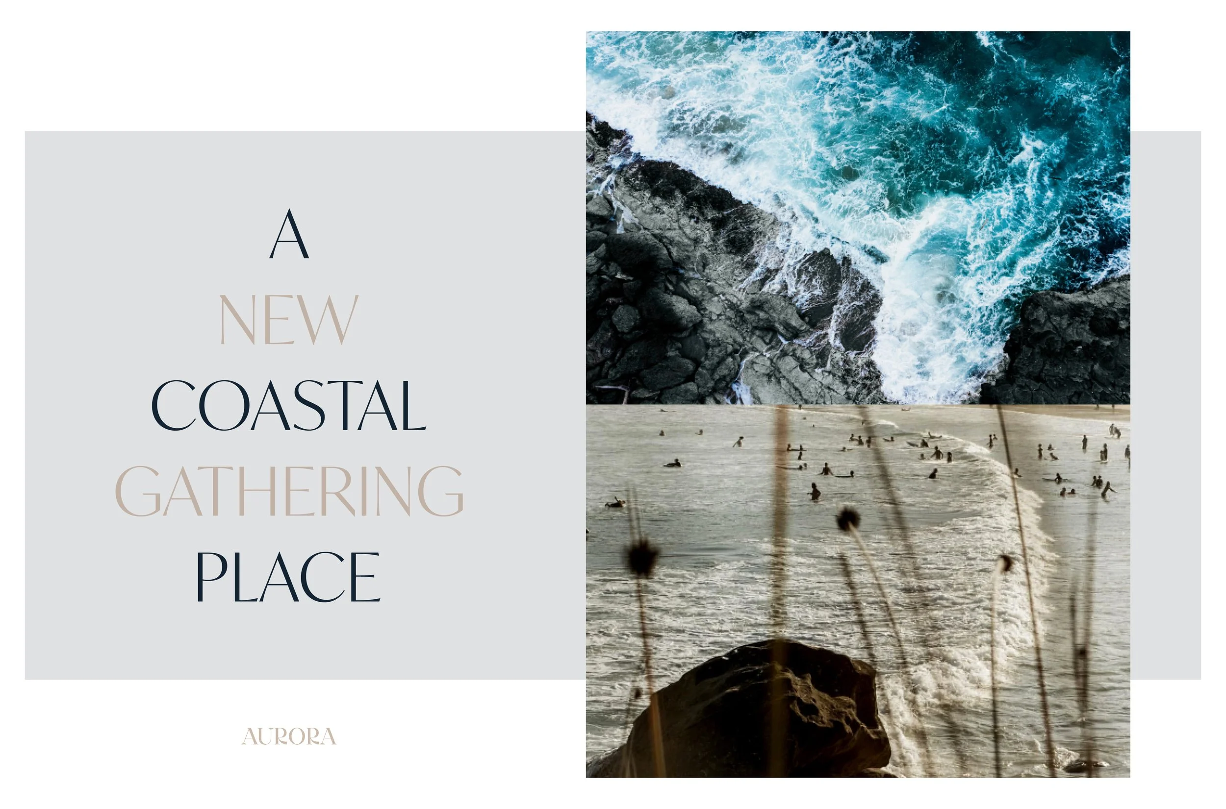
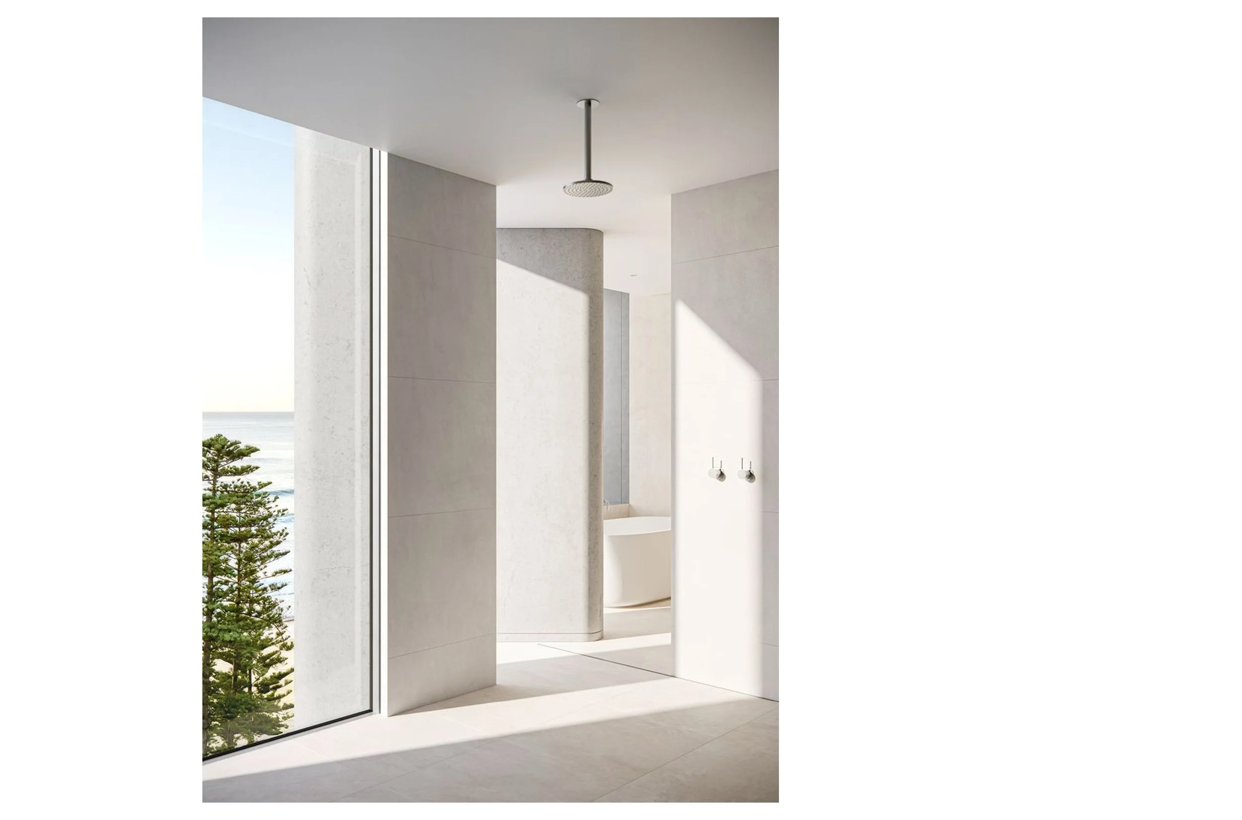
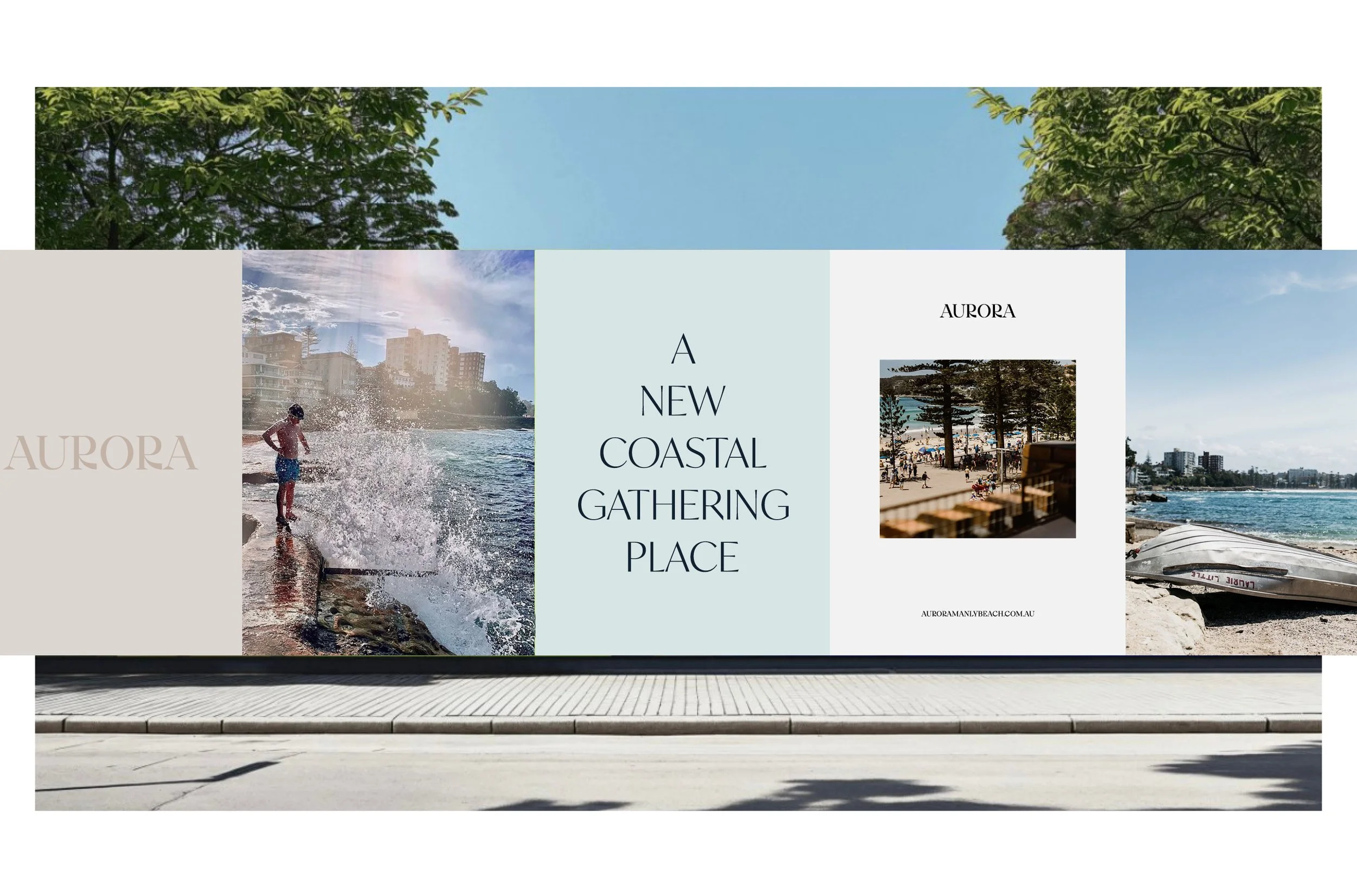
Aurora Manly
Mount Druitt for Westfield
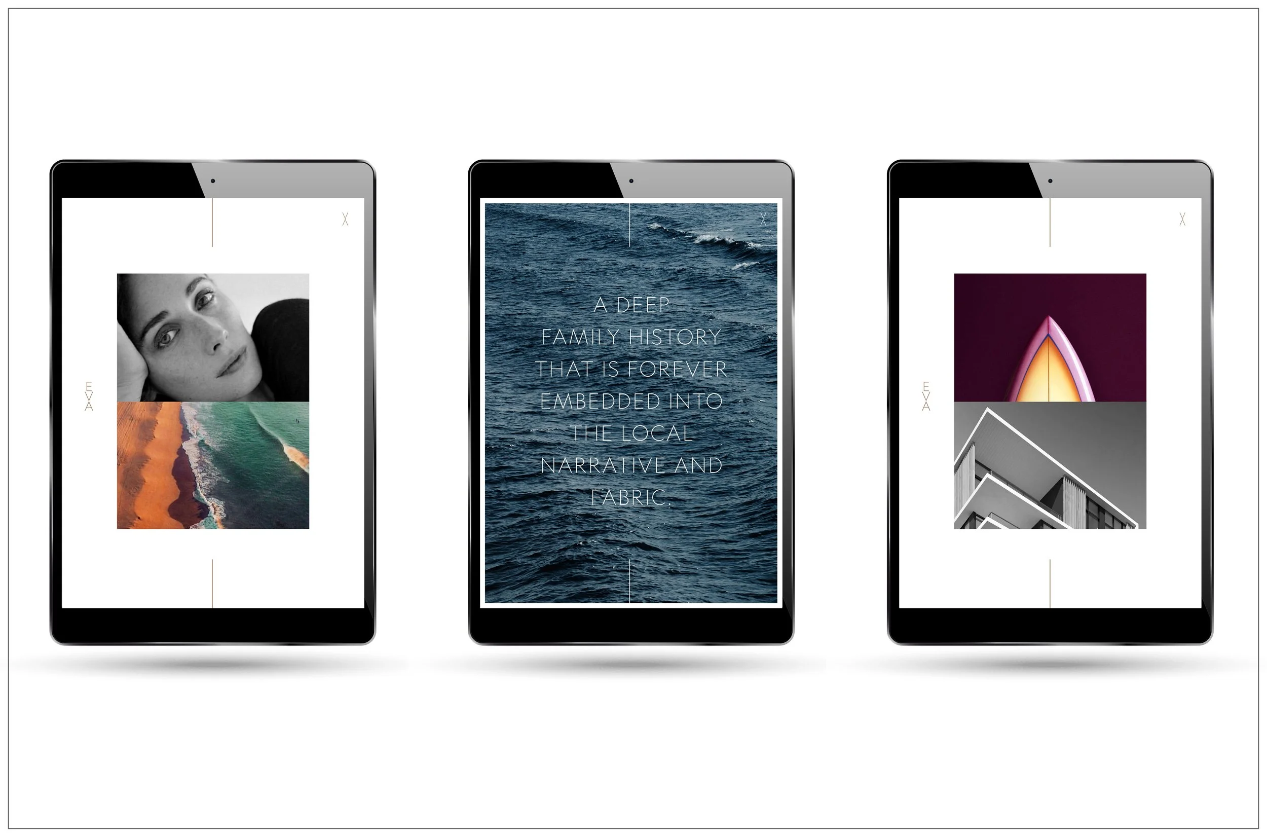
EVA at Palm Beach
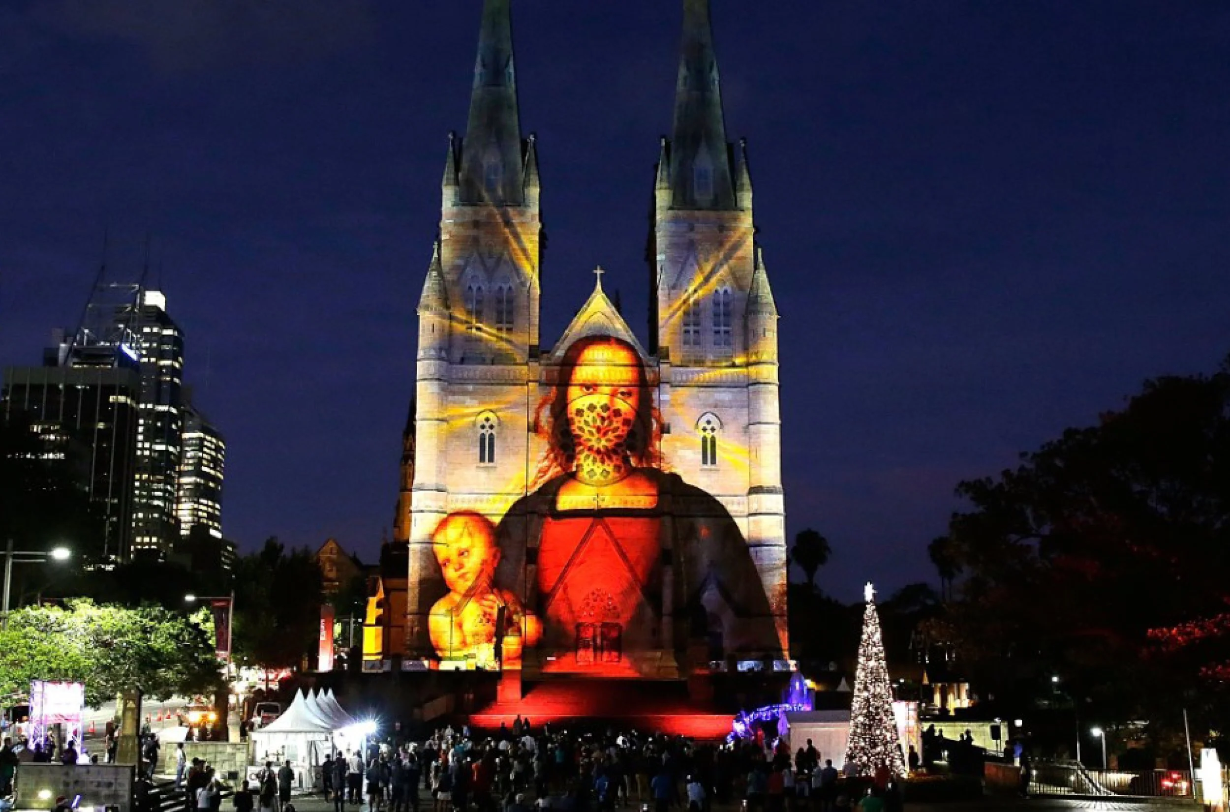
St Marys Cathedral
Serrata at Blakehurst
Westfield Newmarket
Flowers for Martin Parr
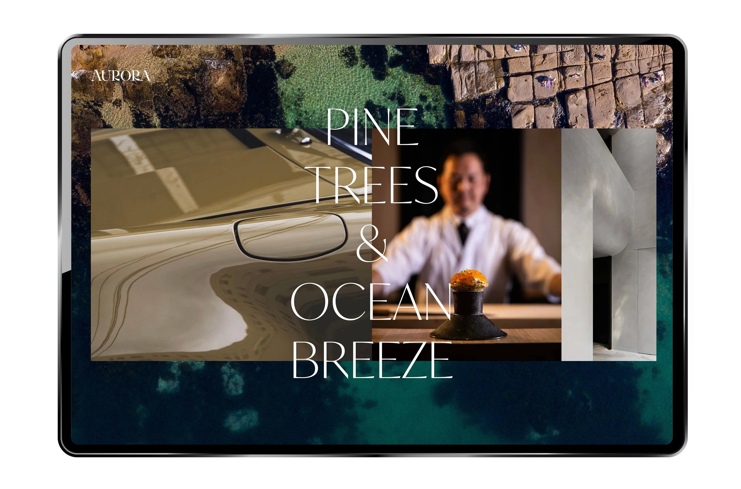
Aurora Manly
NoVo Newcastle
Westfield Newmarket
sibling at Palm Beach
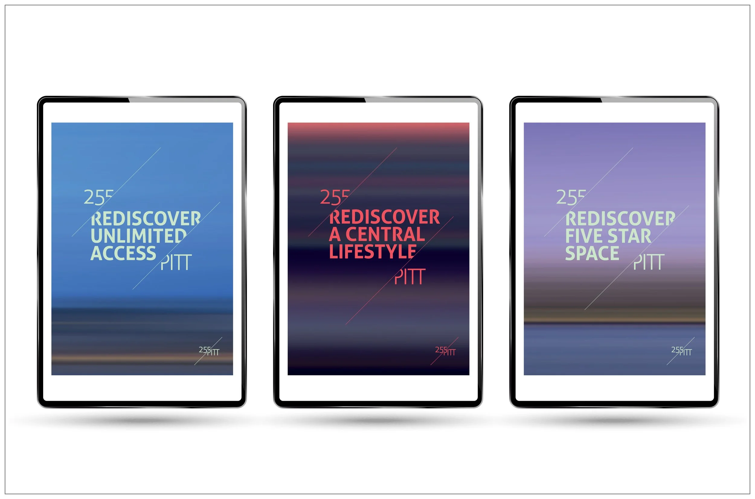
255 Pitt Street

Orchard Hills
Rolls Royce

Sculptra for iNova Pharmaceuticals
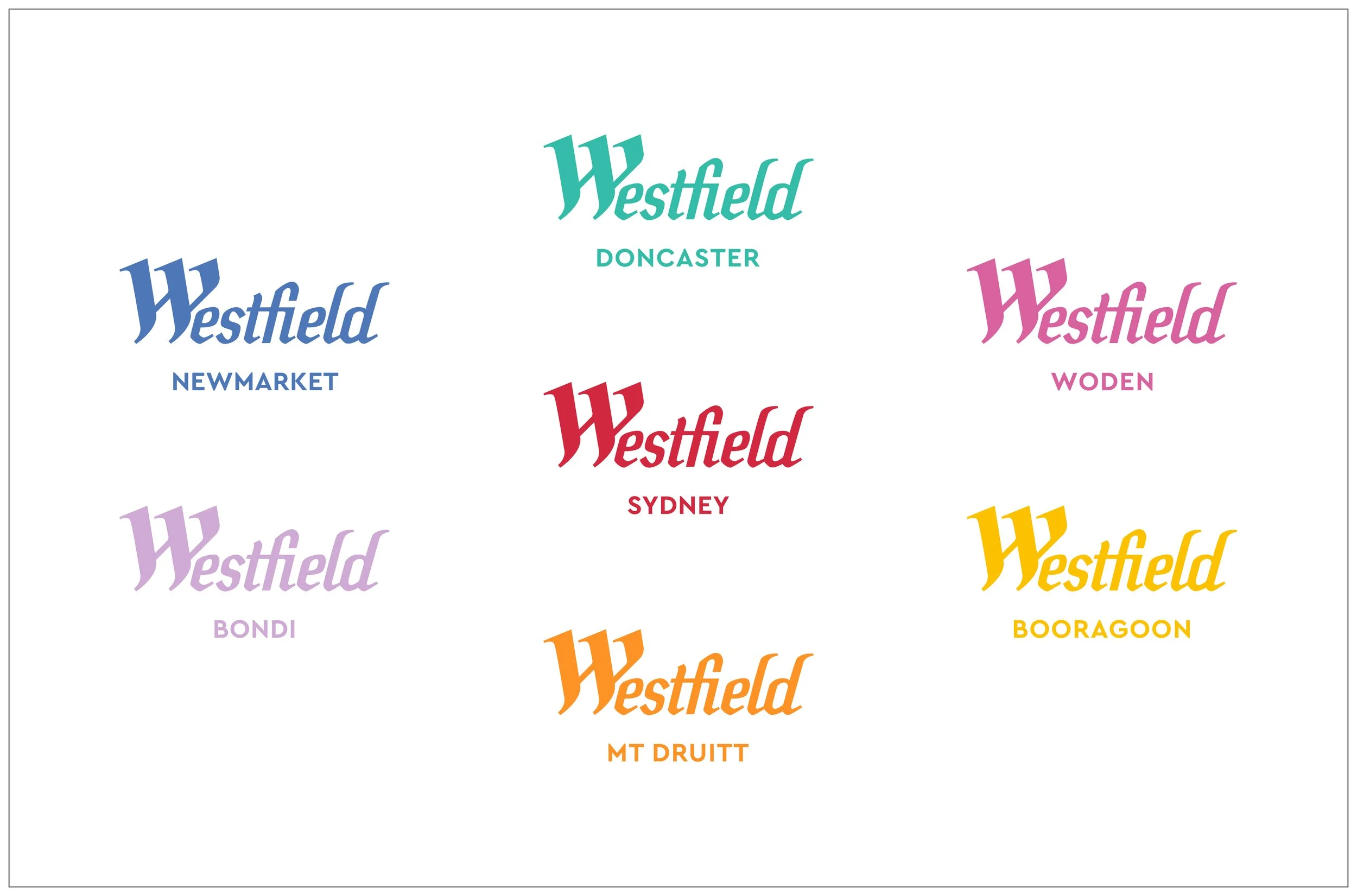
Westfield
Westfield Newmarket
YIRA
Peter Bailey
The IVY
samplelab
Stop.Edit.
Affinity Agency
NUBO

Taylors Rise
YIRA
McGee Consulting
European Cliches for Martin Parr
Russell Investments ETF Campaign

samplelab x adidas

Caliburn Partnership
1 Denison Street
Aurora Manlyxxxx
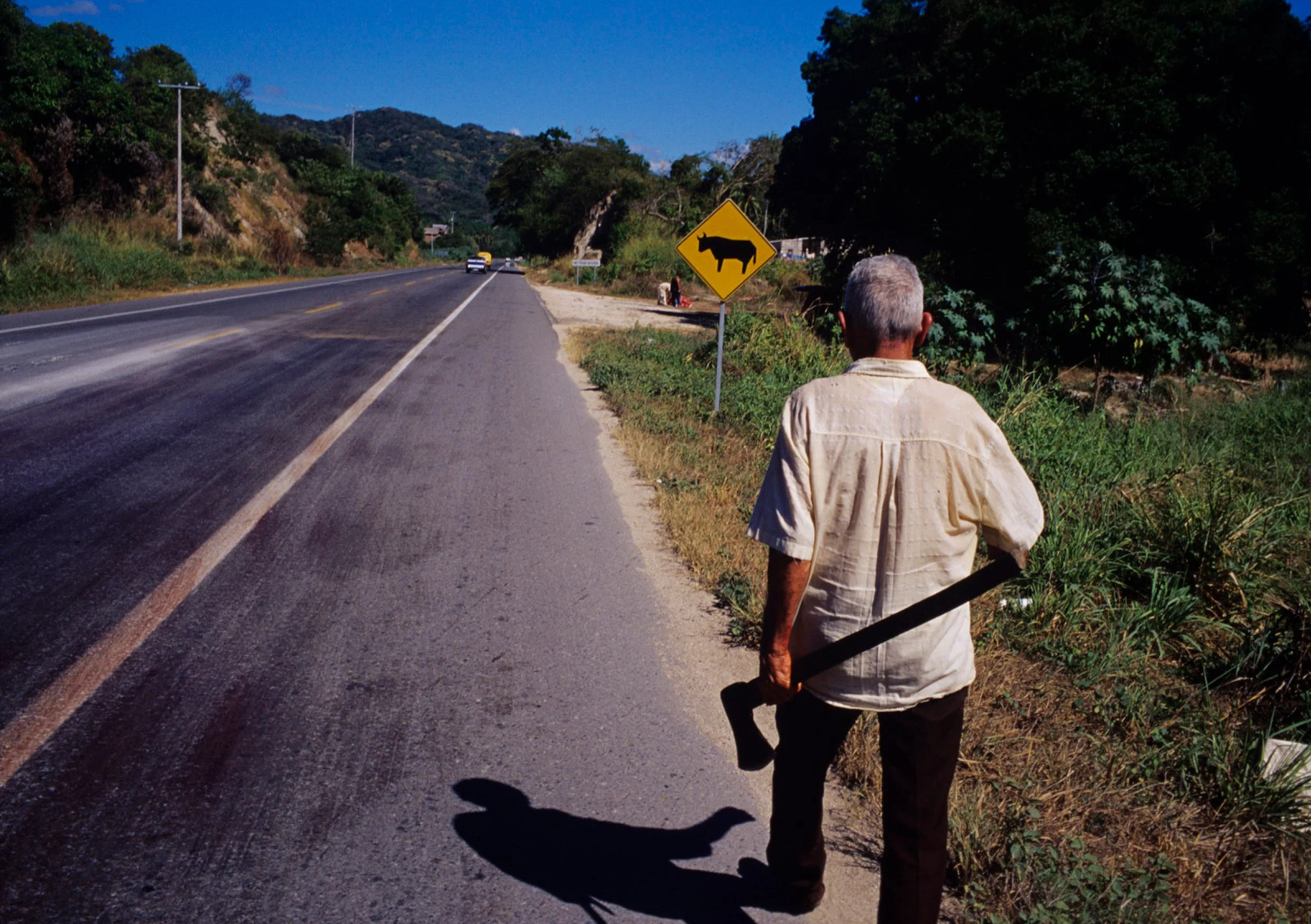
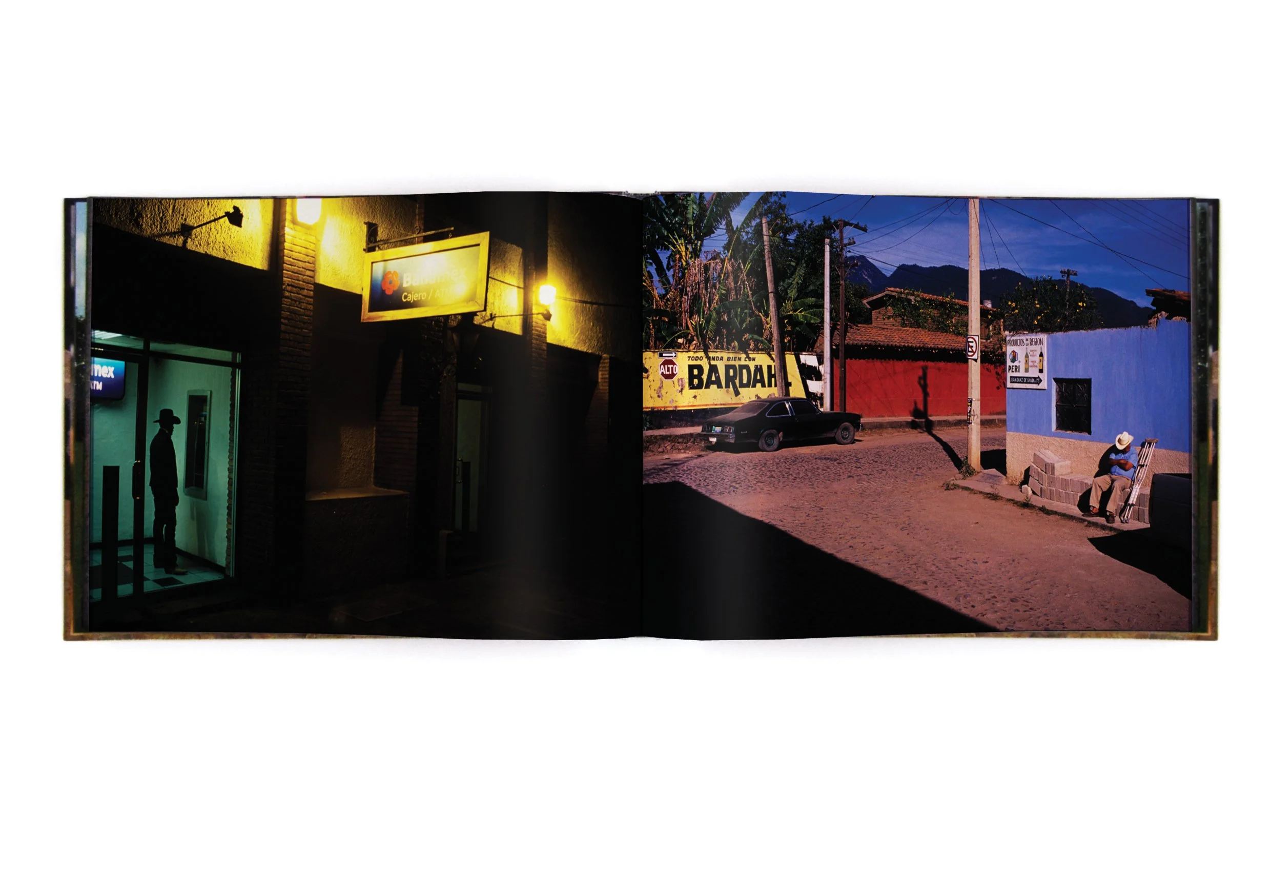
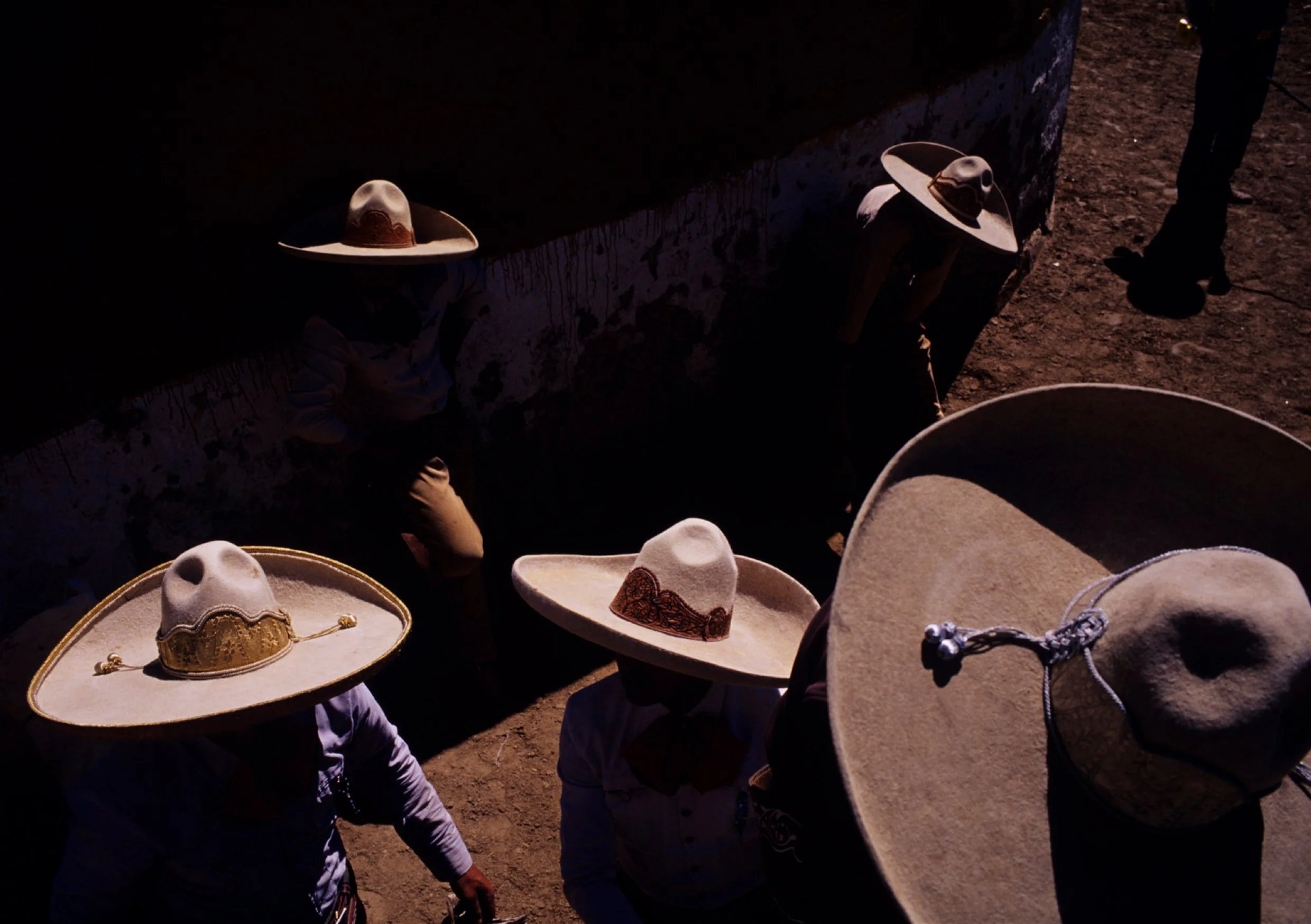
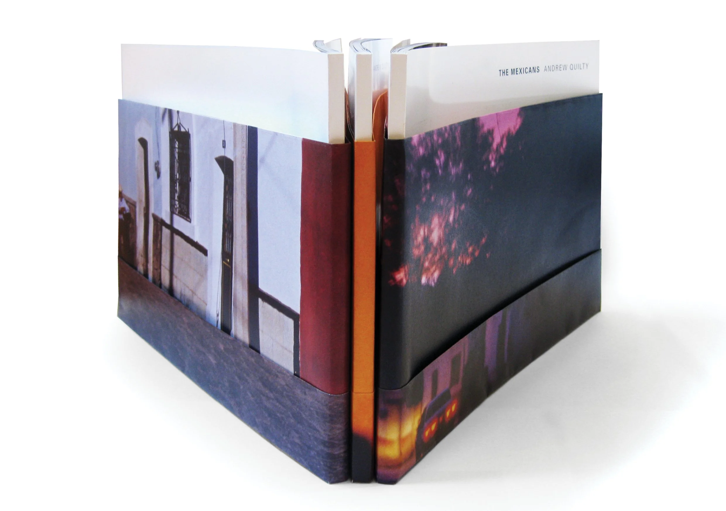
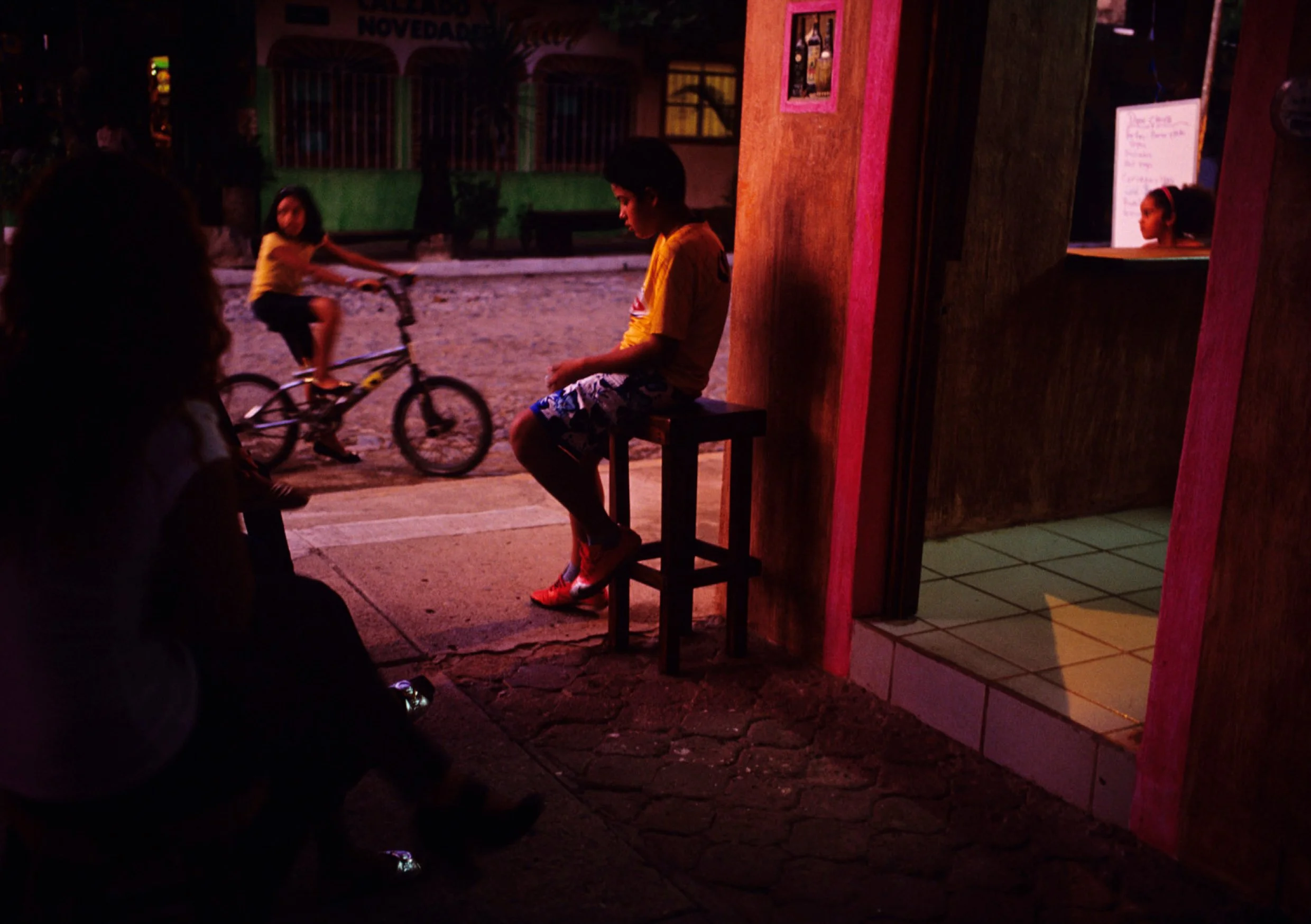
Andrew Quilty - MexicansI designed and published ‘The Mexicans’ for Andrew Quilty. The 120 page book documented his four month, 15,000km journey across 22 Mexican states.
Available in a limited edition of 500, the book was wrapped in three alternative A1 signed prints, and was launched by artist Nicholas Harding during The Mexicans exhibition at the Maunsell Wickes at Barry Stern Galleries.
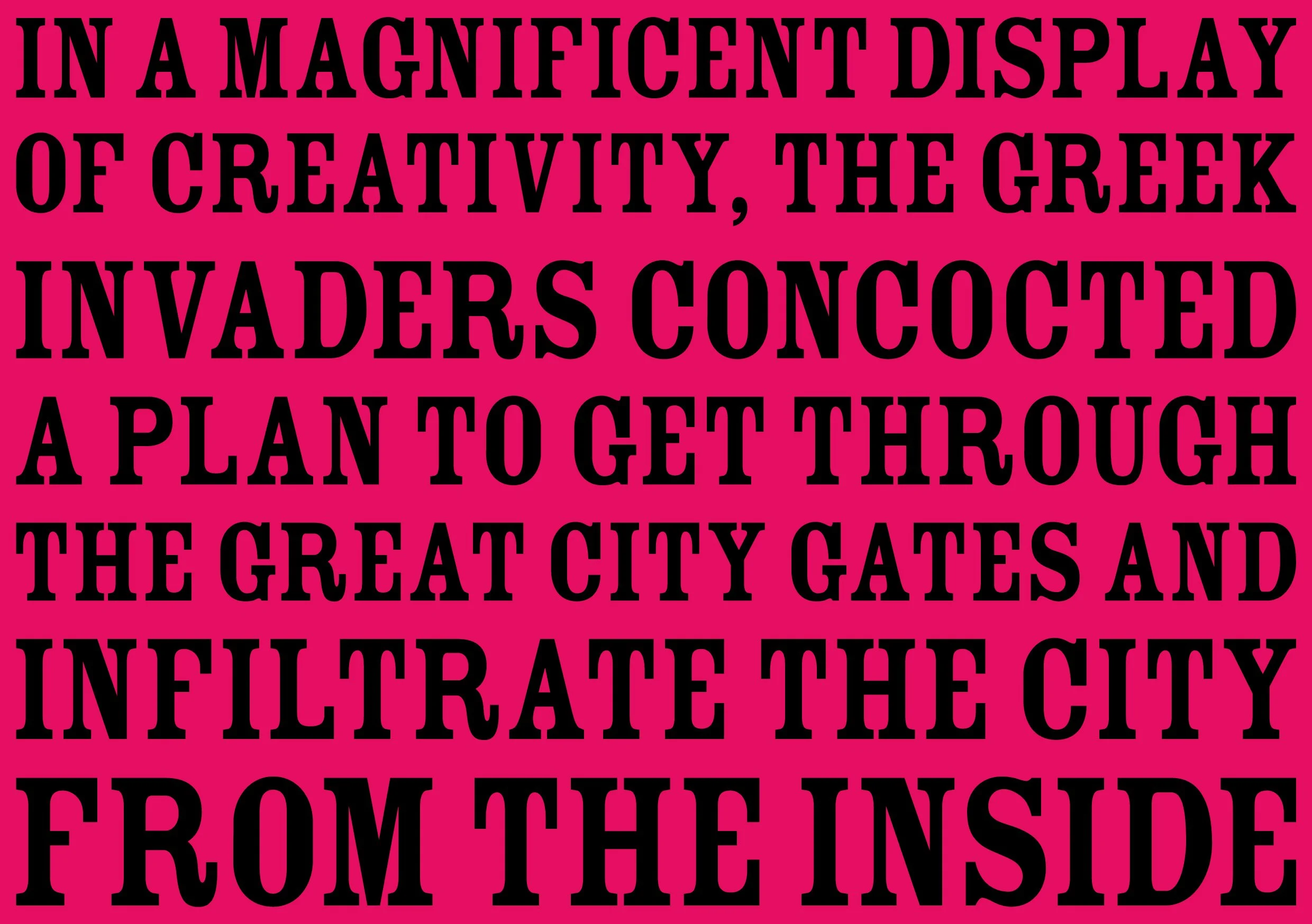
SalmatSalmat was an Australian multi- channel marketing company with headquarters in Sydney. Its clients included Woolworths, Target, Telstra, and the Australiam Government, and at its peak had over 4,000 employees. It was founded in 1979 in Sydney, Australia by Phil (Sal)ter and Peter (Mat)tick as a catalogue distribution company. In 2000, the company’s revenues reached over $200 million, in 2004 it passed $400 million, and by 2008 revenues rose above $800 million. A number of acquisitions followed, including SalesForce Australia.
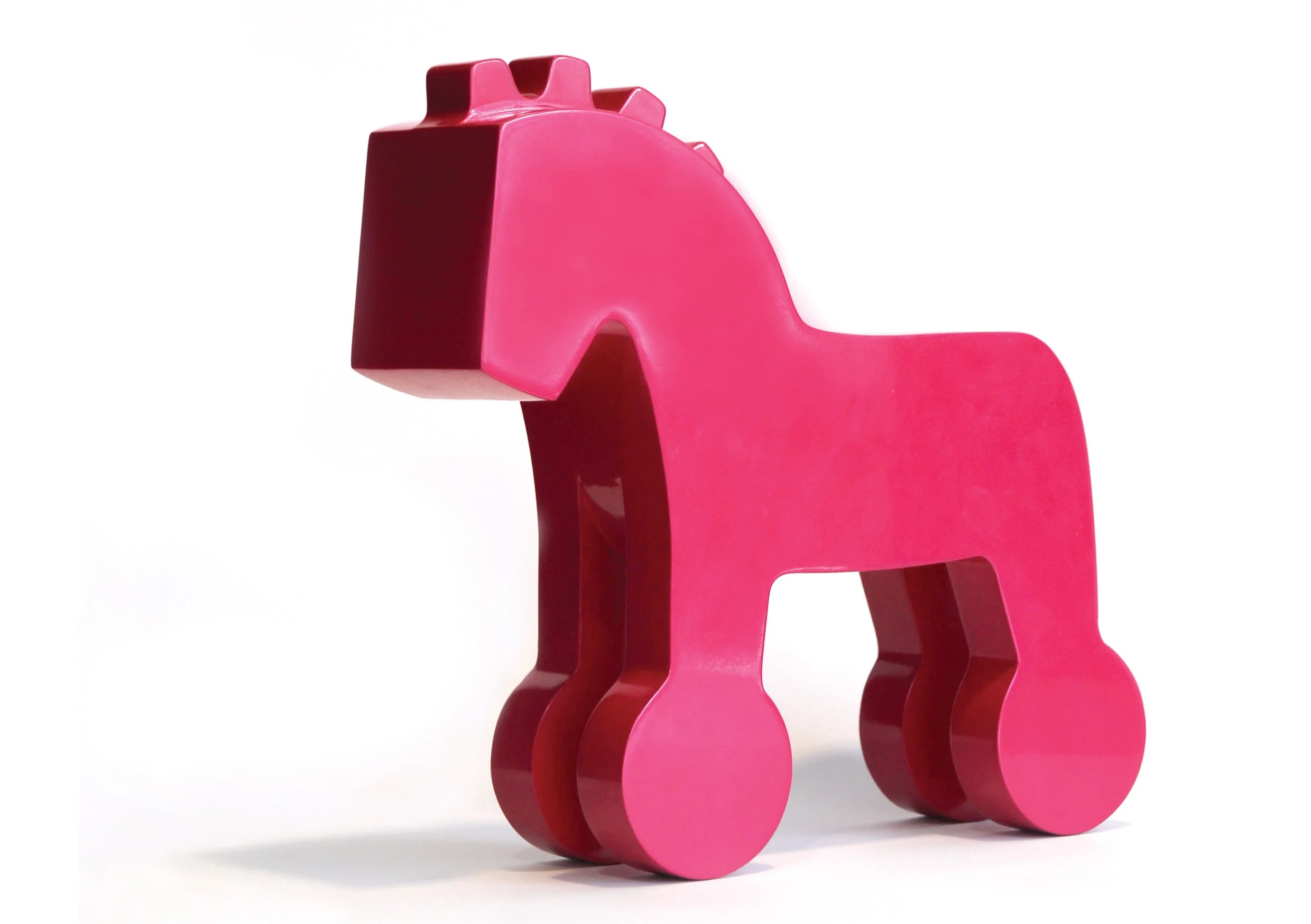
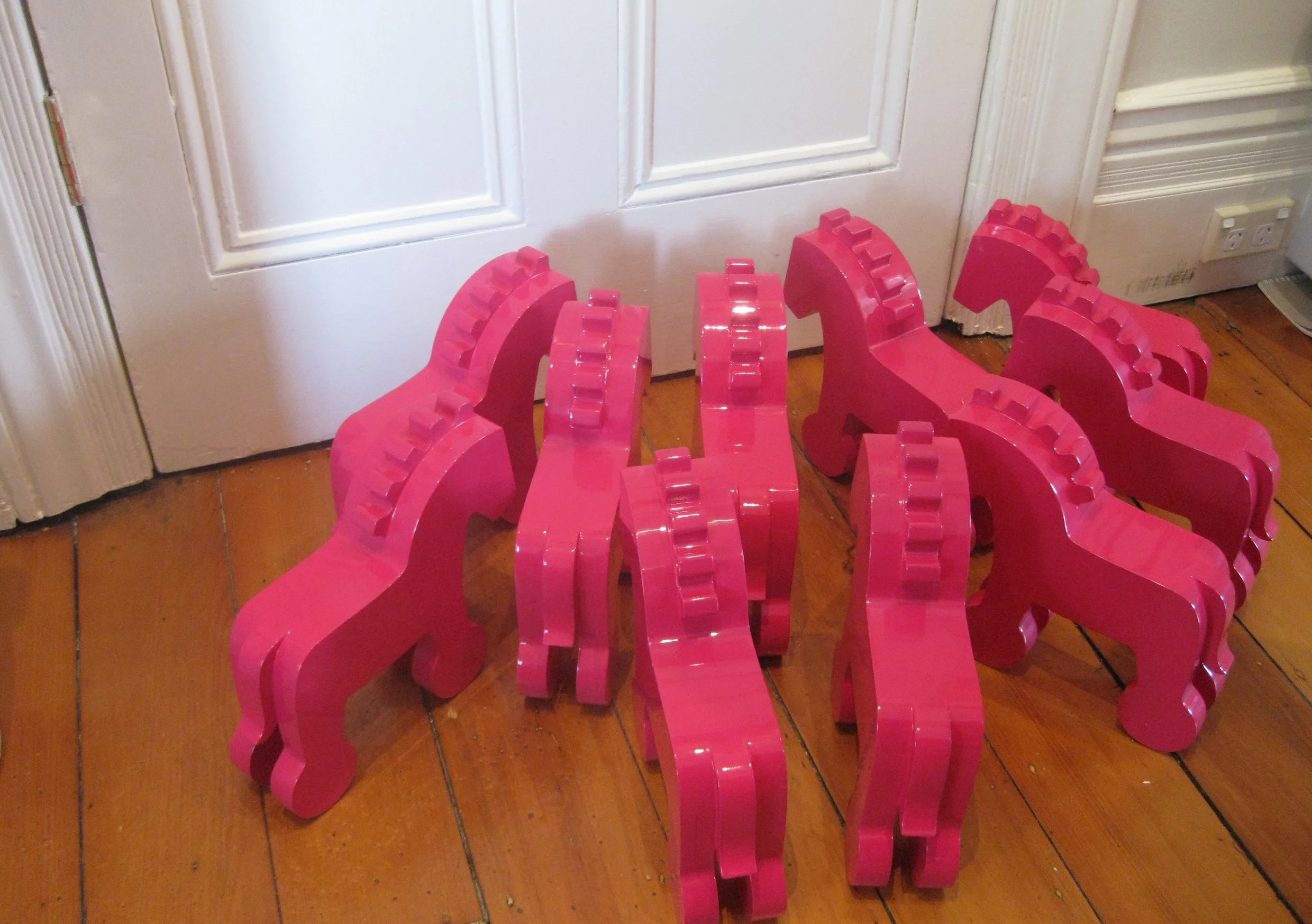
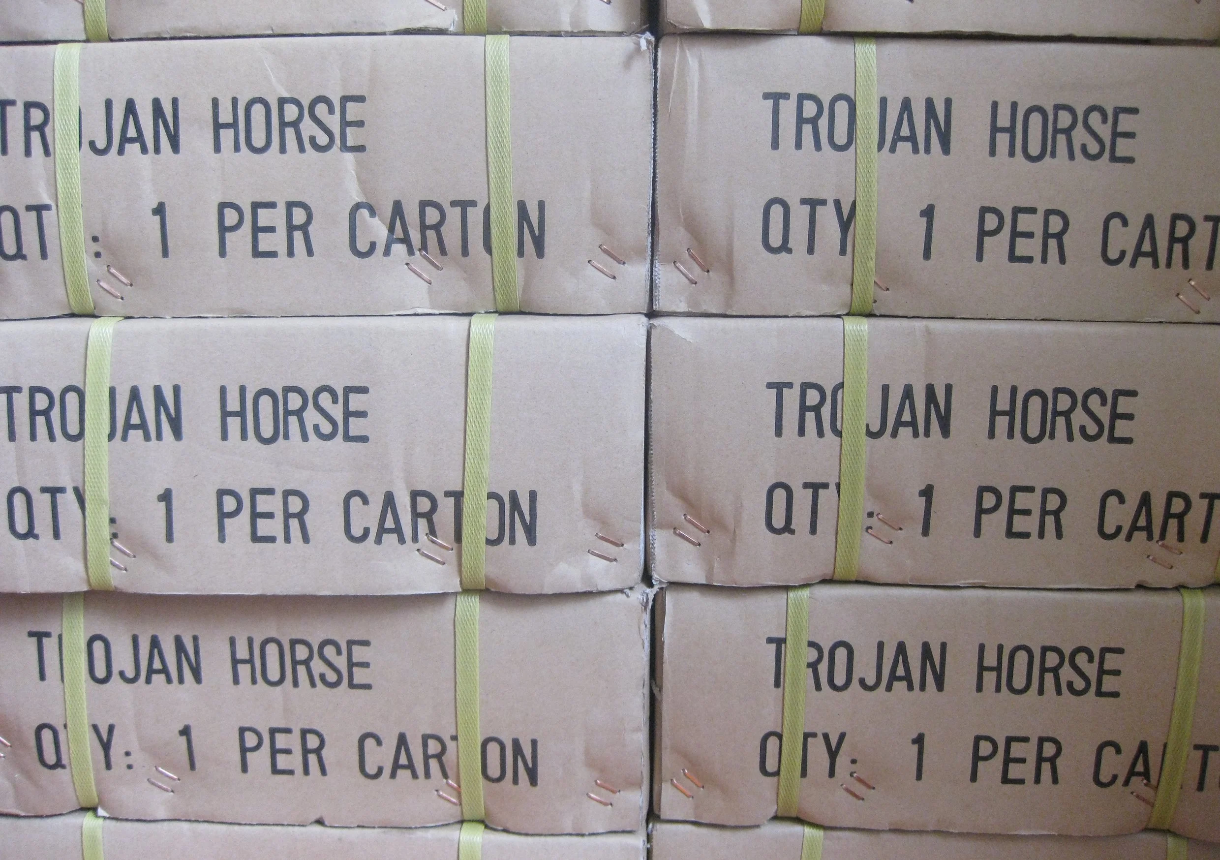
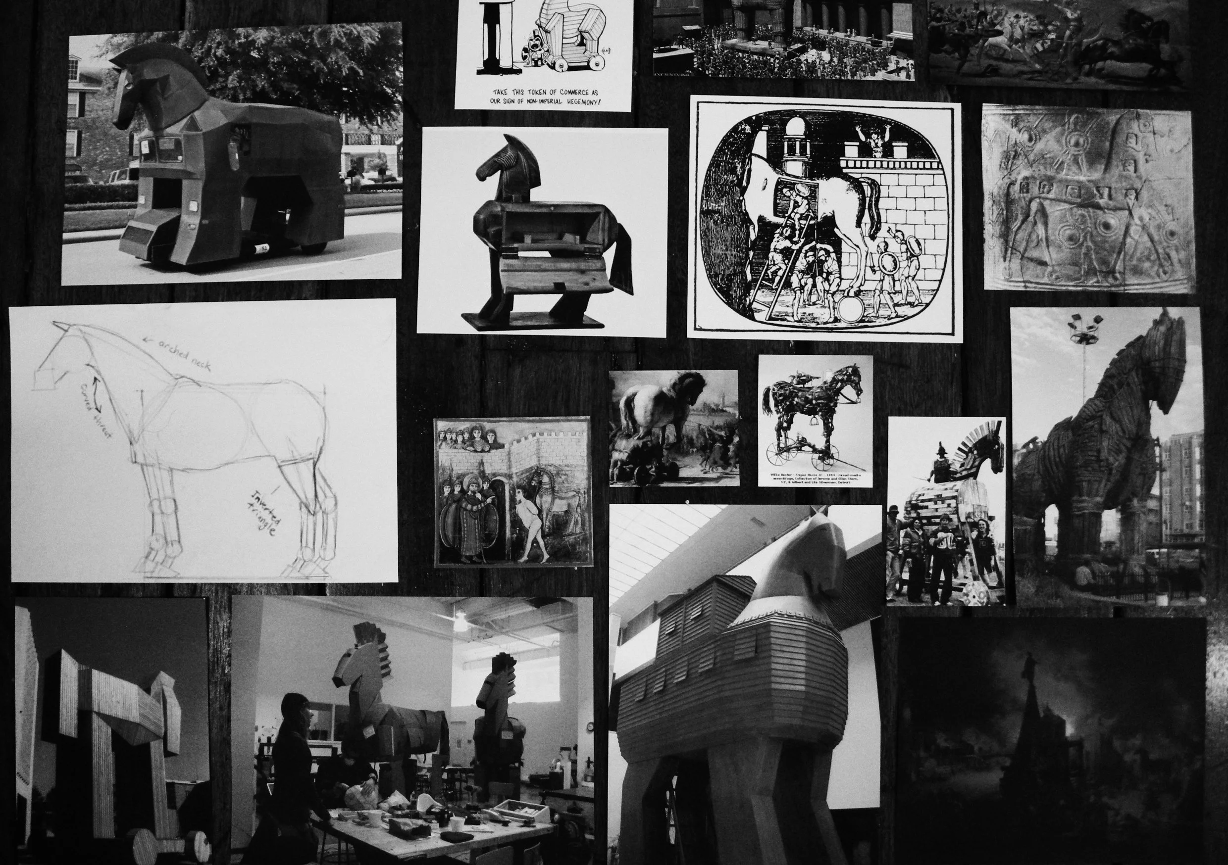
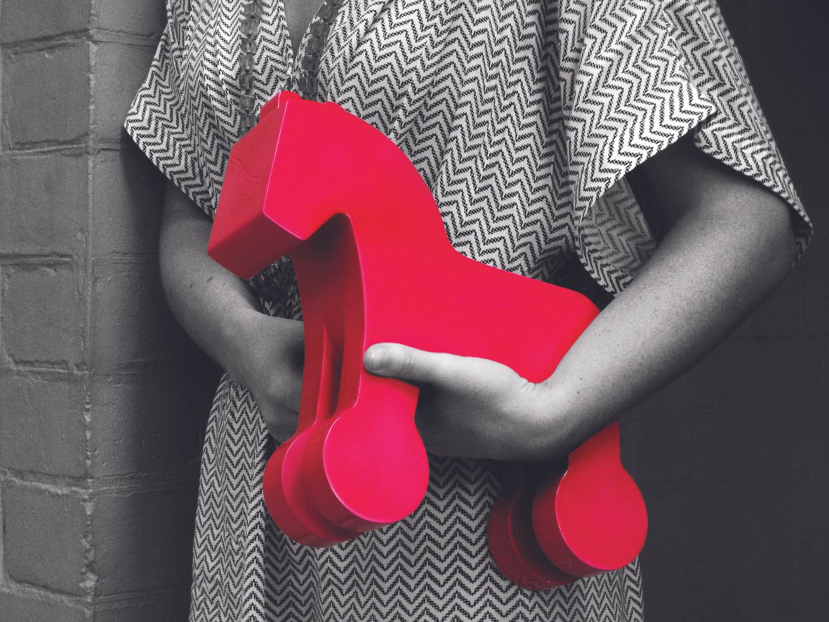
They were a major, and fantastic client of ours and we worked with them on many projects for many years, helping them transition from a traditional print-based distribution business, to an omni-channel communication company. As part of that shift, we were engaged to create a specifically targeted DM campaign, aimed at Australias most prominent media planners and buyers. Not wanting to (ever) create a regular campaign, we set about building something unique...and Salmats own version of the Trojan Horse was born.
After extensive prototyping and experimentation, we produced 400 wooden horses, each weighing 3kg, finished in Salmats bright pink. The horses (or Pinkies as they came to be known) were delivered with a short note left intentionally vague and unbranded. They were too big, too heavy and too beautiful to throw away, so they sat on the (perplexed) recipients desks until a Samat sales rep followed up with a call - an introduction and explanation - the next day.
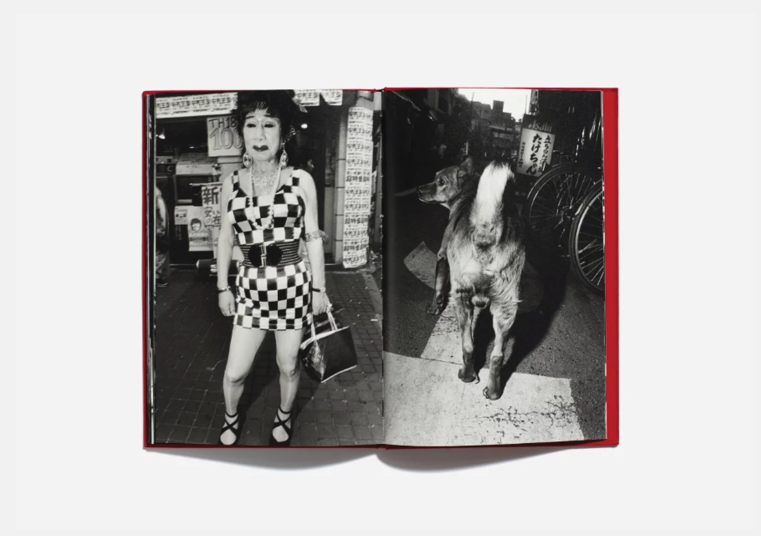
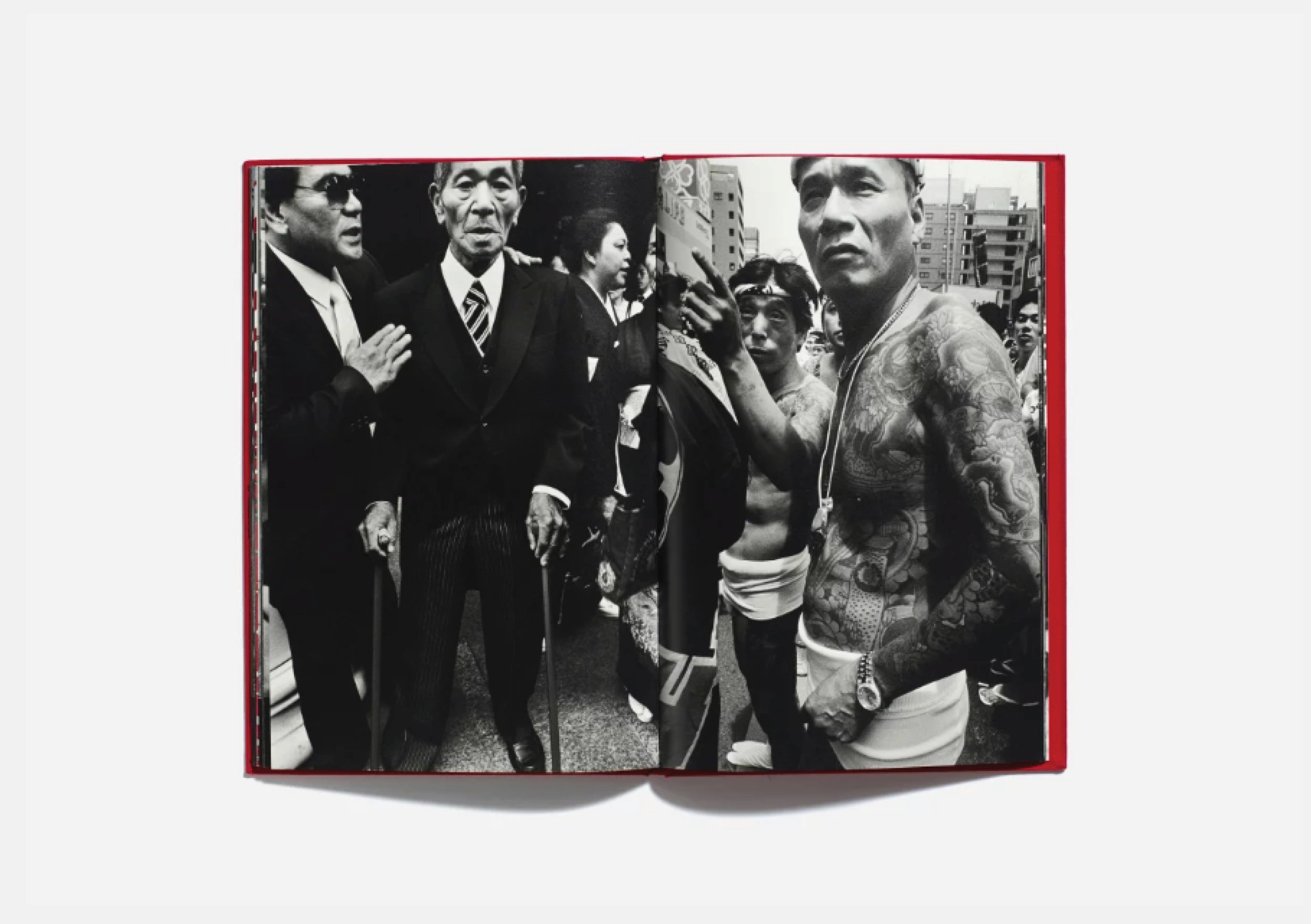
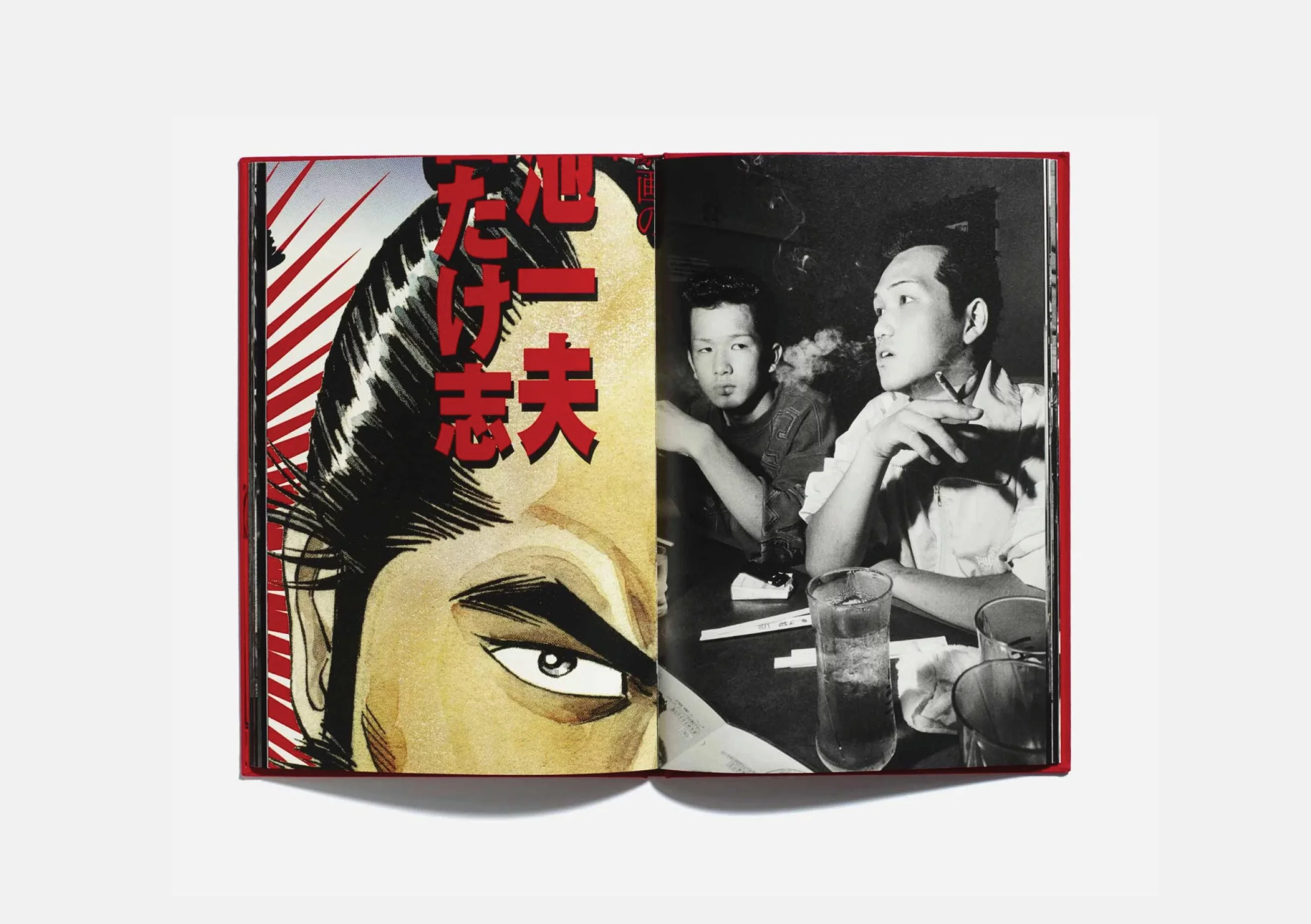
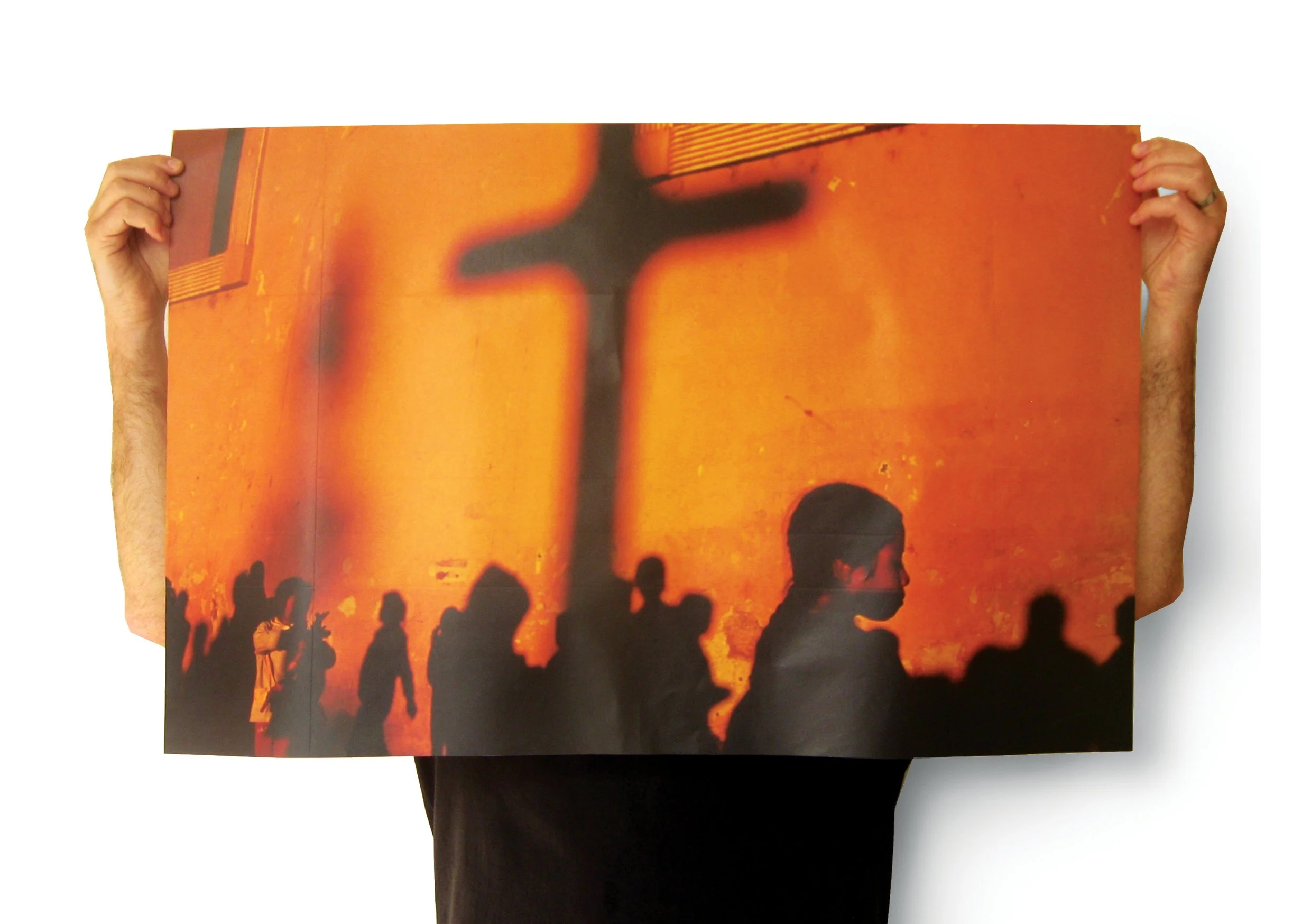
Bruce Gilden - GO!Continuing the collaboration with Magnum Photos, and following our work with Martin Parr on his Flowers book and European Cliches, Jonathan and I worked with Bruce Gilden on the design of his book GO.
The book featured images of the Yakuza (Japanese mafia) and Bosozoku (Japanese biker gangs) taken in Tokyo and Osaka, and was punctuated with Manga cartoons. We launched the book at The Electricity Showrooms in Shoreditch (when it was good), and then across Europe.
We also created a set of limited edition, A1 posters to support the book. The posters featured in the 2001 D&AD annual.